View review
Logo score
Logo review of
Centre Circle
Usable but not client-ready for premium or distinctive branding; needs refinement especially on balance and integration.
Legibility
Originality
Misread
Balance
Scale
Action plan
What to fix first
The most important fixes to handle before polishing the full presentation.
1
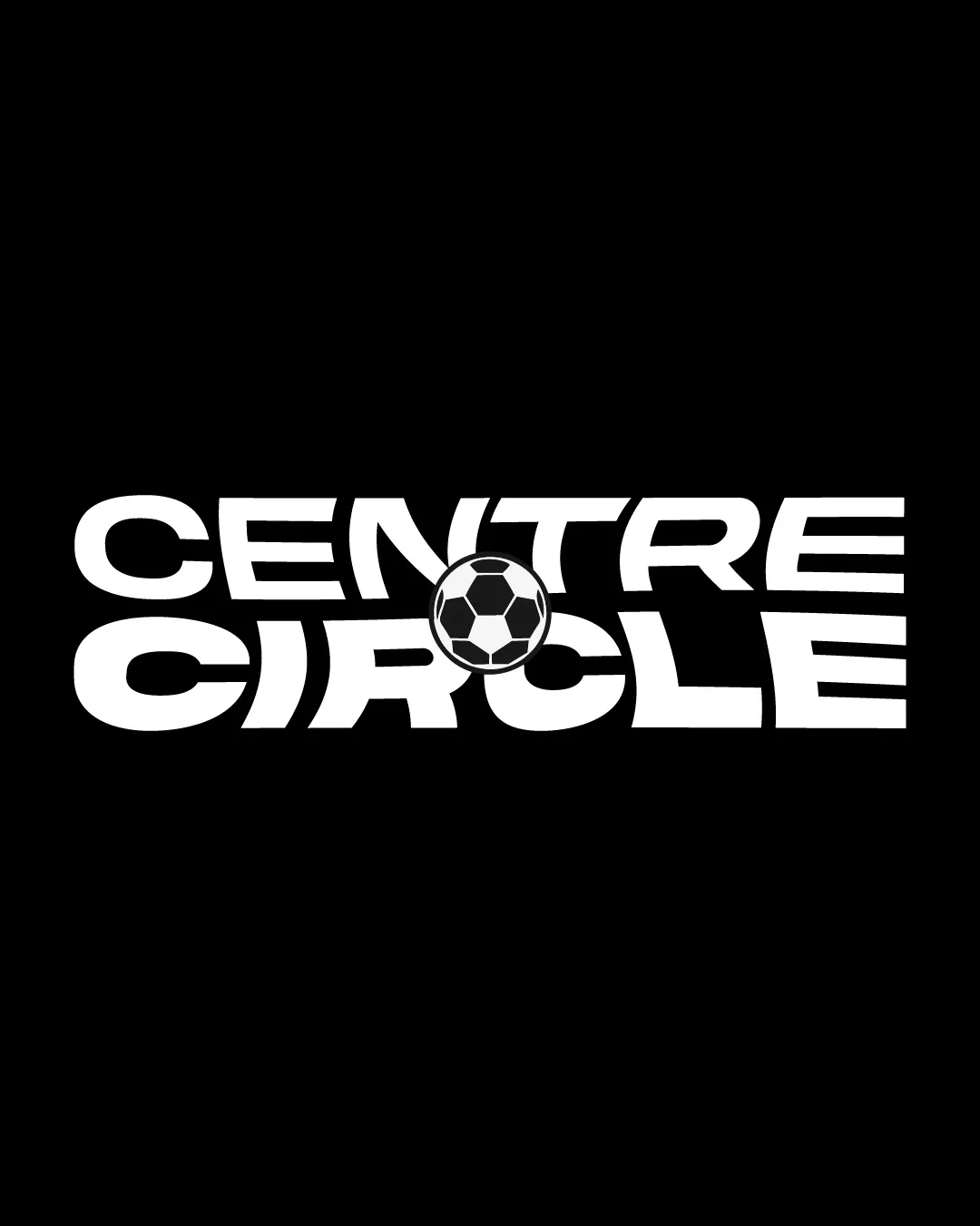
Refine the integration and spacing of the soccer ball with the text for more consistent alignment and flow.
High prioritySoccer ball currently causes a slight disconnect between the words and disrupts strong wordmark alignment.
Impact: Improves Balance, Cohesion, And Professional Appearance. · Effort: Medium
Detailed review
Logo performance breakdown
Legibility
 Text is bold and readable High contrast against the black background
 Soccer ball obscures part of the 'O', very slight interference around central letters
Originality
Soccer ball integration provides a specific thematic link
General layout and concept are typical for sports/football brands
Color harmony
Consistent monochrome palette for versatility and clarity
White
#FFFFFF
Black
#000000
Balance alignment
Central soccer ball creates a strong axis
Alignment slightly forced by soccer ball, causing a break between words Spacing feels a bit uneven due to ball placement

Scalability
Simple, bold forms support small and large use Minimal fine details
Soccer ball detail might lose clarity at extremely small sizes
200x250 px
100×125 px
50×62 px
Misinterpretations
No inappropriate or confusing visual misreads
Beta
No AI design signals found
Likely designed by a human
No strong evidence of generative artifacts; construction and integration appear intentional.
- Soccer ball and text integration is deliberate, details and shapes are coherent.
Visual assessment; not definitive proof of authorship.
Logo structure & brief match
Soccer ball relates directly to 'circle' in both words and theme
Symbol integration disrupts wordmark flow moderately
Industry: Football theme is directly referenced by soccer ball and center circle concept.
YouTube/media Use: Bold and clear enough for digital media or profile use.
Try your own review
Review my logo
Wondering how your logo performs?
Get a clear logo score, key risks, and priority fix ideas before your client or audience sees it.
Keep exploring