Wondering how your logo performs? 🧐
Get professional logo reviews in seconds and catch design issues in time.
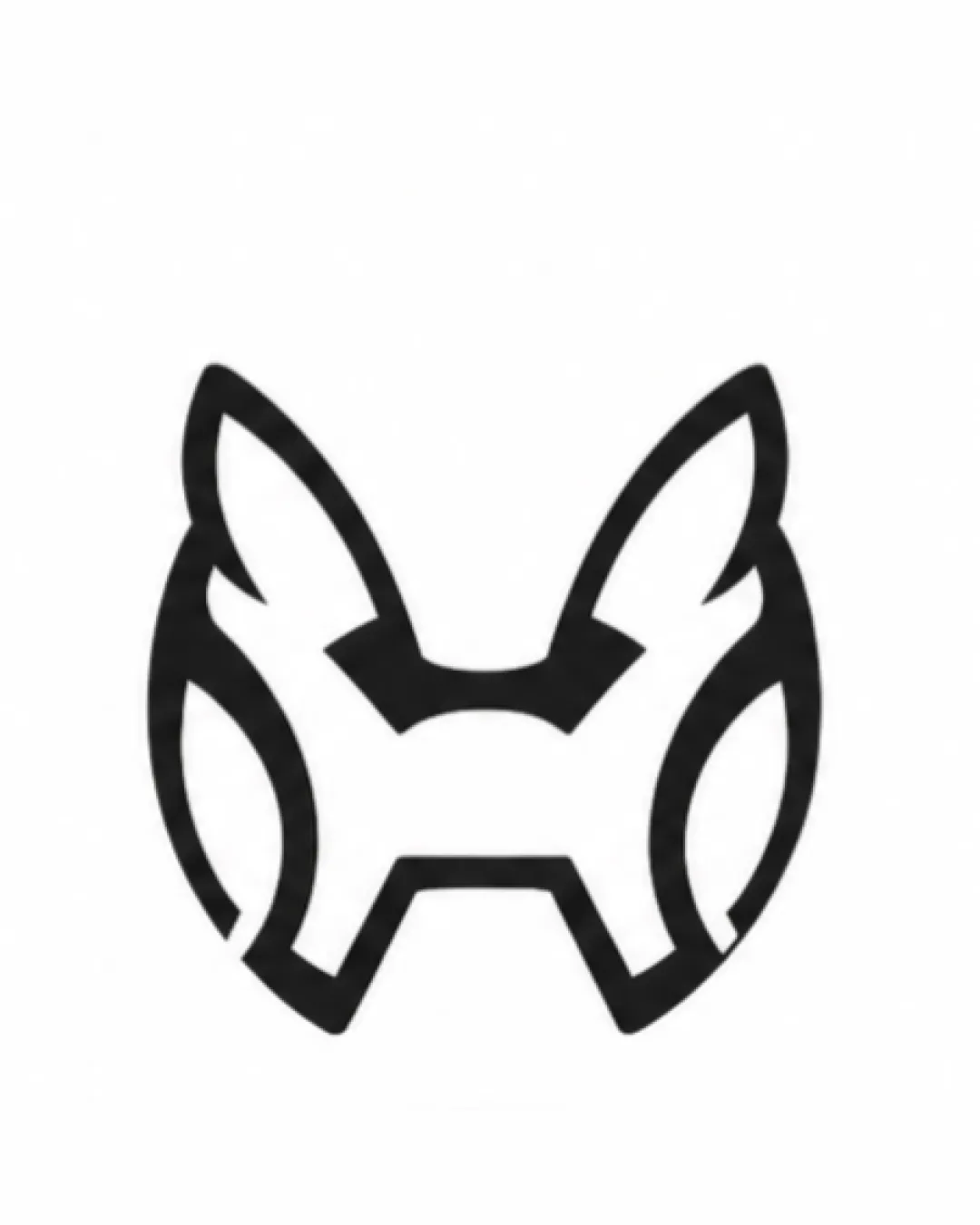
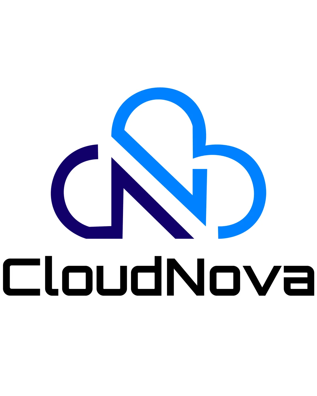
Try it Now!Logo review of CloudNova
 Logo analysis by AI
Logo type:
Style:
Detected symbol:
Detected text:
Business industry:
Review requested by Koya122024
**If AI can recognize or misinterpret it, so can people.
Structured logo review
Legibility
![]() Text is very clear, sharp, and legible even at a small size.
Text is very clear, sharp, and legible even at a small size.![]() Font selection aligns well with the modern and tech-focused brand identity.
Font selection aligns well with the modern and tech-focused brand identity.
Scalability versatility
![]() Logo remains recognizable at most sizes due to bold linework.
Logo remains recognizable at most sizes due to bold linework.![]() Simple shapes and minimal detail work well on large-scale applications such as signage or digital media.
Simple shapes and minimal detail work well on large-scale applications such as signage or digital media.
![]() Thin spacing between cloud lines and intersections may lose clarity at extremely small sizes (e.g., favicon, badge embroidery).
Thin spacing between cloud lines and intersections may lose clarity at extremely small sizes (e.g., favicon, badge embroidery).![]() Gradient-like color shift may not translate well in monochrome or single-color applications.
Gradient-like color shift may not translate well in monochrome or single-color applications.
200x250 px
100×125 px
50×62 px
Balance alignment
![]() Logomark and wordmark proportion is well considered.
Logomark and wordmark proportion is well considered.![]() Centered alignment enhances professional appearance.
Centered alignment enhances professional appearance.
![]() Slight visual weight imbalance—the cloud symbol appears larger and catches the eye before the brand name.
Slight visual weight imbalance—the cloud symbol appears larger and catches the eye before the brand name.

Originality
![]() Monogram integrates initials (C and N) creatively within the cloud motif.
Monogram integrates initials (C and N) creatively within the cloud motif.![]() Abstract approach is more unique than generic cloud icons.
Abstract approach is more unique than generic cloud icons.
![]() Cloud-and-initials concept is commonly used in the tech/SaaS industry.
Cloud-and-initials concept is commonly used in the tech/SaaS industry.![]() No distinct negative space element or hidden symbolism to elevate distinctiveness further.
No distinct negative space element or hidden symbolism to elevate distinctiveness further.
Logomark wordmark fit
![]() Styles of the logomark and wordmark are harmonious—both are geometric and modern.
Styles of the logomark and wordmark are harmonious—both are geometric and modern.![]() Color palette is unified across elements.
Color palette is unified across elements.
Aesthetic look
![]() Minimalistic and visually clean look makes the logo approachable.
Minimalistic and visually clean look makes the logo approachable.![]() Color transition adds modernity without excess decoration.
Color transition adds modernity without excess decoration.
![]() Visual interest could be improved by reducing the heaviness of the upper cloud shape relative to the wordmark.
Visual interest could be improved by reducing the heaviness of the upper cloud shape relative to the wordmark.
Dual meaning and misinterpretations
![]() Logo does not unintentionally resemble inappropriate or misleading symbols.
Logo does not unintentionally resemble inappropriate or misleading symbols.
Color harmony
![]() Limited, crisp palette with a professional gradient from purple to blue enhances brand recognition.
Limited, crisp palette with a professional gradient from purple to blue enhances brand recognition.![]() Strong contrast between logo and background aids clarity.
Strong contrast between logo and background aids clarity.
Jacksons Purple
#221B78
Dodger Blue
#009DFC
Black
#000000
White
#FFFFFF