COFFEE PRO NTO & MORE logo review
3.3/5
Logo score
Logo review of

Coffee Pro Nto & More

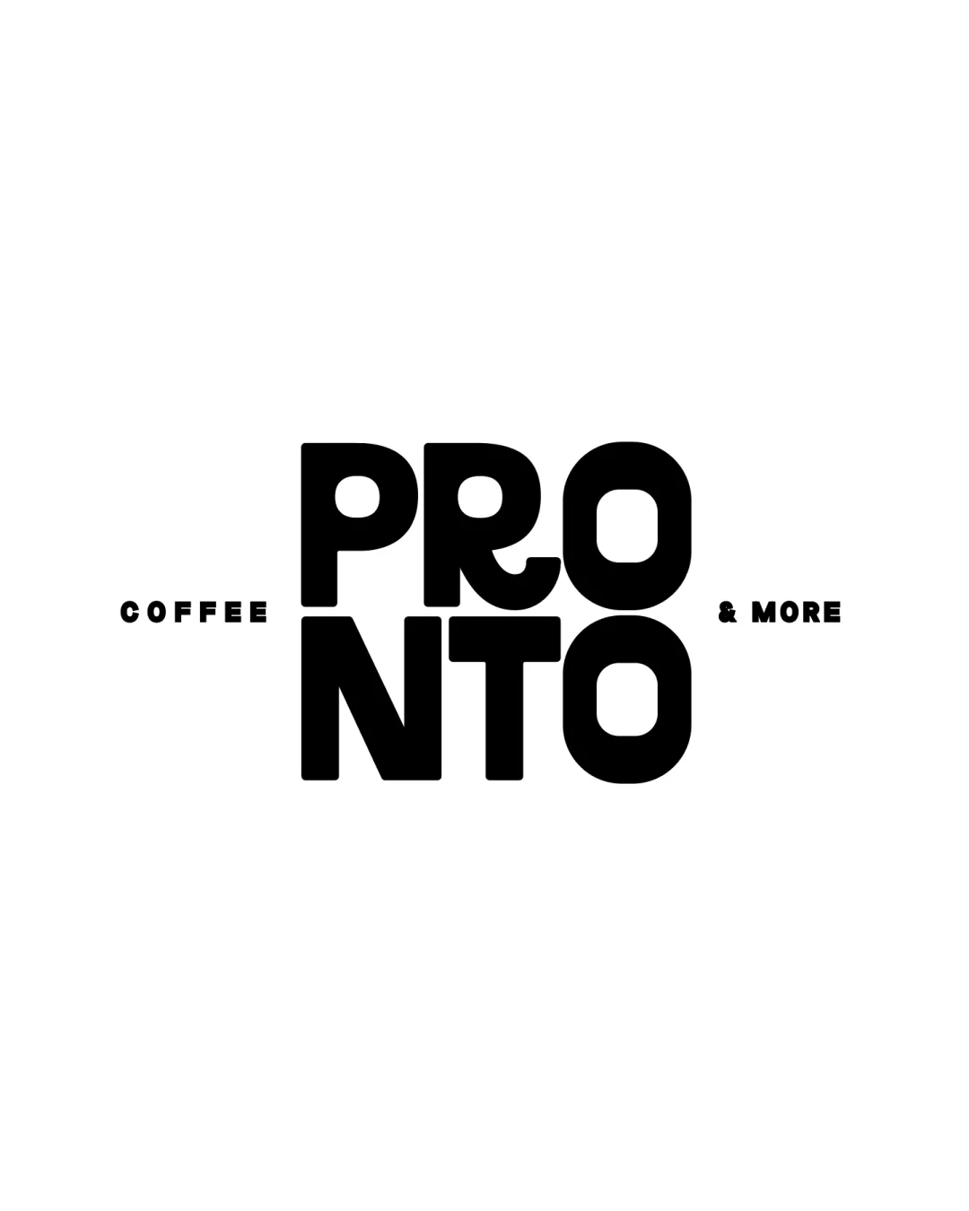
A bold, collegiate wordmark captures energy but needs tagline adjustments for cohesion and scalability.

Wordmark Bold Geometric Wordmark Coffee Shop
5/5
Legibility
3/5
Originality
5/5
Misread
3/5
Balance
3/5
Scale
Your next steps

What to fix first

Focus on the changes that matter. Keep what makes the logo work.

1

tagline elements

Check tagline readability at key print and digital sizes.

Worth testing High priority Low effort
Area to inspectApproximate location

The very small tagline text may become illegible at reduced sizes or from a distance.

How to check

Print/test logo at small sizes to confirm tagline legibility.

See the category review
2

overall wordmark lockup

Test alternative placements or scaling for tagline elements to improve visual unity.

Optional refinement Medium priority Low effort
Area to inspectApproximate location

The tagline elements 'COFFEE' and '& MORE' feel visually disconnected from the main wordmark due to their small size and distance, reducing cohesion.

How to check

Try slightly increasing tagline size or reducing side gaps to see if cohesion improves.

See the category review
Detailed review

Logo performance breakdown

4/5

Brief & logo match

Based on your brief
Compared with

College campus coffee brand

Matches the bold, youthful, coffee-forward brief, but could better express coffee through visual cues or mark integration.

  • Academic/college-friendly Feel

    Bold, simple letterforms and layout feel approachable and energizing for a campus audience.

  • Coffee/food Identity

    Word 'COFFEE' and bold, punchy style express the quick-serve, coffee-based nature, but lacks visual coffee cues or warmth.

5/5

Legibility

  • Main wordmark is clear and boldly readable.
  • No letter confusion in primary text.
3/5

Originality

  • Chunky, geometric letterforms feel youthful and energetic.
3/5

Balance alignment

  • Bold stacked alignment gives a solid presence.
  • The tagline elements 'COFFEE' and '& MORE' feel visually disconnected from the main wordmark due to their small size and distance, reducing cohesion.

    Optional refinement overall wordmark lockup

    Try: Test alternative placements or scaling for tagline elements to improve visual unity.

    Check: Try slightly increasing tagline size or reducing side gaps to see if cohesion improves.

    Area to inspectApproximate location
Uploaded logoAlignment guide overlay

Inspect spacing with the guide. Optical balance may differ from geometric centering.

3/5

Scalability

  • Primary mark remains bold and readable at small sizes.
  • The very small tagline text may become illegible at reduced sizes or from a distance.

    Worth testing tagline elements

    Try: Check tagline readability at key print and digital sizes.

    Check: Print/test logo at small sizes to confirm tagline legibility.

    Area to inspectApproximate location
Uploaded logo at 200 pixels wide
200 × 250 px
Uploaded logo at 100 pixels wide
100 × 125 px
Uploaded logo at 50 pixels wide
50 × 63 px

Compare the detail at different sizes. Labels show the full image dimensions.

5/5

Misinterpretations

  • No plausible misunderstandings.

Black & white

Does the shape still work without color?

These tests are available only for logos uploaded in vector (SVG) format.

Background contrast

Find the surfaces where your logo stays clear.

These tests are available only for logos uploaded in vector (SVG) format.

Blur & silhouette

A 3px blur softens fine details so you can check whether the overall shape stays recognizable. If key gaps close or elements merge, the logo may rely too heavily on detail.

These tests are available only for logos uploaded in vector (SVG) format.

Try your own review

Wondering how your logo performs?

Get a clear logo score, key risks, and priority fix ideas before your client or audience sees it.

Review my logo