রুনন ক্র্যাফ্টস logo review
3.2/5
Logo score
Logo review of

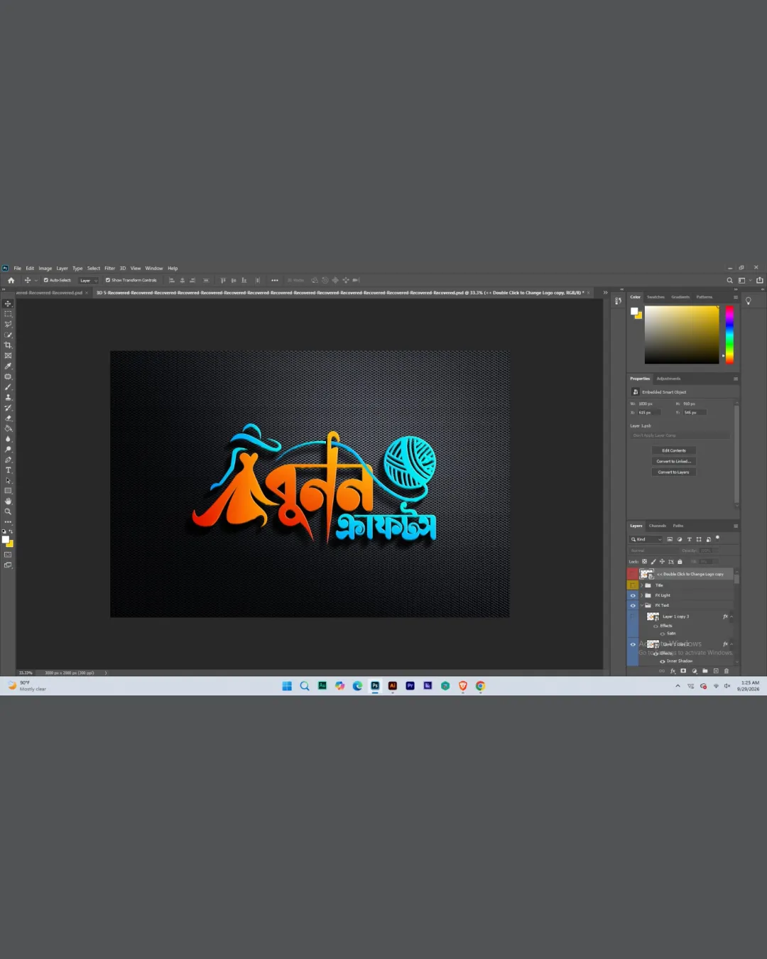
রুনন ক্র্যাফ্টস

A creative, on-theme logo that uniquely blends craft symbolism with Bengali lettering, but needs refinement and simplification for practical deployment.

Combination Colorful Script With Illustrative Element Crafts
4/5
Legibility
3/5
Originality
5/5
Misread
3/5
Balance
3/5
Scale
Your next steps

What to fix first

Focus on the changes that matter. Keep what makes the logo work.

1

wordmark and yarn ball symbol

Simplify complex details or prepare a small-size variant.

Visible issue High priority Medium effort

Detailed script elements and yarn ball lines may lose clarity at small sizes.

How to check

Check legibility and symbol detail at favicon or business card scale.

See the category review
2

wordmark and symbol integration

Adjust symbol placement and thread integration for tighter composition.

Optional refinement Medium priority Medium effort

Symbol-thread crossing and stacked text create minor visual imbalance; the symbol feels slightly disconnected above the main word shape.

How to check

Test horizontal and vertical lockups for unity.

See the category review
Detailed review

Logo performance breakdown

Not scored

Brief & logo match

More context needed

There isn't enough brand context to assess the match.

4/5

Legibility

  • Major script is clear for those who read Bengali.
3/5

Originality

  • Script integration is brandable.
  • Yarn ball as a craft symbol is commonly used, though combined with unique Bengali script and thread integration.

    Optional refinement overall logo

    Try: Further enhance custom elements to increase uniqueness.

    Check: Compare against leading regional craft brand logos for distinction.

4/5

Color harmony

  • Vibrant orange and blue create contrast and craft energy.
Orange#E06B1A
LightBlue#14CCE0
White#FFFFFF
Black#111111

Estimated colors. Use the original design file for exact values.

Create a full color palette using these colors

Create new palette
3/5

Balance alignment

  • Dynamic weaving effect and energetic layout.
  • Symbol-thread crossing and stacked text create minor visual imbalance; the symbol feels slightly disconnected above the main word shape.

    Optional refinement wordmark and symbol integration

    Try: Adjust symbol placement and thread integration for tighter composition.

    Check: Test horizontal and vertical lockups for unity.

Uploaded logoAlignment guide overlay

Inspect spacing with the guide. Optical balance may differ from geometric centering.

3/5

Scalability

  • Strong visual at moderate/large size.
  • Detailed script elements and yarn ball lines may lose clarity at small sizes.

    Visible issue wordmark and yarn ball symbol

    Try: Simplify complex details or prepare a small-size variant.

    Check: Check legibility and symbol detail at favicon or business card scale.
Uploaded logo at 200 pixels wide
200 × 250 px
Uploaded logo at 100 pixels wide
100 × 125 px
Uploaded logo at 50 pixels wide
50 × 63 px

Compare the detail at different sizes. Labels show the full image dimensions.

5/5

Misinterpretations

  • No plausible negative double meaning or misreading.
3/5

Symbol & text fit

  • Thread motif relates symbol and script.

Black & white

Does the shape still work without color?

These tests are available only for logos uploaded in vector (SVG) format.

Background contrast

Find the surfaces where your logo stays clear.

These tests are available only for logos uploaded in vector (SVG) format.

Blur & silhouette

A 3px blur softens fine details so you can check whether the overall shape stays recognizable. If key gaps close or elements merge, the logo may rely too heavily on detail.

These tests are available only for logos uploaded in vector (SVG) format.

Try your own review

Wondering how your logo performs?

Get a clear logo score, key risks, and priority fix ideas before your client or audience sees it.

Review my logo