ConecTEA logo review
4/5
Logo score
Logo review of

Conectea

A highly relevant, visually appealing logo with strong brand fit needs only minor adjustments for optimal small-scale use and color balance.

Combination Mark Friendly, Rounded, Vibrant Assistive Technology / Inclusion
4/5
Legibility
4/5
Originality
5/5
Misread
4/5
Balance
3/5
Scale
Your next steps

What to fix first

Focus on the changes that matter. Keep what makes the logo work.

1

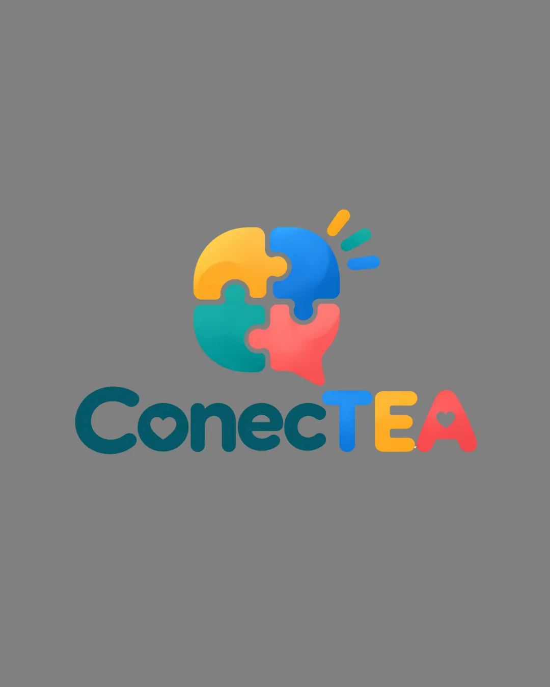
puzzle speech bubble mark

Test the speech bubble mark at small scale for detail retention and legibility.

Worth testing Medium priority Medium effort
Area to inspectApproximate location

The puzzle mark has subtle gradients and small details that could lose clarity at very small sizes.

How to check

Print or display the mark at under 1cm height and check if all segments are distinct.

See the category review
2

E-A join in wordmark

Refine spacing and alignment at the E-A join for optimal visual rhythm.

Optional refinement Low priority Low effort
Area to inspectApproximate location

The spacing and baseline alignment between the 'E' and 'A' in 'TEA' feels slightly uneven due to differing shapes and heart cutouts.

How to check

Zoom in on letter join, compare optically and tweak until spacing feels natural.

See the category review
Detailed review

Logo performance breakdown

5/5

Brief & logo match

Based on your brief
Compared with

Assistive tech for non-speaking autistic children; goals of warmth, connection, inclusion, autonomy, professional yet approachable, with rounded shapes and modern vibrancy.

Logo embodies warmth, connection, and human-centered design with clever use of color, shape, and theme.

  • Warmth And Inclusion

    Rounded shapes, bright colors, and heart cutouts visually communicate warmth and approachability, supporting the inclusive aim.

  • Communication And Connection

    Speech bubble made from puzzle pieces clearly signals both communication and the idea of connecting parts/groups.

4/5

Legibility

  • Logotype is readable and friendly.
  • Distinct color sections clarify brand name.
4/5

Originality

  • Puzzle speech bubble is a clever and fitting visual blend.
  • Heart motifs in letters reinforce warmth and care.
4/5

Color harmony

  • Color usage feels vibrant and engaging.
  • Strong, playful color palette fits the brief, but the saturation and gradients, especially on the red/pink piece, may create visual imbalance or distraction.

    Optional refinement logomark and wordmark

    Try: Test slightly toned-down or more harmonized color transitions, especially with the pink segment.

    Check: Compare versions with softer, more harmonized palette on various backgrounds.

Teal#17676B
Yellow#F3C43D
Green#34BBA4
Blue#4388E5
Pink#F16470
Red#E2472B

Estimated colors. Use the original design file for exact values.

Create a full color palette using these colors

Create new palette
4/5

Balance alignment

  • Wordmark uses playful, well-managed integration.
  • Overall layout feels balanced.
  • The spacing and baseline alignment between the 'E' and 'A' in 'TEA' feels slightly uneven due to differing shapes and heart cutouts.

    Optional refinement E-A join in wordmark

    Try: Refine spacing and alignment at the E-A join for optimal visual rhythm.

    Check: Zoom in on letter join, compare optically and tweak until spacing feels natural.

    Area to inspectApproximate location
Uploaded logoAlignment guide overlay

Inspect spacing with the guide. Optical balance may differ from geometric centering.

3/5

Scalability

  • Logomark shape is bold and recognizable.
  • The puzzle mark has subtle gradients and small details that could lose clarity at very small sizes.

    Worth testing puzzle speech bubble mark

    Try: Test the speech bubble mark at small scale for detail retention and legibility.

    Check: Print or display the mark at under 1cm height and check if all segments are distinct.
    Area to inspectApproximate location
Uploaded logo at 200 pixels wide
200 × 250 px
Uploaded logo at 100 pixels wide
100 × 125 px
Uploaded logo at 50 pixels wide
50 × 63 px

Compare the detail at different sizes. Labels show the full image dimensions.

5/5

Misinterpretations

  • No apparent risk of negative or confusing meanings.
5/5

Symbol & text fit

  • Color, style, and theme unify mark and wordmark effectively.

Black & white

Does the shape still work without color?

These tests are available only for logos uploaded in vector (SVG) format.

Background contrast

Find the surfaces where your logo stays clear.

These tests are available only for logos uploaded in vector (SVG) format.

Blur & silhouette

A 3px blur softens fine details so you can check whether the overall shape stays recognizable. If key gaps close or elements merge, the logo may rely too heavily on detail.

These tests are available only for logos uploaded in vector (SVG) format.

Try your own review

Wondering how your logo performs?

Get a clear logo score, key risks, and priority fix ideas before your client or audience sees it.

Review my logo