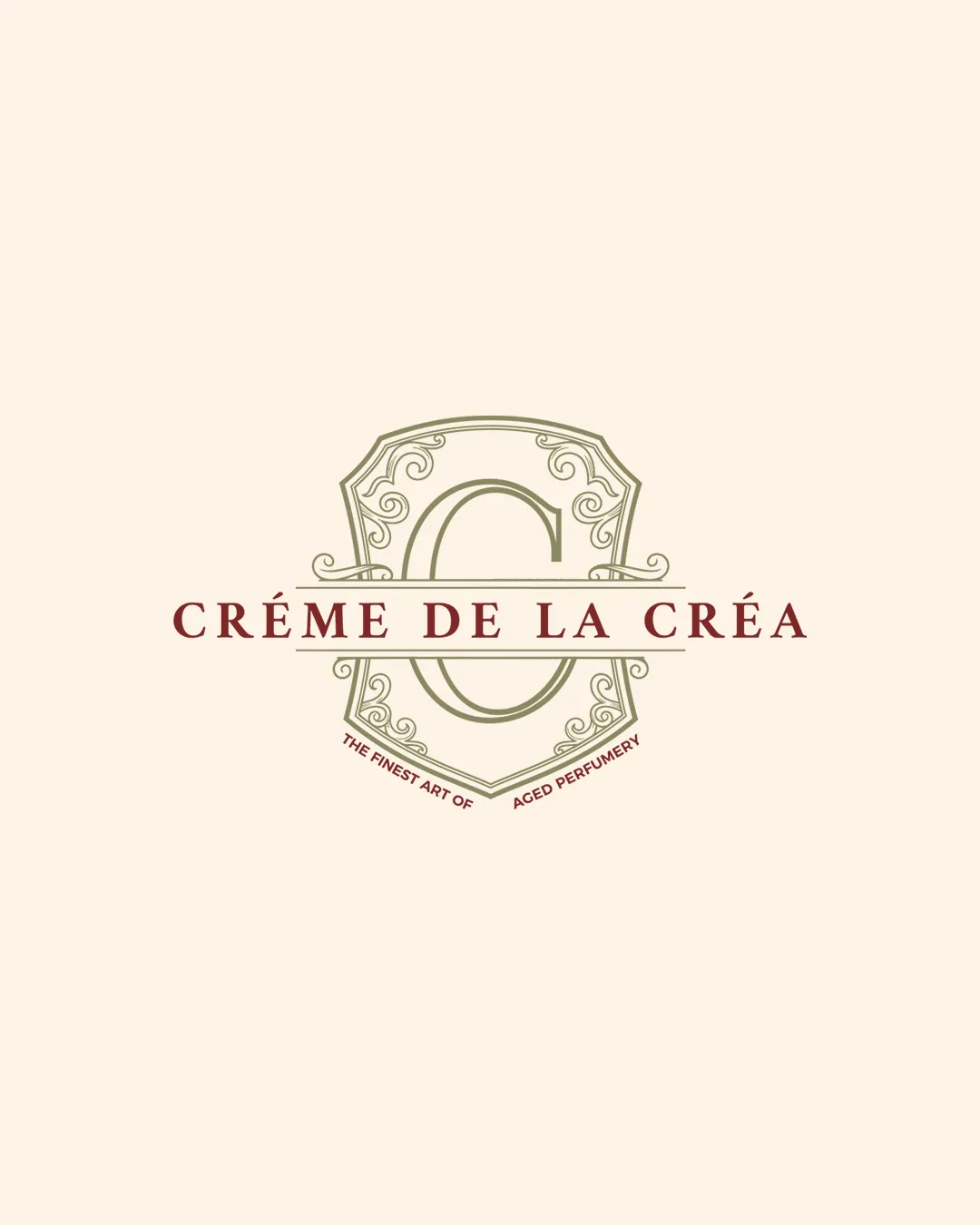
CRÉME DE LA CRÉA THE FINEST ART OF AGED PERFUMER.. logo review
4.3/5
Logo score
Logo review of

Créme De La Créa The Finest Art Of Aged Perfumer..

Elegant, premium logo with high suitability for perfume, provided adjustments are made for clarity at smaller sizes.

Combination Mark Vintage Luxury Serif Perfume
4/5
Legibility
4/5
Originality
5/5
Misread
5/5
Balance
3/5
Scale
Your next steps

What to fix first

Focus on the changes that matter. Keep what makes the logo work.

1

Increase tagline legibility or consider omitting it for small-scale use.

High priority Low effort

Tagline is unreadable at smaller scales and unnecessary for main brand presence.

Improves readability and usability of the logo at all sizes.
2

Simplify some crest linework for small scale reproduction.

Medium priority Medium effort

Delicate linework may be lost or blurred when logo is reduced in size.

Enhances scalability, especially for packaging and digital use.

Detailed review

Logo performance breakdown

Not scored

Brief & logo match

From the original review
  • Perfume

    Logo projects a sense of luxury and refinement appropriate to high-end perfume. Ornate crest and serif type evoke tradition and sophistication.

4/5

Legibility

  • Primary brand name is highly legible in caps.
  • Font choice is elegant and aligns with luxury perception.
  • Tiny tagline text is difficult to read, especially at small sizes.
4/5

Originality

  • Ornate monogram crest adds uniqueness compared to generic perfume marks.
  • Shield/crest motif is somewhat traditional within luxury categories and not groundbreaking.
5/5

Color harmony

  • Sophisticated muted palette fits luxury perfume market.
  • Colors provide subtle, elegant contrast.
Almond#EFE1D2
Muddy Olive#8A6742
Oxblood#8B373B

Estimated colors. Use the original design file for exact values.

Create a full color palette using these colors

Create new palette

5/5

Balance alignment

  • Excellent symmetry and centering of all elements.
  • Text, monogram, and border have balanced spacing.
Uploaded logoAlignment guide overlay

Inspect spacing with the guide. Optical balance may differ from geometric centering.

3/5

Scalability

  • Main mark and brand name retain clarity at medium scale.
  • Thin decorative lines and small details in the crest risk losing definition at smaller sizes.
  • Tagline is not scalable.
Uploaded logo at 200 pixels wide
200 × 250 px
Uploaded logo at 100 pixels wide
100 × 125 px
Uploaded logo at 50 pixels wide
50 × 63 px

Compare the detail at different sizes. Labels show the full image dimensions.

5/5

Misinterpretations

  • No inappropriate or embarrassing visual reads detected.
5/5

Symbol & text fit

  • Wordmark and crest monogram visually integrate seamlessly.

Black & white

Does the shape still work without color?

These tests are available only for logos uploaded in vector (SVG) format.

Background contrast

Find the surfaces where your logo stays clear.

These tests are available only for logos uploaded in vector (SVG) format.

Blur & silhouette

A 3px blur softens fine details so you can check whether the overall shape stays recognizable. If key gaps close or elements merge, the logo may rely too heavily on detail.

These tests are available only for logos uploaded in vector (SVG) format.

Try your own review

Wondering how your logo performs?

Get a clear logo score, key risks, and priority fix ideas before your client or audience sees it.

Review my logo