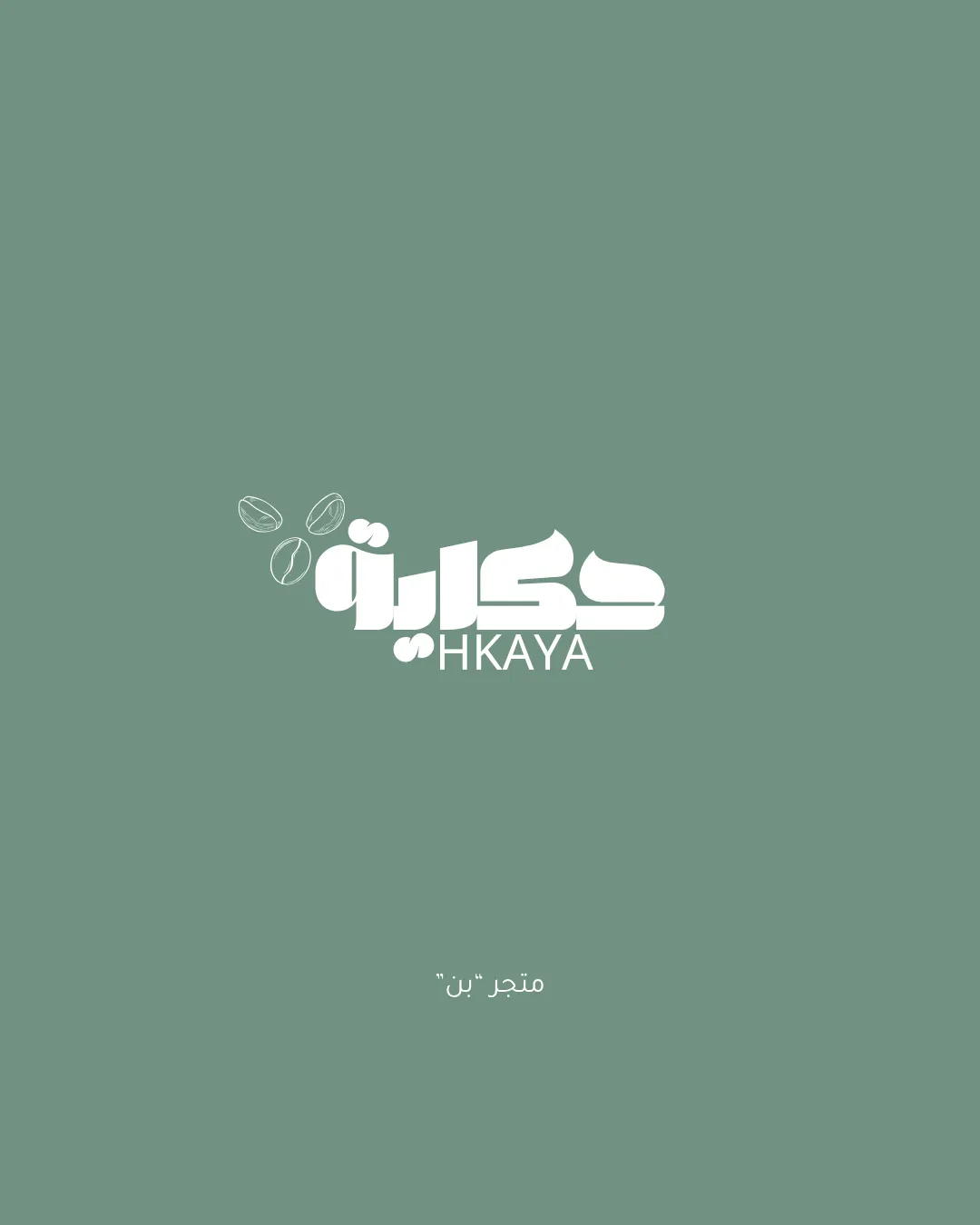
HKAYA coffee shop logo logo review
3.5/5
Logo score Combination mark (wordmark + symbol) category

HKAYA coffee shop logo

creative122684 Essential logo review

A strong, modern bilingual coffee logo with clear intent, but needing improved mark-to-word alignment and resilience at small scale.

This logo lockup shows solid execution, supported by distinctive construction and text readability; improving visual balance is the clearest next step.

Combination Mark (wordmark + Symbol) Modern, Bold Sans-serif, With Arabic And Latin Text Coffee Shop / Café
4/5
Legibility
4/5
Originality
3/5
Balance
3/5
Scale
3/5
Style consistency
Your next steps

What to fix first

Focus on the changes that matter. Keep what makes the logo work.

1

wordmark + coffee beans icon (top left of wordmark)

Adjust the visual weight or proximity between the beans and the wordmark for stronger unity.

Medium priority Visible issue Medium effort

The three outlined coffee beans are visually light and float above the much bolder, dense Arabic wordmark, causing a slight imbalance; they may feel disconnected at small sizes or on cluttered backgrounds.

See the category review
Detailed review

Logo performance breakdown

4/5

Brief & logo match

Well-suited to a coffee shop: clear coffee cues and bilingual approach, but bean-symbol balance can be refined for brand presence.

5/5

Misinterpretations

  • No unintended interpretations observed.
4/5

Legibility

Wordmark 4/5 · Layout 4/5

  • Arabic wordmark is bold and clear at intended size.
  • Latin 'HKAYA' is readable with sufficient space.
  • The small size of the Latin text may challenge readability at normal or small logo applications, especially compared to the boldness of the main wordmark.

    Worth testing Latin text "HKAYA" below Arabic wordmark
4/5

Originality

Symbol 4/5 · Wordmark 4/5

  • Distinctive combination of Arabic and Latin with custom bean icon.
3/5

Balance alignment

Symbol 3/5 · Wordmark 3/5 · Layout 3/5

Available in Advanced logo reviews
3/5

Scalability

Symbol 3/5 · Wordmark 3/5 · Layout 3/5

Available in Advanced logo reviews
3/5

Style consistency

This review includes a score but no supporting explanation for this category.

Try your own review

Wondering how your logo performs?

Get a clear logo score, key risks, and priority fix ideas before your client or audience sees it.

Review my logo