What to preserve
A playful and appetizing wordmark with a bold, syrupy yellow script and splash accent designed to appeal to a fun, youthful, or food-oriented market.
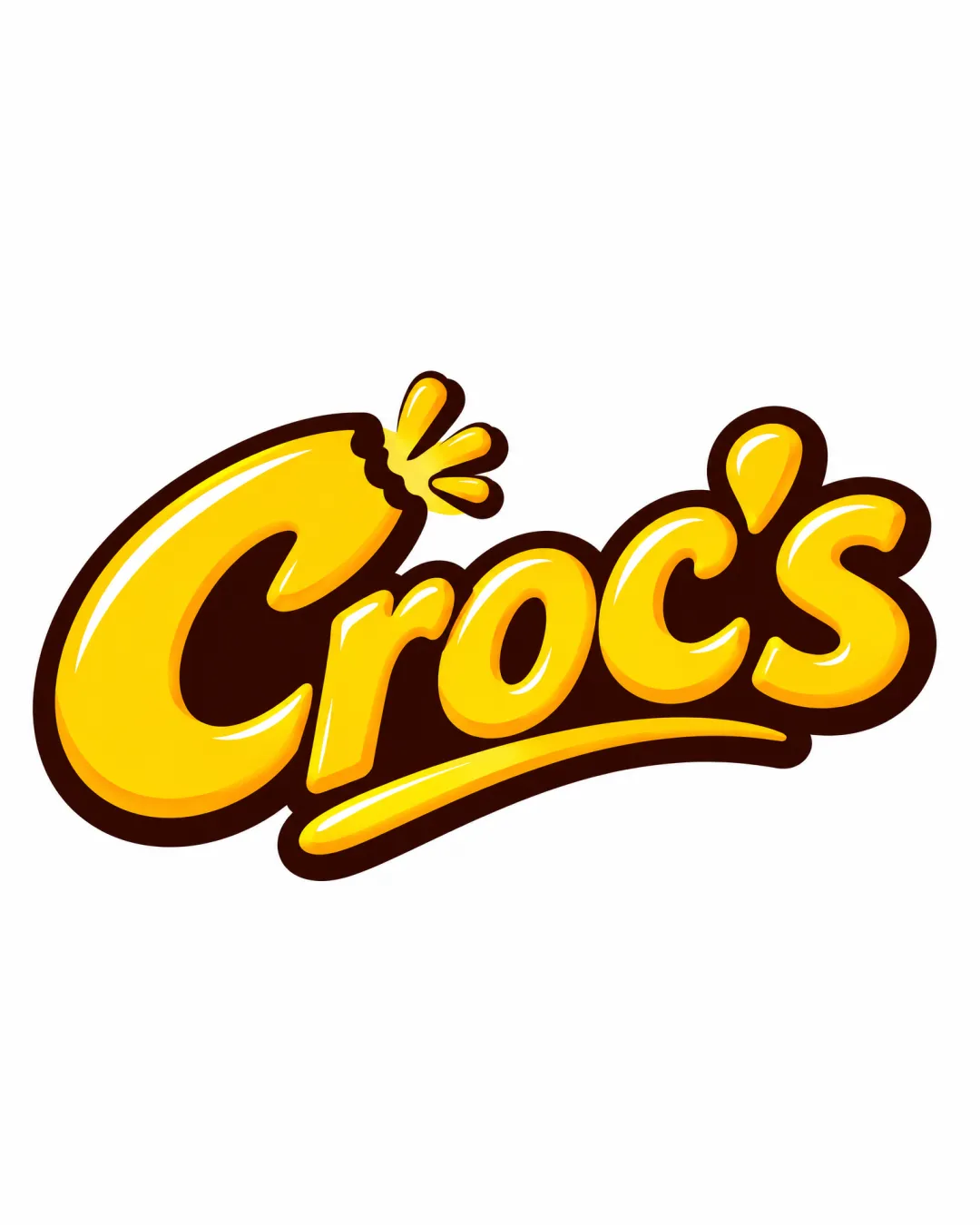
A bold, playful, and appetizing wordmark with excellent readability and shelf appeal, though minor tweaks could further refine versatility.
This wordmark shows strong execution, supported by text readability and distinctive construction.
Focus on the changes that matter. Keep what makes the logo work.
A playful and appetizing wordmark with a bold, syrupy yellow script and splash accent designed to appeal to a fun, youthful, or food-oriented market.
entire wordmark
The 3D styling and bold inner shadows enhance appeal at larger sizes but may lose detail at small scales, potentially making the splash accent blend with the letter 'C'.
See the category reviewThe energetic, glossy script and splash effect strongly support a youth- or snack-focused brand, though the food link is visual, not explicit.
Estimated colors. Use the original design file for exact values.
Create a full color palette using these colors
Create new paletteThe sweeping underline and high-contrast shadows create an energetic look but introduce visual weight towards the lower edge, which might feel slightly bottom-heavy in some applications.

Inspect spacing with the guide. Optical balance may differ from geometric centering.
The 3D styling and bold inner shadows enhance appeal at larger sizes but may lose detail at small scales, potentially making the splash accent blend with the letter 'C'.
Try: Test logo legibility and splash effect at reduced sizes.
Get a clear logo score, key risks, and priority fix ideas before your client or audience sees it.
More credits needed
Add credits to continue without losing your work.
Then $7/month. Cancel anytime.
Essential logo review with AI
Estimated progress