What to preserve
The custom 'M' and elegant typography convey bespoke craftsmanship and upscale appeal, aligning well with a luxury furniture maker.

A sophisticated, luxurious logo fitting a bespoke furniture maker; refinement in spacing could further enhance elegance.
This logo lockup shows strong execution, supported by text readability and distinctive construction; layout still needs assessment.
Focus on the changes that matter. Keep what makes the logo work.
The custom 'M' and elegant typography convey bespoke craftsmanship and upscale appeal, aligning well with a luxury furniture maker.
Logo preview unavailable. The written feedback is still available on this card.
spacing between 'M' and 'A'
The custom 'M' creates slight negative space imbalance beside the geometric 'A', subtly affecting visual cohesion.
See the category reviewThe luxurious, custom serif mark and impeccable spacing reinforce the hand-crafted, premium positioning of a bespoke UK furniture maker.
Highly stylized 'M' creates a distinct character but closely echoes generic luxury serif forms.
Try: Explore additional custom details or symbolism to further elevate distinctive presence.
Check: Optional: for greater uniqueness
The custom 'M' creates slight negative space imbalance beside the geometric 'A', subtly affecting visual cohesion.
Try: Refine sidebearing of 'M' or adjust letter spacing for smoother visual transition.
Logo preview unavailable. The written feedback is still available on this card.
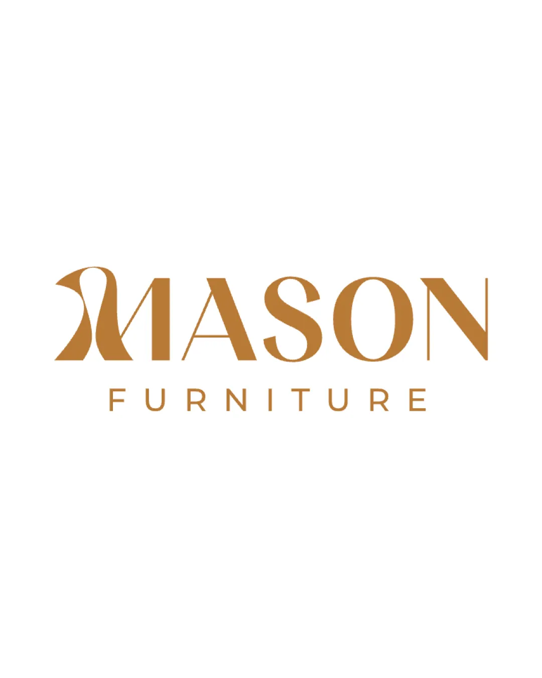

Inspect spacing with the guide. Optical balance may differ from geometric centering.
Does the shape still work without color?
Find the surfaces where your logo stays clear.
Compare the mark and lettering on each surface.
Shows the lower-contrast areas of the logo (5th percentile). Tiny details may have lower contrast. Good ≥ 4.5:1 · Medium ≥ 3:1 · Bad < 3:1. A visual guide, not an accessibility rating.
A 3px blur softens fine details so you can check whether the overall shape stays recognizable. If key gaps close or elements merge, the logo may rely too heavily on detail.
Look for clear separation between shapes and a distinctive outline.
Premium furniture logo with strong category fit and clear bespoke differentiation.
The mono, elegant serif logotype fits luxury furniture branding standards and feels appropriate for a high-end maker.
The unique 'M' distinctly separates it from most industry competitors; strong bespoke impression.
The impression your logo creates.
The logo exudes boldness, luxury, and contemporary elegance with a seriously refined approach, balancing warmth with a premium feel.
AI interpretation of the visible design. These describe personality, not quality.
How strongly it attracts attention.
The large stylized 'M' and bold letterforms give the brand immediate visual impact.
How serious or lighthearted it feels.
The sharp lines and elegant spacing create a serious, confident mood with little playfulness.
How relaxed or formal it appears.
The typography and layout are ceremonious and sophisticated, consistent with high-end, formal branding.
Heritage cues versus a current look.
The geometric precision and sculptural 'M' point to current design trends rather than heritage cues.
Its emotional feel, beyond colour temperature.
The bronze color adds approachability while the overall presentation keeps the tone refined and balanced.
Everyday appeal versus luxury cues.
Premium typography, color choice, and detail present a strong luxury appeal over everyday accessibility.
See your logo in context, then check what needs attention before production. Settings use the colors detected in your logo where available.
Thoughtful work for people who expect more.
Could not load this preview. The written review is still available.
MASON FURNITURE logo
Could not load this preview. The written review is still available.
Discover the latest products, services, stories, and updates from MASON FURNITURE logo.
Could not load this preview. The written review is still available.
Could not load this preview. The written review is still available.
Could not load this preview. The written review is still available.
Could not load this preview. The written review is still available.
The uploaded asset includes a wordmark.
A monochrome version is visible. Test its detail and contrast at the intended size before production.
Export the wordmark separately, without the symbol or tagline, for narrow placements and smaller sizes.
Prepare a separate wordmark with the existing tagline for larger placements. Keep the tagline-free wordmark for small sizes.
Prepare a compact mark for avatars, favicons, and restricted spaces.
Define the intended brand colors separately without changing this monochrome review score.
Get a clear logo score, key risks, and priority fix ideas before your client or audience sees it.
More credits needed
Add credits to continue without losing your work.
Then $7/month. Cancel anytime.
Essential logo review with AI
Estimated progress