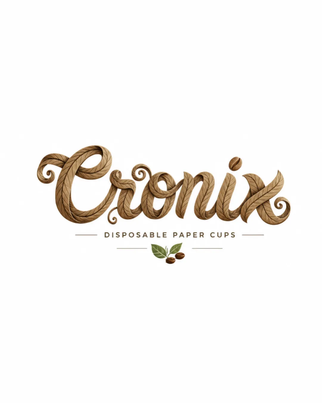
Cronix DISPOSABLE PAPER CUPS logo review
4.0 / 5
Logo score
Logo review of

Cronix Disposable Paper Cups

Attractive, distinctive, and client-ready after optimizing for scalability; suitable for sustainable product branding.

Combination Mark Organic Hand-drawn Script Food And Beverage Packaging
4/5
Legibility
4/5
Originality
5/5
Misread
4/5
Balance
3/5
Scale
Action plan

What to fix first

The most important fixes to handle before polishing the full presentation.

1

Refine linework for scalability and ensure detail is legible at small sizes or in monochrome.

High priority

Fine leaf texture and script details may not reproduce well at smaller sizes.

Impact: Improves Readability, Adaptability, And Professional Finish For Varied Product And Collateral Uses. · Effort: Medium

2

Consider minor simplification of script swashes for improved clarity.

Medium priority

Reduced complexity will help quick recognition, especially in busy retail/cardboard contexts.

Impact: Enhances Immediate Legibility And Visual Clarity Without Sacrificing Style. · Effort: Medium

Detailed review

Logo performance breakdown

4/5

Legibility

Checkmark icon Main word 'Cronix' is stylized but readable
Checkmark icon Supporting text is clear and legible

Warning icon Ornate script could reduce quick readability at small sizes

4/5

Originality

Checkmark icon Leaf-textured script is visually distinctive and tailored for sustainable theme

Warning icon Script style is creative but not entirely unique for eco-oriented products

5/5

Color harmony

Checkmark icon Earthy palette reflects sustainable/eco values and is visually appealing

Brown
#A67C52

Dark Brown
#4C3C23

Olive Green
#7A8A55

White
#FFFFFF

4/5

Balance alignment

Checkmark icon Wordmark is centered and balanced with subtext and icon
Checkmark icon Visual weight is well distributed

Warning icon Slight heaviness in decorative swashes compared to supporting elements

logo 200x250 pixels scalability test alignment grid overlay
3/5

Scalability

Checkmark icon Details add uniqueness at medium scale

Warning icon Fine detailing and textures may be lost or cluttered at smaller sizes
Warning icon Illustrated script less adaptable for one-color applications

logo 200x250 pixels scalability test

200x250 px

logo 100x125 pixels scalability test

100×125 px

logo 50x62 pixels scalability test

50×62 px

5/5

Misinterpretations

Checkmark icon No inappropriate or confusing dual meanings detected

Beta

AI design signals unclear

Mixed visual signals

Leafy detail and smooth joins are well crafted but possible minor inconsistencies in texture and line may suggest digital or AI-aided origins.

  • Highly organic, seamless texture could indicate digital brush or generative technique

Visual assessment; not definitive proof of authorship.

5 / 5

Logo structure & brief match

Checkmark icon Icon and wordmark share natural, organic theme and color harmony

Checkmark icon Disposable Paper Cup: Illustrated, textured script and natural color scheme effectively communicate a sustainable, eco-friendly paper cup product.

Try your own review

Wondering how your logo performs?

Get a clear logo score, key risks, and priority fix ideas before your client or audience sees it.

Review my logo