DELIER logo review
4.0 / 5
Logo score
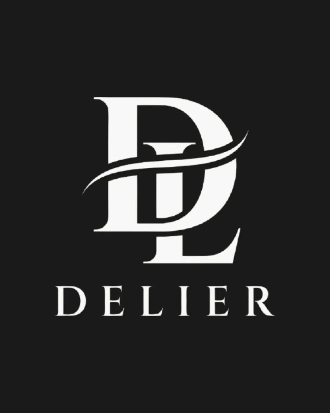
Logo review of

Delier

Polished and visually aligned for luxury perfume, with only minor refinements recommended.

Combination Mark Luxury Serif Beauty
5/5
Legibility
3/5
Originality
5/5
Misread
4/5
Balance
4/5
Scale
Action plan

What to fix first

The most important fixes to handle before polishing the full presentation.

1

Refine the swoosh to ensure clarity and definition at small scales, possibly simplifying its ends or thickness.

Medium priority

Thin, tapered swoosh may blur at small sizes, affecting clarity.

Impact: Improves The Logo’s Versatility, Ensuring The Mark Remains Distinct Across All Applications. · Effort: Low

2

Explore subtle ways to make the DL monogram less generic, perhaps through custom letterforms or a more distinctive connection.

Medium priority

Current monogram structure is visually elegant but not unique.

Impact: Increases Brand Distinctiveness And Memorability, Reducing Risk Of Blending Into Competitive Luxury Markets. · Effort: Medium

Detailed review

Logo performance breakdown

5/5

Legibility

Checkmark icon All text is clear and easy to read
Checkmark icon Serif font adds elegance without sacrificing readability

3/5

Originality

Checkmark icon Elegant integration of initials with a stylized swoosh

Warning icon DL interlock and swoosh motif are common among premium/luxury logos

5/5

Color harmony

Checkmark icon Classic high-contrast black and white pairing
Checkmark icon Palette works well for luxury/beauty positioning

White
#FFFFFF

Charcoal
#181818

4/5

Balance alignment

Checkmark icon Strong central alignment between mark and wordmark
Checkmark icon Monogram feels visually balanced overall

Warning icon Swoosh overlaps could be optically distracting

logo 200x250 pixels scalability test alignment grid overlay
4/5

Scalability

Checkmark icon Bold lines ensure mark is clear at small sizes
Checkmark icon Simple color scheme maintains legibility

Warning icon Thin swoosh detail may lose definition at very small scale

logo 200x250 pixels scalability test

200x250 px

logo 100x125 pixels scalability test

100×125 px

logo 50x62 pixels scalability test

50×62 px

5/5

Misinterpretations

Checkmark icon No inappropriate or embarrassing misreads detected

Beta

No AI design signals found

Likely designed by a human

Letterforms and construction are clean, deliberate, and consistent with professional human design practices.

  • No malformed shapes or illogical construction
  • Letter geometry and serif detailing are coherent and polished

Visual assessment; not definitive proof of authorship.

5 / 5

Logo structure & brief match

Checkmark icon Serif styles are consistent across mark and wordmark

Checkmark icon Luxury Beauty/perfume Market: Serif monogram and clean contrast evoke premium, elegant brand suitable for perfume packaging and marketing

Try your own review

Wondering how your logo performs?

Get a clear logo score, key risks, and priority fix ideas before your client or audience sees it.

Review my logo