 View review
Logo score
Logo review of
Dental Space
Review the detailed scores below to see what is working and what should be refined first.
Objective AI feedback. Your creative decision.
Legibility
Originality
Misread
Balance
Scale
Detailed review
Logo performance breakdown
Legibility
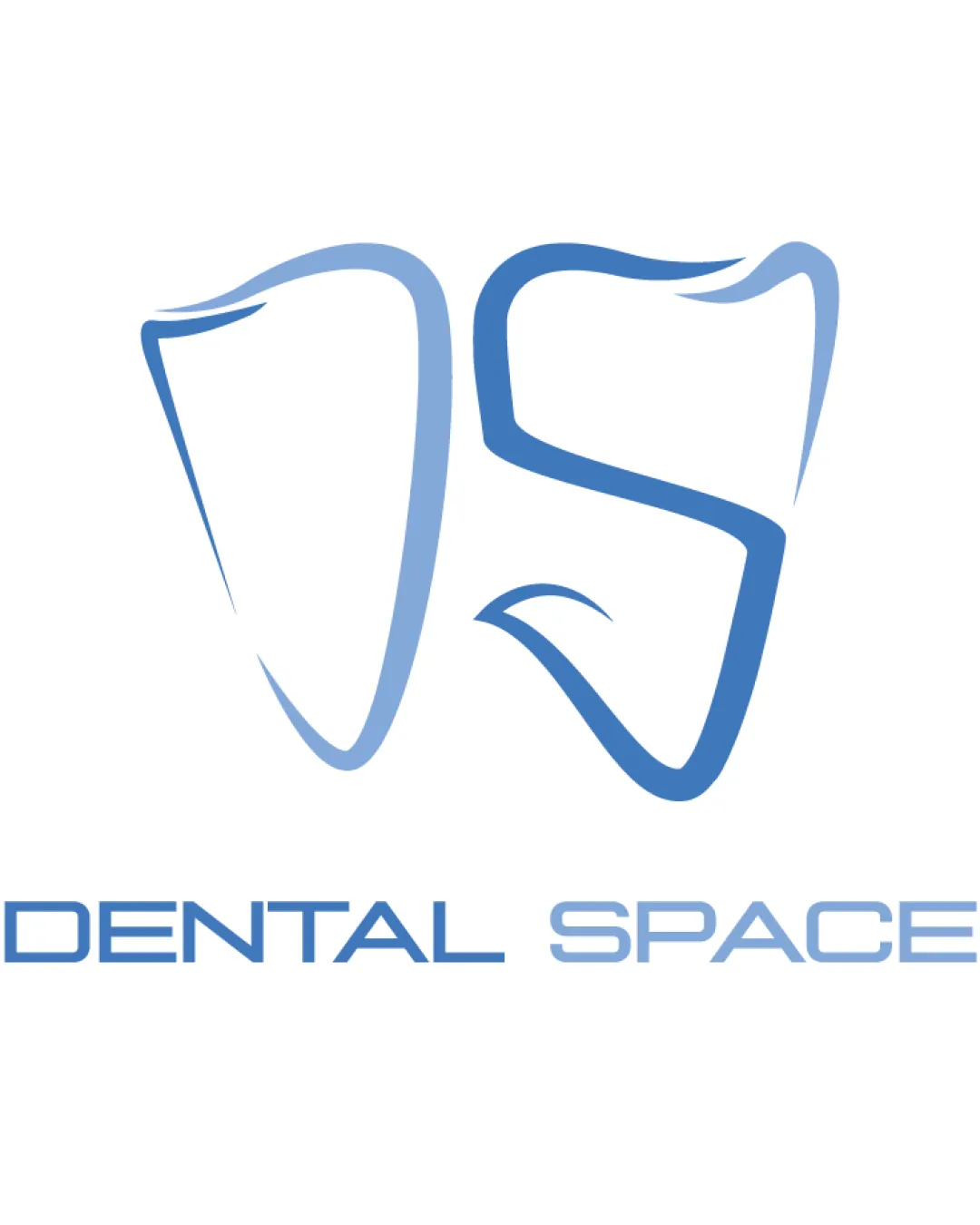
 Text 'DENTAL SPACE' is clear and uses a modern, easily readable font. Color contrast between text and background is strong.
 The stylized letters in the monogram may not be immediately recognizable as ‘D’ and ‘S’ for all viewers, potentially creating confusion.
Originality
Creative approach by merging tooth shapes with initials, giving a memorable identity related to dental service. Avoids explicitly generic dental symbols (like toothbrushes or only a single tooth).
Tooth outline motifs are common in the dental industry—though the DS integration adds a unique twist, it isn't unprecedented.
Color harmony
Consistent use of light and medium blue tones, conveying trustworthiness and calmness. Simple, controlled palette ensures versatility and professionalism.
Light Blue
#5C98CF
Pale Blue
#A8C8E4
White
#FFFFFF
Balance alignment
Logomark is visually centered over wordmark, giving a cohesive structure.
The weight and thickness of the logomark do not match the boldness of the wordmark, causing a slight imbalance. The 'DS' monogram appears heavier on the right side, disrupting symmetry.

Scalability
Simple linework and minimal detail aid in large-scale adaptations such as signage or billboards. Outline style works well on light backgrounds and for digital use.
Thin lines in the logomark risk losing clarity, especially in small-scale formats like favicons, social icons, or stitching on uniforms. Logo may lack impact when scaled down due to lightweight line art.
200x250 px
100×125 px
50×62 px
Misinterpretations
No unintentional inappropriate or misleading symbols noticed.
Symbol & text fit
Both logomark and wordmark rely on cool blues and geometric styles, creating overall cohesion.
Wordmark and logomark share a modern, clean aesthetic.
Letter spacing in the wordmark and the fluid curves of the logomark differ stylistically—one is rigid, the other is organic.
Thickness mismatch between logomark (thin, fluid) and wordmark (bold, geometric) creates some visual disunity.
Try your own review
Review my logo
Wondering how your logo performs?
Get a clear logo score, key risks, and priority fix ideas before your client or audience sees it.
Keep exploring