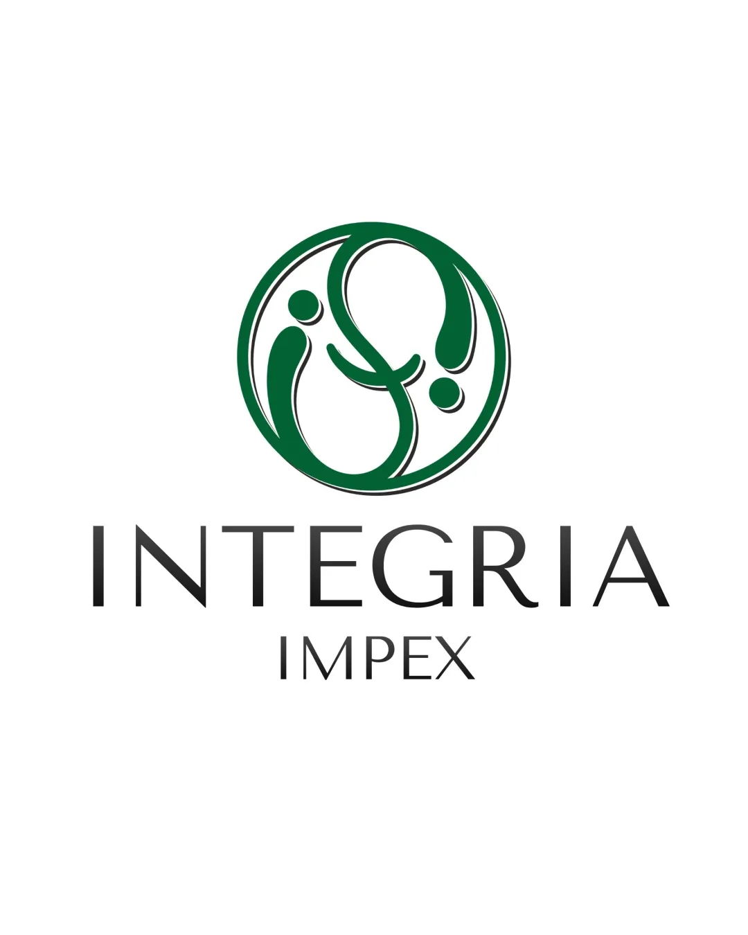
INTEGRIA IMPEX logo review
4.2 / 5
Logo score
Logo review of

Integria Impex

Distinctive, professional logo with only minor refinements needed for scalability and typographic unity.

Objective AI feedback. Your creative decision.

Combination Mark Modern, Abstract, Professional Corporate Services
4.5/5
Legibility
4/5
Originality
4.5/5
Misread
4/5
Balance
4/5
Scale
Action plan

What to fix first

The most important fixes to handle before polishing the full presentation.

1

Refine small-scale clarity of abstract mark

Medium priority

Ensures symbol remains clear at all sizes.

Impact: Improves Versatility In Various Applications. · Effort: Low

2

Harmonize weight and spacing between 'IMPEX' and other elements

Low priority

Minor spacing and alignment fixes aid professional finish.

Impact: Adds Polish To Presentation And Cohesion. · Effort: Low

Detailed review

Logo performance breakdown

4.5/5

Legibility

Checkmark icon Wordmark is highly readable and well-spaced.
Checkmark icon Typography is clean and modern.

Warning icon Minor variation in spacing between 'IMPEX' and 'INTEGRIA' could be refined.

4/5

Originality

Checkmark icon Abstract mark is distinctive and not generic.
Checkmark icon Uncommon mark construction for sector.

Warning icon Abstract mark could be interpreted as generic without context.

4/5

Color harmony

Checkmark icon Green and black are harmonious and professional.
Checkmark icon Color choice supports trust and growth themes.

Warning icon Limited palette—could experiment with secondary contrast for flexibility.

Green
#165b3c

Black
#000000

White
#FFFFFF

Your palette is close. Refine the color roles and combinations before updating the logo.

Build brand colors
4/5

Balance alignment

Checkmark icon Good vertical alignment of mark and wordmark.
Checkmark icon Balanced composition creates a cohesive unit.

Warning icon Slight mismatch in weight between the symbol and 'IMPEX' text.

logo 200x250 pixels scalability test alignment grid overlay
4/5

Scalability

Checkmark icon Mark and wordmark retain clarity at small sizes.
Checkmark icon Simplicity aids versatile use.

Warning icon Fine lines in the mark might reduce clarity at very small scale.

logo 200x250 pixels scalability test

200x250 px

logo 100x125 pixels scalability test

100×125 px

logo 50x62 pixels scalability test

50×62 px

4.5/5

Misinterpretations

Checkmark icon No clear risk of negative or inappropriate interpretations.
Checkmark icon Symbol communicates positivity and connection.

4 / 5

Logo structure & brief match

Checkmark icon Mark and wordmark complement each other stylistically.
Checkmark icon Professional cohesion between elements.

Warning icon Symbol meaning is not immediately obvious without supporting brand narrative.

Checkmark icon Sector Appropriateness: Professional and fitting for corporate and B2B applications.
Checkmark icon Distinctiveness: Visually distinct in a formal landscape.

Try your own review

Wondering how your logo performs?

Get a clear logo score, key risks, and priority fix ideas before your client or audience sees it.

Review my logo