Wondering how your logo performs? 🧐
Get professional logo reviews in seconds and catch design issues in time.
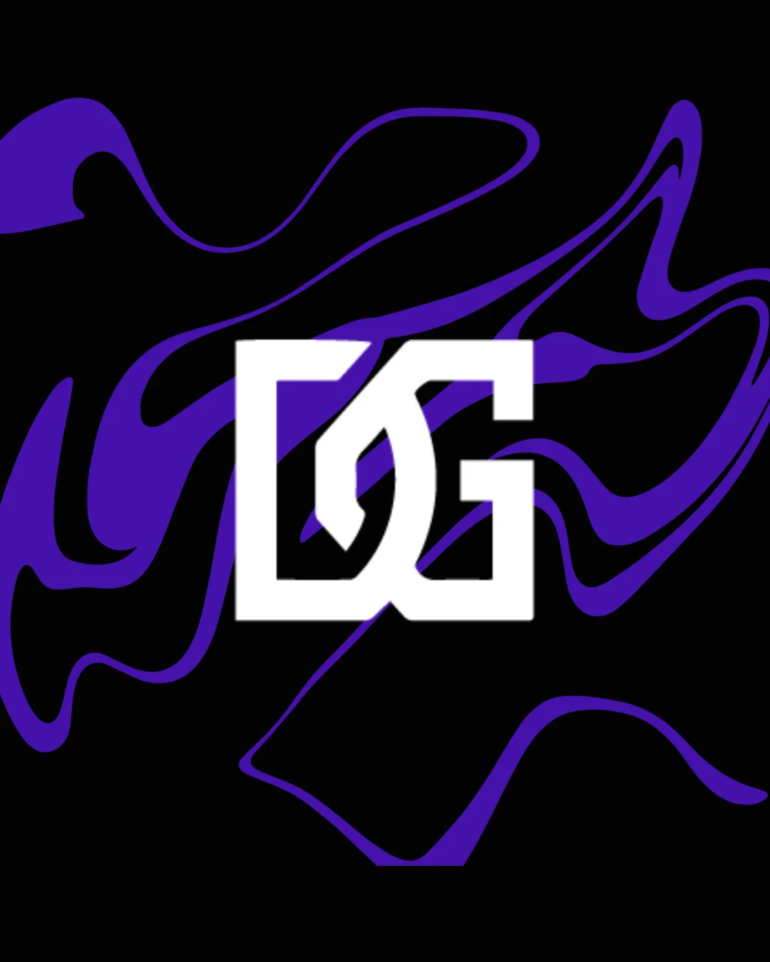
Try it Now!Logo review of DG
 Logo analysis by AI
Logo type:
Style:
Detected symbol:
Detected text:
Business industry:
Review requested by Gabo
**If AI can recognize or misinterpret it, so can people.
Structured logo review
Legibility
![]() The DG letters are bold and separated clearly, allowing for decent readability even at smaller sizes.
The DG letters are bold and separated clearly, allowing for decent readability even at smaller sizes.![]() Minimal decorative elements help maintain clarity.
Minimal decorative elements help maintain clarity.
![]() Some viewers may initially find it challenging to distinguish the D and G due to their geometric intersection.
Some viewers may initially find it challenging to distinguish the D and G due to their geometric intersection.![]() The stylization may reduce instant recognition, particularly for viewers unfamiliar with the brand.
The stylization may reduce instant recognition, particularly for viewers unfamiliar with the brand.
Scalability versatility
![]() Simple geometric structure generally scales down well for digital use and merchandise.
Simple geometric structure generally scales down well for digital use and merchandise.![]() Would be effective for large banners and digital display.
Would be effective for large banners and digital display.
![]() Inner details and tight overlaps may get muddy at very small sizes such as app favicons or embroidery.
Inner details and tight overlaps may get muddy at very small sizes such as app favicons or embroidery.![]() Intricacy within intersections could cause problems on monochrome or low-resolution surfaces.
Intricacy within intersections could cause problems on monochrome or low-resolution surfaces.
200x250 px
100×125 px
50×62 px
Balance alignment
![]() Overall shape forms a balanced square, offering strong symmetry.
Overall shape forms a balanced square, offering strong symmetry.![]() Interlocking letters produce a cohesive and compact layout.
Interlocking letters produce a cohesive and compact layout.
![]() Top left and bottom right may feel slightly heavier due to letterform connections, which can subtly disrupt optical weight.
Top left and bottom right may feel slightly heavier due to letterform connections, which can subtly disrupt optical weight.

Originality
![]() Geometrically styled DG monogram is unique compared to standard fonts or widely used letter combinations.
Geometrically styled DG monogram is unique compared to standard fonts or widely used letter combinations.![]() Bold, intersecting stroke treatment gives a distinctive visual personality.
Bold, intersecting stroke treatment gives a distinctive visual personality.
![]() Interlocking letter monograms are a recurring trend, so some generic quality may persist if not paired with unique applications.
Interlocking letter monograms are a recurring trend, so some generic quality may persist if not paired with unique applications.
Aesthetic look
![]() Modern, bold appearance with a strong presence against a dark background.
Modern, bold appearance with a strong presence against a dark background.![]() Color choice enhances visual impact and stays aesthetically pleasing.
Color choice enhances visual impact and stays aesthetically pleasing.
![]() Background graphics are visually busy and could distract from the logo, reducing overall cleanliness.
Background graphics are visually busy and could distract from the logo, reducing overall cleanliness.
Dual meaning and misinterpretations
![]() No inappropriate or unintended shapes are present in the composition.
No inappropriate or unintended shapes are present in the composition.
Color harmony
![]() Limited to high-contrast colors—white, purple, and black—creating a clear and focused palette.
Limited to high-contrast colors—white, purple, and black—creating a clear and focused palette.![]() Good separation between logo and background.
Good separation between logo and background.
![]() Busy purple background pattern slightly undermines logo clarity; a plain background would further enhance harmony.
Busy purple background pattern slightly undermines logo clarity; a plain background would further enhance harmony.
White
#FFFFFF
Purple
#4B1FA4
Black
#000000