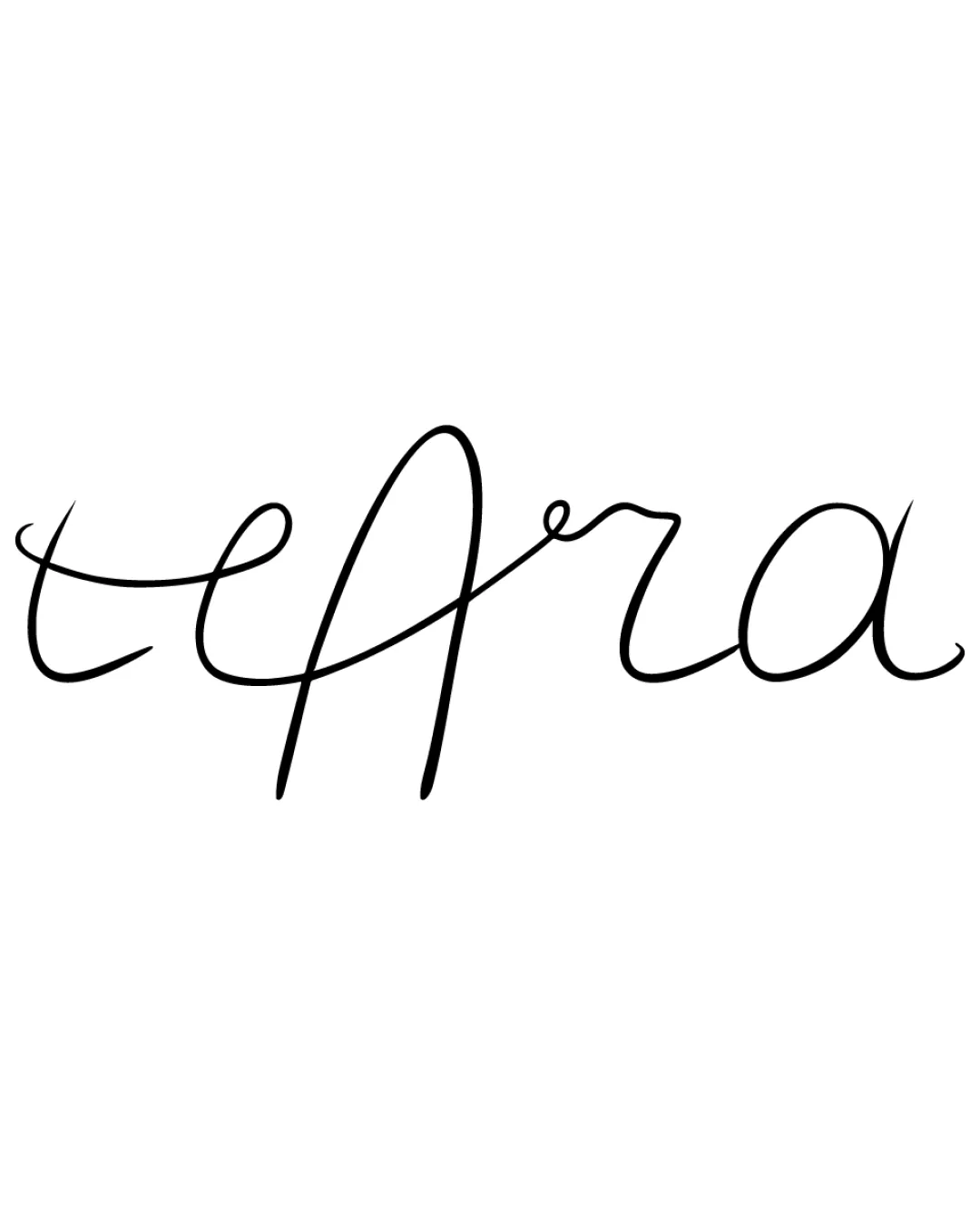
teAra logo review
3.3 / 5
Logo score
Logo review of

Teara

Review the detailed scores below to see what is working and what should be refined first.

Wordmark Handwritten Script Fashion
2/5
Legibility
4/5
Originality
4/5
Misread
3/5
Balance
2/5
Scale
Action plan

What to fix first

The most important fixes to handle before polishing the full presentation.

1

Fix possible misinterpretation

High priority

Letter ambiguity may cause accidental misreading (e.g., possible confusion with 'teara', 'tegra', or 'tearla').
Impact: High · Effort: Medium

Detailed review

Logo performance breakdown

2/5

Legibility

Checkmark icon Elegant script style reflects a personal and stylish touch.

Warning icon Letterforms are difficult to decipher at a glance, especially the capital 'A' and the transition between letters. Readers may misinterpret the brand name on first viewing, reducing memorability and impact.

4/5

Originality

Checkmark icon Distinctive handwritten quality provides personality and uniqueness. Not based on typical generic sans-serif or script fonts.

Warning icon No integrated symbol or hidden meaning in the letterforms. Despite the flourish, overly long ascenders and descenders are fairly common in script logos.

5/5

Color harmony

Checkmark icon Single black-on-white colorway ensures visual consistency. No clashing or unnecessary colors present, maximizing versatility.

Black
#000000

White
#FFFFFF

3/5

Balance alignment

Checkmark icon Organic letter spacing provides a sense of flow and movement.

Warning icon Uneven baselines and inconsistent stroke thicknesses create imbalance, particularly the oversized 'A' which disrupts horizontal rhythm. The left and right sides feel disconnected in size and emphasis.

logo 200x250 pixels scalability test alignment grid overlay
2/5

Scalability

Checkmark icon Simple, single-color design allows for use on light backgrounds and basic applications like letterheads.

Warning icon Thin lines risk disappearing or breaking up at smaller scales (business cards, website favicons, embroidery on hats/shirts). Lack of boldness makes the logo unsuitable for large signage or vehicle wraps where clarity is essential.

logo 200x250 pixels scalability test

200x250 px

logo 100x125 pixels scalability test

100×125 px

logo 50x62 pixels scalability test

50×62 px

4/5

Misinterpretations

Checkmark icon No inappropriate or suggestive negative space detected.

Warning icon Letter ambiguity may cause accidental misreading (e.g., possible confusion with 'teara', 'tegra', or 'tearla').

Try your own review

Wondering how your logo performs?

Get a clear logo score, key risks, and priority fix ideas before your client or audience sees it.

Review my logo