View review
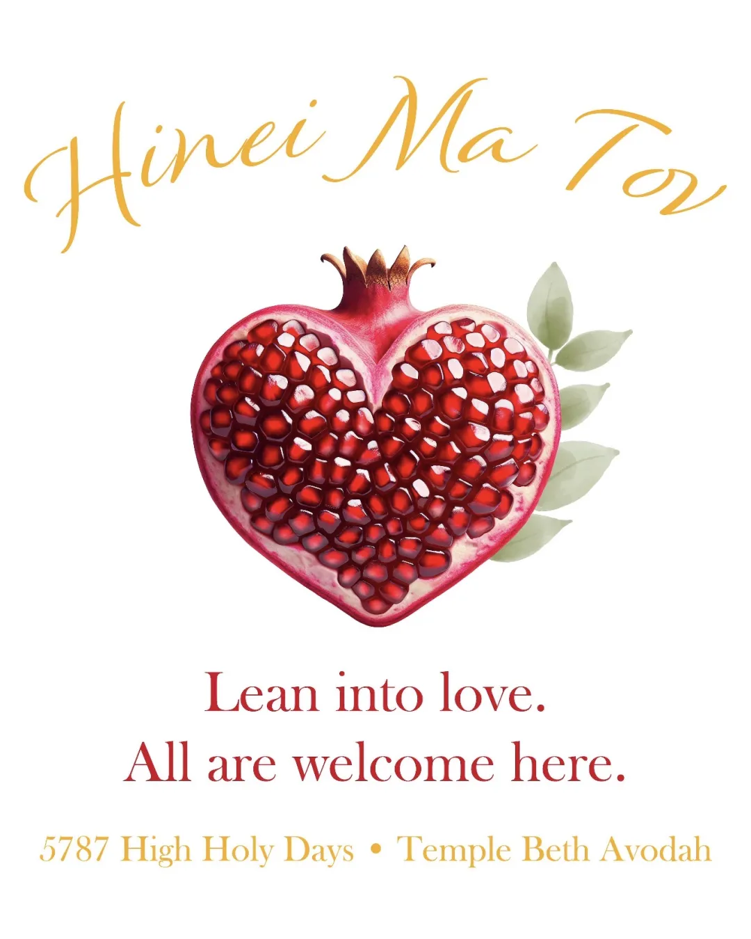
Logo review ofHinei Ma Tov, Lean Into Love. All Are Welcome Here..
Review the detailed scores below to see what is working and what should be refined first.
Logo performance breakdown
Legibility
Text is generally readable.
Distinct contrast between text and background.
Elegant fonts for both headline and tagline.
Script font 'Hinei Ma Tov' at top is slightly difficult to read due to flourish-heavy style.
Color contrast on gold text ('5787 High Holy Days • Temple Beth Avodah') could be improved for better readability on white.

Originality
Heart-shaped pomegranate is conceptually unique and relevant to cultural/religious symbolism.
Combination of fruit and heart adds a layer of meaning around love and abundance.
Illustrated fruit in logos is not wholly original, but the heart-shaped execution is uncommon.
Color harmony
Color palette is warm, inviting, and cohesive.
Red and gold hues work in synergy with the symbol's message.
Illustration uses a wide color gradient, reducing reusability in monochrome/limited palette situations.
Tall Poppy
#B41F2C
Gold
#EFA529
White
#FFFFFF
Green Smoke
#B9BC96
Your palette is close. Explore sharper color combinations with Colorfly.design before updating the logo.
Explore palettesBalance alignment
Logo maintains symmetry with the central pomegranate.
Text blocks are reasonably centered above and below the symbol.
Gold script at top feels slightly unanchored compared to structured lower text.
Leaf elements extend rightward from pomegranate, mildly disrupting left-right balance.
Scalability
Logo works well on large formats such as posters or event banners.
Detailed illustration is appealing at full size.
Pomegranate illustration has high detail that will be lost or muddled at small sizes or in embroidery.
Readability of all phrases decreases sharply when scaled down.
Illustrative nature means the logo is not easily reproducible in single color or small-scale mockups (e.g., social media icons).
200x250 px
100×125 px
50×62 px
Misinterpretations
Heart and pomegranate reference abundance, love, and inclusivity.
No inappropriate or problematic shapes detected.
Symbol & text fit
The elegant script and serif fonts match the refined, welcoming tone of the illustrative symbol.
Harmonious integration between symbol and text positions.
Multiple text sections in varied styles may create visual hierarchy confusion.
Slightly inconsistent font choices (script vs serif) create minor stylistic dissonance.
Wondering how your logo performs?
Get a clear logo score, key risks, and priority fix ideas before your client or audience sees it.