View review
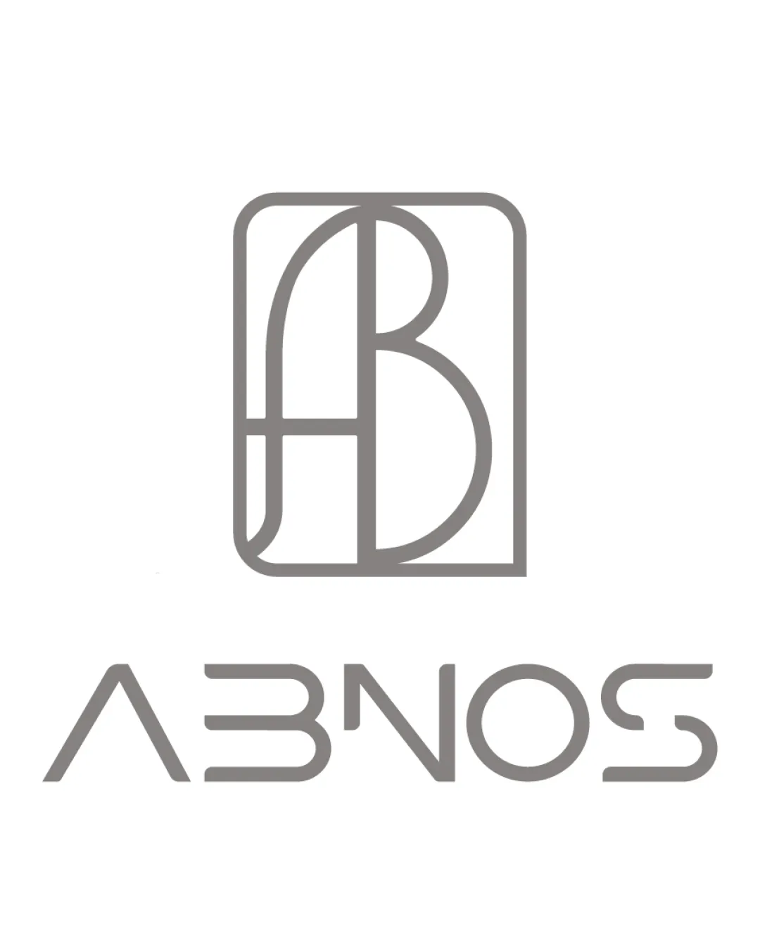
Logo review ofAbnos
Review the detailed scores below to see what is working and what should be refined first.
Logo performance breakdown
Legibility
Consistent stroke width helps retain modernity
All characters present and (eventually) decipherable
The geometric approach makes 'B', 'S', and 'A' ambiguous at first glance
Letterforms are overly stylized, requiring effort to read, especially with '3' for 'B' and top bar missing from 'A'

Originality
Custom monogram provides visual interest
Use of geometric, modular type is relatively unique
Certain aspects, like using a '3' for 'B', border on overused in geometric logotypes
Wordmark lacks unique contextual elements beyond its modularity
Color harmony
Nice monochrome color choice allows maximum versatility
Contrast with white background is clear and elegant
Gray
#8E8B88
White
#FFFFFF
Balance alignment
Monogram is well-centered in its container
Visual weight is generally even between symbol and wordmark
No clear visual anchor between logomark and wordmark; slight disconnect between the two
Rectangular form feels heavy compared to the open wordmark
Scalability
Minimalist, bold lines should render well at moderate sizes
Monogram can function independently as an icon
Fine line work may lose clarity at very small sizes or on embroidered surfaces
Wordmark legibility may be further compromised when scaled down
200x250 px
100×125 px
50×62 px
Misinterpretations
No obvious inappropriate dual meanings or unintended imagery detected
Abstracted forms are safe for international use
Symbol & text fit
Stroke weights are consistent between logomark and wordmark
Both elements share a geometric visual language
Wordmark feels slightly detached from the logomark by style (curves vs. boxy container)
Wondering how your logo performs?
Get a clear logo score, key risks, and priority fix ideas before your client or audience sees it.