Dineva logo review
4/5
Logo score
Logo review of

Dineva

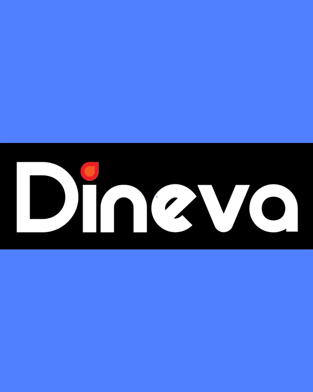
A strong and approachable wordmark with a clever accent, only needing light refinements for fuller alignment with the brand's tech-growth narrative.

Wordmark Modern Geometric Sans-serif Restaurant Technology
5/5
Legibility
4/5
Originality
5/5
Misread
4/5
Balance
4/5
Scale
Your next steps

What to fix first

Focus on the changes that matter. Keep what makes the logo work.

1

red leaf on 'i'

Consider refining the leaf into a more abstract or dual-purpose shape that subtly hints at technology or growth (e.g. stylized upward motion or pixel motif).

Optional refinement Medium priority Medium effort
Area to inspectApproximate location

The red leaf shape for the 'i' tittle is friendly but could be more visually connected to tech or evolution, not only food.

How to check

Evaluate if updated mark suggests both hospitality and technological growth.

See the category review
2

red leaf on 'i'

Test the wordmark at reduced sizes to confirm the leaf remains legible and recognizable.

Worth testing Medium priority Low effort
Area to inspectApproximate location

The small red leaf detail may lose clarity at very small sizes or in low contrast applications.

How to check

Render wordmark at 32px height and review legibility of the leaf shape.

See the category review
Detailed review

Logo performance breakdown

4/5

Brief & logo match

Based on your brief
Compared with

Dineva: B2B restaurant platform, modern, innovative, growth-focused—should signal technology, hospitality, and evolution.

The wordmark is visually strong and approachable, but the main symbol emphasizes food over technological evolution, leaving mild tension with the tech-growth aspect of the brief.

  • Modern, Innovative Aesthetic

    The geometric sans-serif styling and color contrasts convey a modern and innovative feel, supporting the brief's direction.

  • Growth And Evolution Symbolism

    The red leaf nods to growth and hospitality, but could more strongly express technological evolution as per the brief; current form is more food-focused.

5/5

Legibility

  • Distinct, easy-to-read letterforms
  • No ambiguous characters
4/5

Originality

  • Leaf detail is a friendly, distinctive touch
  • Name itself is unique and well-composed
  • The red leaf shape for the 'i' tittle is friendly but could be more visually connected to tech or evolution, not only food.

    Optional refinement red leaf on 'i'

    Try: Consider refining the leaf into a more abstract or dual-purpose shape that subtly hints at technology or growth (e.g. stylized upward motion or pixel motif).

    Check: Evaluate if updated mark suggests both hospitality and technological growth.

    Area to inspectApproximate location
4/5

Color harmony

  • Bold black/white contrast
  • Red accent draws attention, blue adds vibrancy
White#FFFFFF
Black#000000
Red#E44136
Blue#6394FF

Estimated colors. Use the original design file for exact values.

Create a full color palette using these colors

Create new palette
4/5

Balance alignment

  • Even geometric proportions
  • Modern, professional image
  • The spacing and geometric font are mostly strong, but the 'e' and 'v' connection looks slightly compressed compared to other letter pairs.

    Optional refinement overall wordmark

    Try: Slightly adjust kerning between 'e' and 'v' for a more even visual flow.

    Check: Inspect letterspacing at various sizes for optical balance.

Uploaded logoAlignment guide overlay

Inspect spacing with the guide. Optical balance may differ from geometric centering.

4/5

Scalability

  • Simple forms scale well
  • Minor risk with small red leaf detail
  • The small red leaf detail may lose clarity at very small sizes or in low contrast applications.

    Worth testing red leaf on 'i'

    Try: Test the wordmark at reduced sizes to confirm the leaf remains legible and recognizable.

    Check: Render wordmark at 32px height and review legibility of the leaf shape.

    Area to inspectApproximate location
Uploaded logo at 200 pixels wide
200 × 250 px
Uploaded logo at 100 pixels wide
100 × 125 px
Uploaded logo at 50 pixels wide
50 × 63 px

Compare the detail at different sizes. Labels show the full image dimensions.

5/5

Misinterpretations

  • No obvious unintended readings

Black & white

Does the shape still work without color?

These tests are available only for logos uploaded in vector (SVG) format.

Background contrast

Find the surfaces where your logo stays clear.

These tests are available only for logos uploaded in vector (SVG) format.

Blur & silhouette

A 3px blur softens fine details so you can check whether the overall shape stays recognizable. If key gaps close or elements merge, the logo may rely too heavily on detail.

These tests are available only for logos uploaded in vector (SVG) format.

Try your own review

Wondering how your logo performs?

Get a clear logo score, key risks, and priority fix ideas before your client or audience sees it.

Review my logo