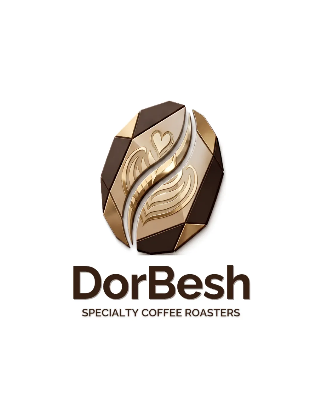
DorBesh SPECIALTY COFFEE ROASTERS logo review
4/5
Logo score
Logo review of

Dorbesh Specialty Coffee Roasters

A strong, stylish specialty coffee logo with clear messaging and a distinctive symbol, but the intricate mark needs testing for small-size usability.

Combination Mark Modern Metallic, Three-dimensional Coffee, Specialty Food And Beverage
5/5
Legibility
4/5
Originality
5/5
Misread
4/5
Balance
3/5
Scale
Your next steps

What to fix first

Focus on the changes that matter. Keep what makes the logo work.

1

standalone_mark (bean with gold details)

Test the standalone mark for clarity in small sizes and flat single-color versions; simplify inner details if necessary.

Worth testing High priority Medium effort
Area to inspectApproximate location

The central mark has many fine metallic highlights and gradient details that may be lost or muddy at small sizes or in single-color reproduction.

How to check

View or print the mark at 1-2 cm width and as a flat single color; check if all key shapes remain recognizable.

See the category review
2

wordmark and mark lockup

Visually tighten vertical alignment and check optical centering of wordmark under the symbol.

Optional refinement Medium priority Low effort
Area to inspectApproximate location

Minor vertical gap and alignment between the mark and the 'DorBesh' wordmark could feel slightly disjointed.

How to check

Check that the wordmark feels visually anchored and evenly spaced beneath the symbol, with no excess white space.

See the category review
Detailed review

Logo performance breakdown

4/5

Brief & logo match

Based on an inferred industry
Compared with

Specialty coffee roaster or café, upscale market.

Logo visually communicates specialty coffee and premium positioning but should be checked for adaptability in non-premium or compact formats.

  • Coffee/roaster Theme

    Bean shape and latte art motif immediately signal coffee specialty, fitting the industry cleanly.

  • Premium Positioning

    Three-dimensional gold tones and bold typography project a specialty, high-end product vibe.

5/5

Legibility

  • Wordmark is clean, highly readable, and well contrasted.
  • Tagline uses a clear, legible sans-serif font.
4/5

Originality

  • Coffee bean symbol uses unique gold and brown angular forms.
  • Latte art motif inside bean is a creative touch.
5/5

Color harmony

  • Gold and brown tones evoke coffee and luxury; harmonious palette.
Gold#B68B44
Bronze#A6886B
DarkBrown#3E2B1B
LightBeige#F6F6F6
Black#231F20

Estimated colors. Use the original design file for exact values.

Create a full color palette using these colors

Create new palette
4/5

Balance alignment

  • Logo feels generally grounded and professional.
  • Minor vertical gap and alignment between the mark and the 'DorBesh' wordmark could feel slightly disjointed.

    Optional refinement wordmark and mark lockup

    Try: Visually tighten vertical alignment and check optical centering of wordmark under the symbol.

    Check: Check that the wordmark feels visually anchored and evenly spaced beneath the symbol, with no excess white space.

    Area to inspectApproximate location
Uploaded logoAlignment guide overlay

Inspect spacing with the guide. Optical balance may differ from geometric centering.

3/5

Scalability

  • Shape is distinctive and self-contained.
  • The central mark has many fine metallic highlights and gradient details that may be lost or muddy at small sizes or in single-color reproduction.

    Worth testing standalone_mark (bean with gold details)

    Try: Test the standalone mark for clarity in small sizes and flat single-color versions; simplify inner details if necessary.

    Check: View or print the mark at 1-2 cm width and as a flat single color; check if all key shapes remain recognizable.
    Area to inspectApproximate location
Uploaded logo at 200 pixels wide
200 × 250 px
Uploaded logo at 100 pixels wide
100 × 125 px
Uploaded logo at 50 pixels wide
50 × 63 px

Compare the detail at different sizes. Labels show the full image dimensions.

5/5

Misinterpretations

  • No obvious or likely negative double meanings.
4/5

Symbol & text fit

  • Mark and wordmark both feel premium and modern.

Black & white

Does the shape still work without color?

These tests are available only for logos uploaded in vector (SVG) format.

Background contrast

Find the surfaces where your logo stays clear.

These tests are available only for logos uploaded in vector (SVG) format.

Blur & silhouette

A 3px blur softens fine details so you can check whether the overall shape stays recognizable. If key gaps close or elements merge, the logo may rely too heavily on detail.

These tests are available only for logos uploaded in vector (SVG) format.

Try your own review

Wondering how your logo performs?

Get a clear logo score, key risks, and priority fix ideas before your client or audience sees it.

Review my logo