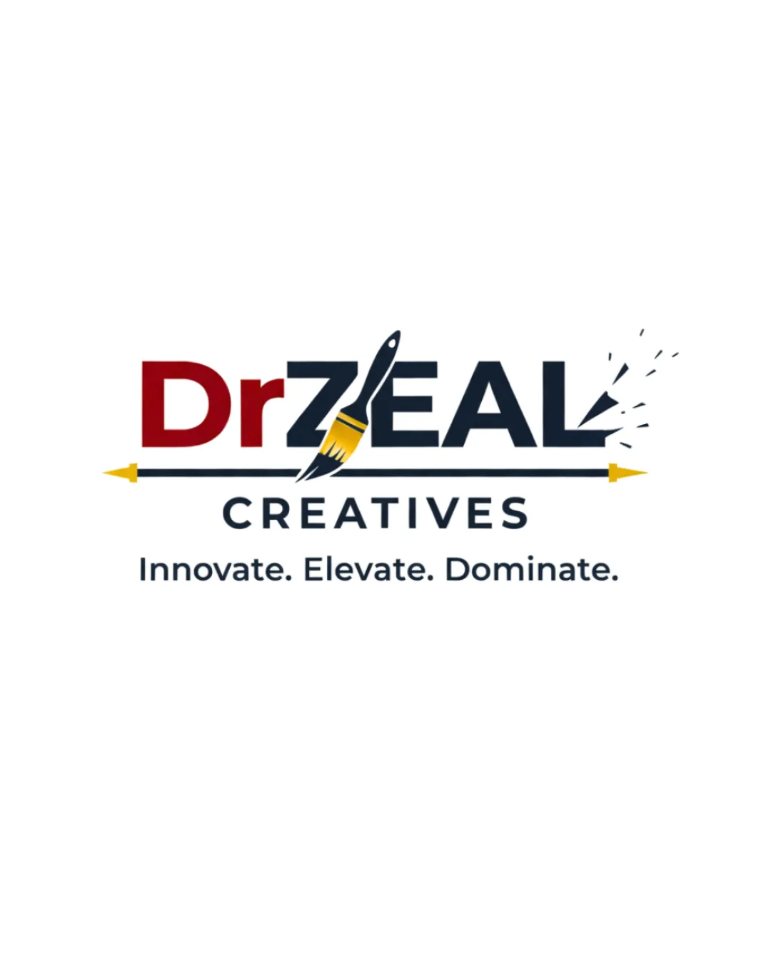
Dr ZEAL CREATIVES Innovate. Elevate. Dominate. logo review
4/5
Logo score
Logo review of

Dr Zeal Creatives Innovate. Elevate. Dominate.

Distinctive and professional, this logo is well-aligned with a premium creative agency, needing only minor adjustments for polish and scalability.

Combination Mark Modern, Illustrative Accent, Bold Wordmark Creative Agency
4/5
Legibility
4/5
Originality
5/5
Misread
4/5
Balance
3/5
Scale
Your next steps

What to fix first

Focus on the changes that matter. Keep what makes the logo work.

1

arrow and paintbrush integration (upper band)

Refine the connection between the arrow and paintbrush for a smoother, more integrated look.

Optional refinement Medium priority Medium effort
Area to inspectApproximate location

The transition between the arrow shaft and the paintbrush handle appears visually abrupt and less fluid than the rest of the design, reducing unity.

How to check

Review the junction at increased zoom and prototype alternative joins for optical flow.

See the category review
2

'L' burst effect (upper band, rightmost area)

Test legibility of the 'L' burst marks at reduced logo sizes and simplify or bold as needed.

Worth testing Medium priority Low effort
Area to inspectApproximate location

Small burst marks beyond the 'L' could be lost or appear as stray dots at reduced sizes, potentially affecting clarity.

How to check

Downscale the logo to small icon size and check if burst marks remain distinguishable.

See the category review
Detailed review

Logo performance breakdown

4/5

Brief & logo match

Based on your brief
Compared with

Creative agency; premium but friendly brand positioning.

The logo clearly expresses creativity and quality, with minor risks to small-scale clarity.

  • Premium But Friendly Appearance

    Confident color palette and bold typography convey quality, while playful brush burst softens the formality.

  • Creative Industry Relevance

    Paintbrush and creative arrow concept directly signals artistic focus and agency services.

4/5

Legibility

  • Major text is clearly readable in all elements.
  • Distinct style for 'Dr' vs. 'ZEAL' aids hierarchy.
4/5

Originality

  • Creative paintbrush-arrow integration.
  • Dynamic energy in the 'L' burst.
4/5

Color harmony

  • Professional palette of red, gold, dark blue and black.
  • Colors signal both premium quality and creativity.
DarkRed#990000
DarkBlue#242E3F
Yellow#FFCC33
Black#000000
White#FFFFFF

Estimated colors. Use the original design file for exact values.

Create a full color palette using these colors

Create new palette
4/5

Balance alignment

  • Logical spatial structure with central axis.
  • Enhanced by underline arrow and word alignment.
  • The transition between the arrow shaft and the paintbrush handle appears visually abrupt and less fluid than the rest of the design, reducing unity.

    Optional refinement arrow and paintbrush integration (upper band)

    Try: Refine the connection between the arrow and paintbrush for a smoother, more integrated look.

    Check: Review the junction at increased zoom and prototype alternative joins for optical flow.

    Area to inspectApproximate location
Uploaded logoAlignment guide overlay

Inspect spacing with the guide. Optical balance may differ from geometric centering.

3/5

Scalability

  • Bold shapes for main letters and paintbrush are robust.
  • Risks isolated to small decorative burst marks.
  • Small burst marks beyond the 'L' could be lost or appear as stray dots at reduced sizes, potentially affecting clarity.

    Worth testing 'L' burst effect (upper band, rightmost area)

    Try: Test legibility of the 'L' burst marks at reduced logo sizes and simplify or bold as needed.

    Check: Downscale the logo to small icon size and check if burst marks remain distinguishable.

    Area to inspectApproximate location
Uploaded logo at 200 pixels wide
200 × 250 px
Uploaded logo at 100 pixels wide
100 × 125 px
Uploaded logo at 50 pixels wide
50 × 63 px

Compare the detail at different sizes. Labels show the full image dimensions.

5/5

Misinterpretations

  • No plausible unintended readings detected.
  • Symbolism is direct and appropriate.
4/5

Symbol & text fit

  • Paintbrush effectively bridges symbol and wordmark.

Black & white

Does the shape still work without color?

These tests are available only for logos uploaded in vector (SVG) format.

Background contrast

Find the surfaces where your logo stays clear.

These tests are available only for logos uploaded in vector (SVG) format.

Blur & silhouette

A 3px blur softens fine details so you can check whether the overall shape stays recognizable. If key gaps close or elements merge, the logo may rely too heavily on detail.

These tests are available only for logos uploaded in vector (SVG) format.

Try your own review

Wondering how your logo performs?

Get a clear logo score, key risks, and priority fix ideas before your client or audience sees it.

Review my logo