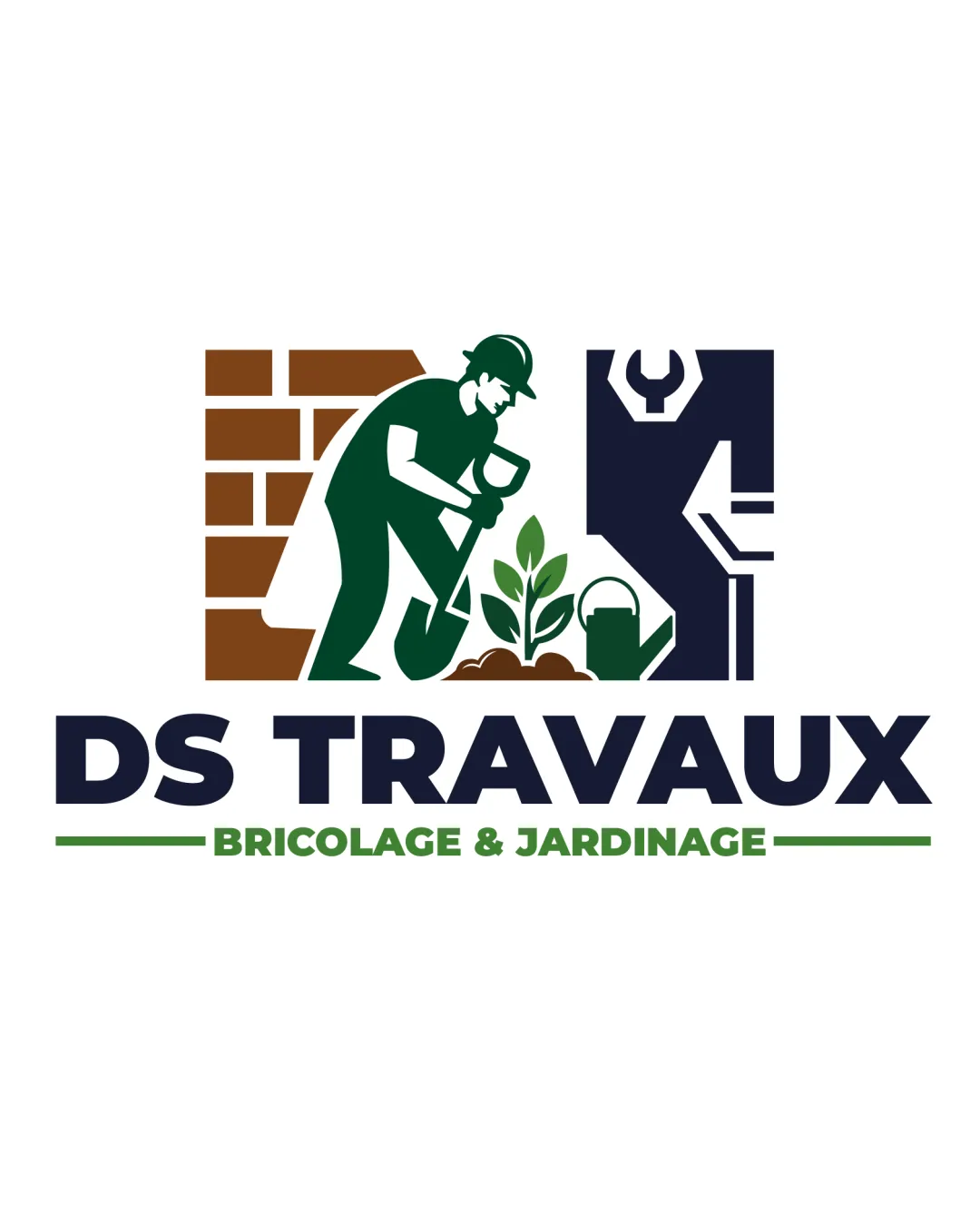
DS TRAVAUX BRICOLAGE & JARDINAGE logo review
4/5
Logo score
Logo review of

Ds Travaux Bricolage & Jardinage

A strong, clear logo for home/garden services, needing only minor tweaks for optimal small-scale use.

Combination Mark Bold Illustrative, Geometric Integrated Mark Home And Garden Services
5/5
Legibility
4/5
Originality
5/5
Misread
4/5
Balance
3/5
Scale
Your next steps

What to fix first

Focus on the changes that matter. Keep what makes the logo work.

1

pictorial mark (worker, tools, and initials at top)

Test the logo at reduced sizes to ensure important illustrative details remain recognizable.

Worth testing High priority Medium effort
Area to inspectApproximate location

The mark has fine details (face, hand, spade, wrench) that might be lost at very small sizes.

How to check

Print or display the logo at very small sizes (~24px and below) and check if the worker, tools, and initials are still readable.

See the category review
2

alignment of mark and wordmark

Adjust mark or spacing to achieve a more optically balanced lockup above the centered type.

Optional refinement Medium priority Low effort
Area to inspectApproximate location

The mark above is left-weighted due to the worker leaning forward, creating a slight imbalance with the centered wordmark below.

How to check

Check if the vertical axis through the logo feels consistently weighted visually from top to bottom.

See the category review
Detailed review

Logo performance breakdown

4/5

Brief & logo match

Based on an inferred industry
Compared with

Sector appears to be home improvement and gardening, based on visual elements and French wording.

The logo visually and textually fits a home and garden service, needing only scalability refinement for best use.

  • Clear Service Focus

    The illustration and tagline directly reference DIY and gardening, clearly communicating the business purpose.

  • Professional, Approachable Image

    The human figure and fresh palette make the brand look trustworthy and friendly.

5/5

Legibility

  • All text is clear and bold
  • Font size and contrast aid fast recognition
4/5

Originality

  • Initials cleverly integrated with industry imagery
  • Distinct worker/tools concept
4/5

Color harmony

  • Earthy, professional palette fitting the sector
  • Effective use of contrast and color separation
Navy#24344B
Green#315134
Brown#A16436
White#FFFFFF

Estimated colors. Use the original design file for exact values.

Create a full color palette using these colors

Create new palette
4/5

Balance alignment

  • Good type alignment overall
  • Integrated mark and type have strong hierarchy
  • The mark above is left-weighted due to the worker leaning forward, creating a slight imbalance with the centered wordmark below.

    Optional refinement alignment of mark and wordmark

    Try: Adjust mark or spacing to achieve a more optically balanced lockup above the centered type.

    Check: Check if the vertical axis through the logo feels consistently weighted visually from top to bottom.

    Area to inspectApproximate location
Uploaded logoAlignment guide overlay

Inspect spacing with the guide. Optical balance may differ from geometric centering.

3/5

Scalability

  • Distinct silhouette for the mark
  • Robust blocky wordmark
  • The mark has fine details (face, hand, spade, wrench) that might be lost at very small sizes.

    Worth testing pictorial mark (worker, tools, and initials at top)

    Try: Test the logo at reduced sizes to ensure important illustrative details remain recognizable.

    Check: Print or display the logo at very small sizes (~24px and below) and check if the worker, tools, and initials are still readable.
    Area to inspectApproximate location
Uploaded logo at 200 pixels wide
200 × 250 px
Uploaded logo at 100 pixels wide
100 × 125 px
Uploaded logo at 50 pixels wide
50 × 63 px

Compare the detail at different sizes. Labels show the full image dimensions.

5/5

Misinterpretations

  • Imagery cannot be easily misinterpreted
4/5

Symbol & text fit

  • Mark and wordmark are thematically and visually connected

Black & white

Does the shape still work without color?

These tests are available only for logos uploaded in vector (SVG) format.

Background contrast

Find the surfaces where your logo stays clear.

These tests are available only for logos uploaded in vector (SVG) format.

Blur & silhouette

A 3px blur softens fine details so you can check whether the overall shape stays recognizable. If key gaps close or elements merge, the logo may rely too heavily on detail.

These tests are available only for logos uploaded in vector (SVG) format.

Try your own review

Wondering how your logo performs?

Get a clear logo score, key risks, and priority fix ideas before your client or audience sees it.

Review my logo