 View review
Logo score
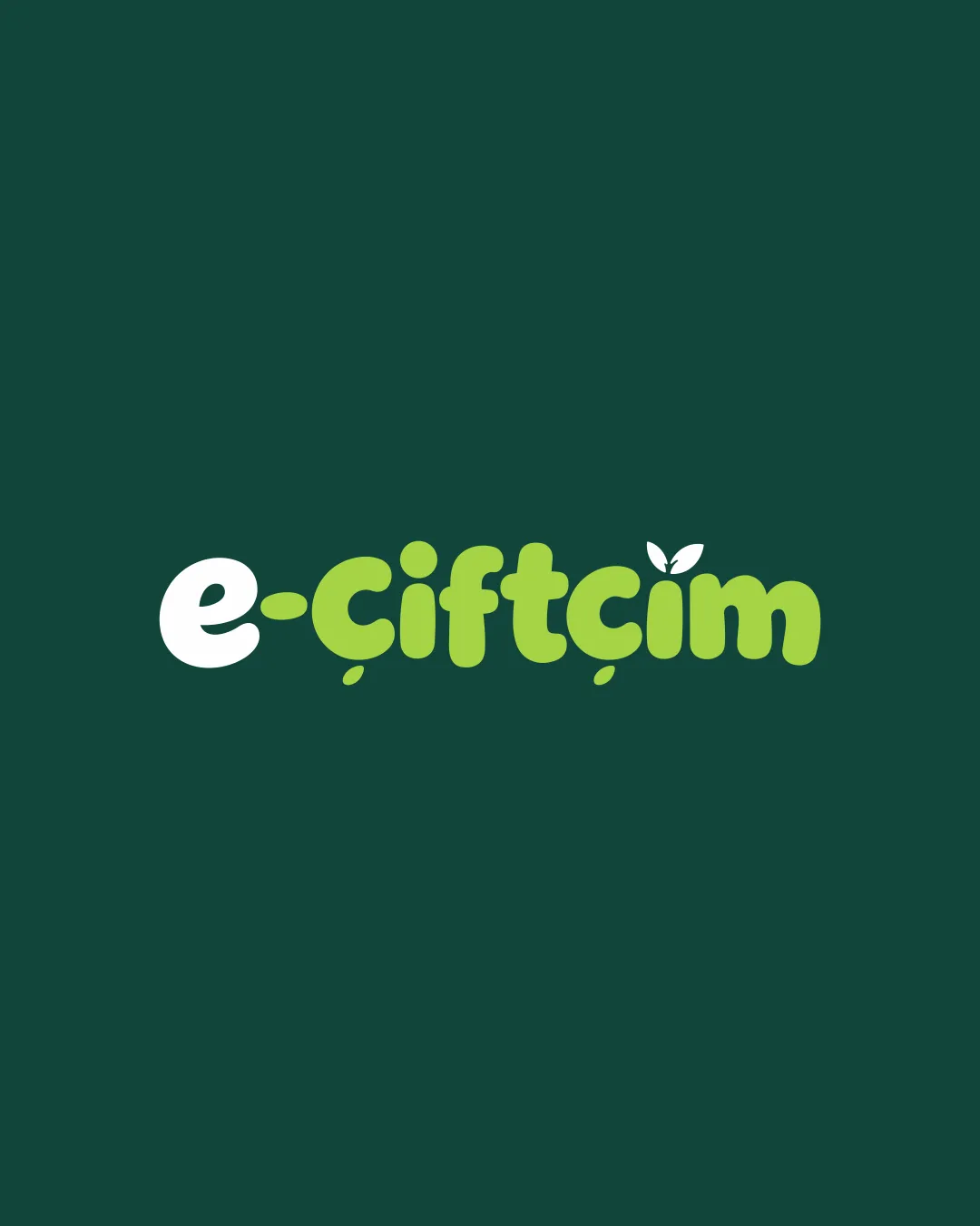
Logo review ofE Çiftçim
Review the detailed scores below to see what is working and what should be refined first.
Legibility
Originality
Misread
Balance
Scale
Detailed review
Logo performance breakdown
Legibility
![]() Text is clear and sufficiently spaced.
Text is clear and sufficiently spaced.![]() Distinct contrast between white and green elements.
Distinct contrast between white and green elements.
![]() The rounded, chunky font may reduce clarity at very small sizes, especially for the dotless 'i' and 'ç', which could blend.
The rounded, chunky font may reduce clarity at very small sizes, especially for the dotless 'i' and 'ç', which could blend.![]() Some diacritical marks, such as the cedilla and the leaf, may become unclear at thumbnail size.
Some diacritical marks, such as the cedilla and the leaf, may become unclear at thumbnail size.
Originality
![]() Leaf detail integrates agricultural message subtly.
Leaf detail integrates agricultural message subtly.![]() Soft, playful letter shapes add distinctiveness.
Soft, playful letter shapes add distinctiveness.
![]() Leaf as an agriculture cue is somewhat common and does not feel highly unique.
Leaf as an agriculture cue is somewhat common and does not feel highly unique.
Color harmony
![]() Excellent use of a limited, nature-inspired palette.
Excellent use of a limited, nature-inspired palette.![]() Strong contrast provides legibility.
Strong contrast provides legibility.
White
#FFFFFF
Conifer
#A2D96D
Eden
#194F43
Balance alignment
![]() Wordmark feels visually balanced with even weight distribution.
Wordmark feels visually balanced with even weight distribution.![]() Leaf motif above 'i' is playful but not disruptive to overall flow.
Leaf motif above 'i' is playful but not disruptive to overall flow.

Scalability
![]() Simple forms enhance clarity at medium-to-large sizes (e.g., website headers, packaging).
Simple forms enhance clarity at medium-to-large sizes (e.g., website headers, packaging).![]() Limited colors help keep reproduction straightforward.
Limited colors help keep reproduction straightforward.
![]() Details like the leaf and diacritical marks may get lost in small applications such as favicons or pens.
Details like the leaf and diacritical marks may get lost in small applications such as favicons or pens.![]() Chunky letterforms may not embroider cleanly or work well in extremely compact spaces.
Chunky letterforms may not embroider cleanly or work well in extremely compact spaces.
200x250 px
100×125 px
50×62 px
Misinterpretations
![]() No inappropriate or unintended double meanings detected.
No inappropriate or unintended double meanings detected.![]() All motifs feel wholesome and relevant to the sector.
All motifs feel wholesome and relevant to the sector.
Try your own review
Review my logo
Wondering how your logo performs?
Get a clear logo score, key risks, and priority fix ideas before your client or audience sees it.
Keep exploring