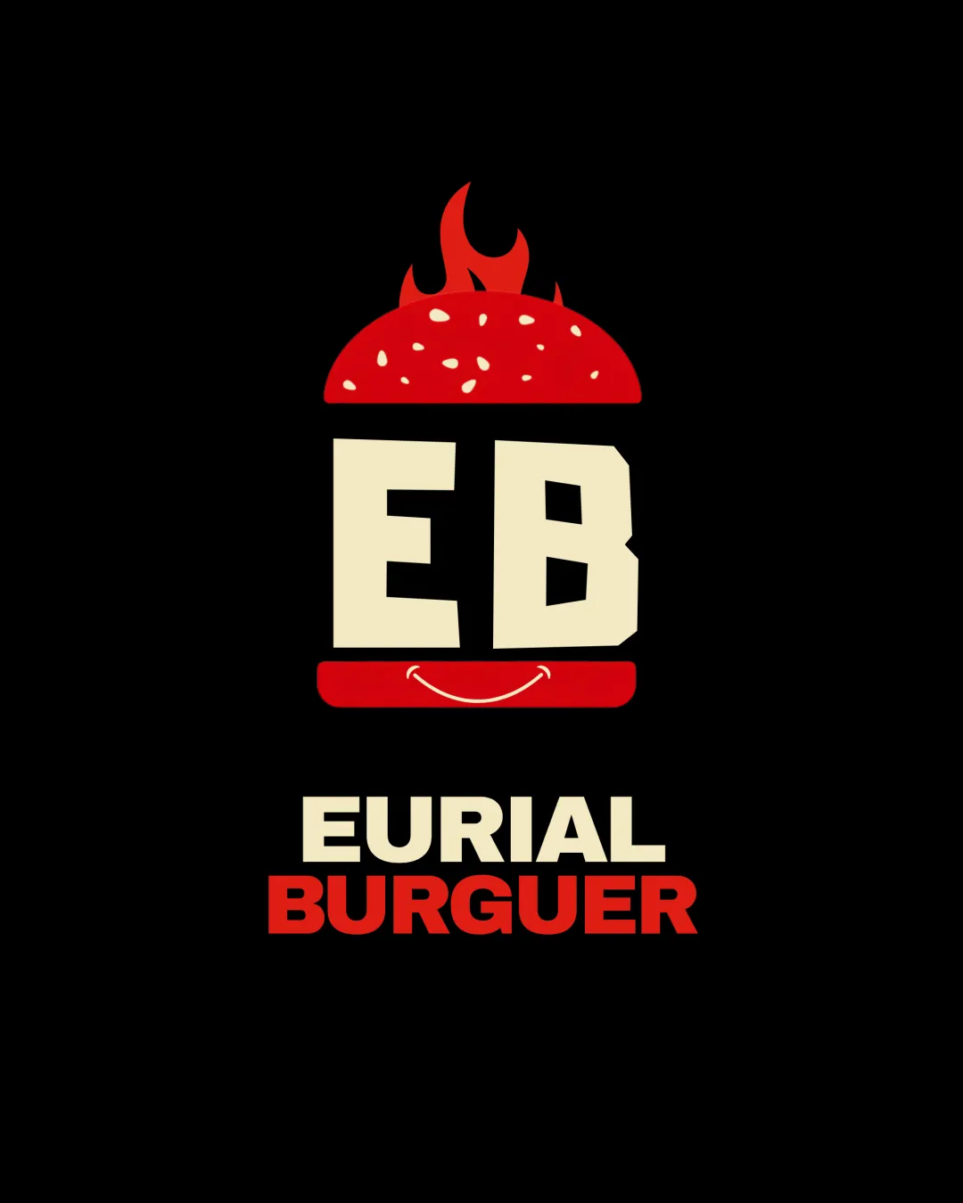
EB EURIAL BURGUER logo review
4/5
Logo score
Logo review of

Eb Eurial Burguer

This is a strong, bold concept for a fast food brand, with minor typographic and refinement tweaks needed for wide application.

Combination Mark Bold Graphic, Playful Fast Food Fast Food
4/5
Legibility
3/5
Originality
5/5
Misread
3/5
Balance
3/5
Scale
Your next steps

What to fix first

Focus on the changes that matter. Keep what makes the logo work.

1

wordmark 'BURGUER'

Confirm if 'BURGUER' is intentional for the market or correct to the standard spelling if targeting a broader audience.

Visible issue High priority Low effort
Area to inspectApproximate location

'BURGUER' deviates from the standard English spelling ('BURGER'), which could be confusing for non-local customers.

How to check

Compare with intended language/brand positioning; correct if needed.

See the category review
2

overall composition

Reduce vertical spacing between the icon/initials and the brand name for stronger cohesion.

Optional refinement Medium priority Low effort

The 'EB' and the burger graphic have tight vertical alignment, but the lower text feels slightly detached, impacting unity.

How to check

Print or preview at menu/signage size to test unity perception.

See the category review
Detailed review

Logo performance breakdown

4/5

Brief & logo match

Based on your brief
Compared with

Empresa de fast food localizado em Angola Luanda

The logo visually expresses a fast food burger brand, but spelling/typographic choices may limit broader appeal.

  • Sector Relevance

    Burger mark and fire immediately communicate fast food, matching the brief for a Luanda burger brand.

  • Memorability

    Bold initials and playful burger integration create a distinctive identity for local recognition.

4/5

Legibility

  • Bold, high-contrast text
  • Clear initial emphasis
  • 'BURGUER' deviates from the standard English spelling ('BURGER'), which could be confusing for non-local customers.

    Visible issue wordmark 'BURGUER'

    Try: Confirm if 'BURGUER' is intentional for the market or correct to the standard spelling if targeting a broader audience.

    Check: Compare with intended language/brand positioning; correct if needed.
    Area to inspectApproximate location
3/5

Originality

  • Burger motif represents category well
4/5

Color harmony

  • Warm palette fits fast food sector
  • Good color contrast
Beige#F8E4C0
Red#D62217
Black#000000

Estimated colors. Use the original design file for exact values.

Create a full color palette using these colors

Create new palette
3/5

Balance alignment

  • Centralized design
  • Stacked alignment reinforces hierarchy
  • The 'EB' and the burger graphic have tight vertical alignment, but the lower text feels slightly detached, impacting unity.

    Optional refinement overall composition

    Try: Reduce vertical spacing between the icon/initials and the brand name for stronger cohesion.

    Check: Print or preview at menu/signage size to test unity perception.

Uploaded logoAlignment guide overlay

Inspect spacing with the guide. Optical balance may differ from geometric centering.

3/5

Scalability

  • Simple block forms scale well
  • Thin flame details above the bun may be lost or appear irregular at very small sizes or on low-res prints.

    Worth testing burger bun flames

    Try: Test legibility and recognizability of the flames at the smallest intended size; simplify if needed.

    Check: Preview mark at small favicon/packaging size.

Uploaded logo at 200 pixels wide
200 × 250 px
Uploaded logo at 100 pixels wide
100 × 125 px
Uploaded logo at 50 pixels wide
50 × 63 px

Compare the detail at different sizes. Labels show the full image dimensions.

5/5

Misinterpretations

  • No supported alternative readings
4/5

Symbol & text fit

  • EB mark ties visually to burger symbol

Black & white

Does the shape still work without color?

These tests are available only for logos uploaded in vector (SVG) format.

Background contrast

Find the surfaces where your logo stays clear.

These tests are available only for logos uploaded in vector (SVG) format.

Blur & silhouette

A 3px blur softens fine details so you can check whether the overall shape stays recognizable. If key gaps close or elements merge, the logo may rely too heavily on detail.

These tests are available only for logos uploaded in vector (SVG) format.

Try your own review

Wondering how your logo performs?

Get a clear logo score, key risks, and priority fix ideas before your client or audience sees it.

Review my logo