 View review
Logo score
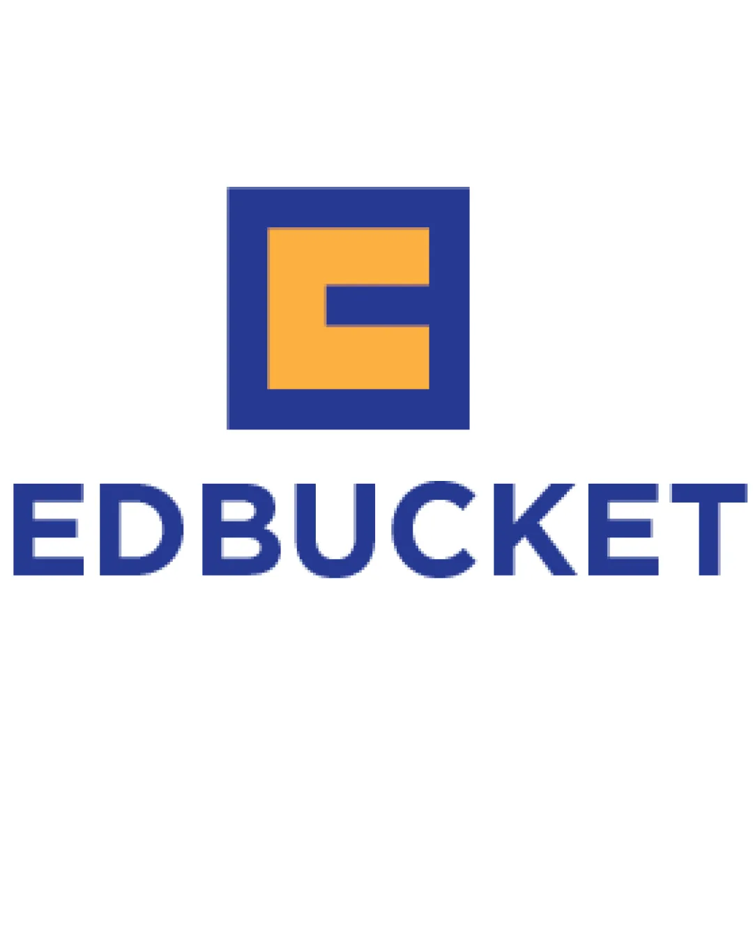
Logo review ofEdbucket
Strong, legible, and versatile, but small enhancements are recommended for greater distinction and balance.
Legibility
Originality
Misread
Balance
Scale
Action plan
What to fix first
The most important fixes to handle before polishing the full presentation.
1
Refine the proportion or weight of the monogram ‘E’ so it feels more visually balanced with the boldness of the wordmark.
Medium priorityCurrent mark is slightly heavier than the type, disrupting optimal balance.
Impact: Improves Professionalism And Overall Harmony. · Effort: Medium
2
Explore subtle tweaks to the monogram shape to introduce more uniqueness.
Low priorityGeometric ‘E’ in a square is fairly common; a twist could make it more memorable.
Impact: Could Help Differentiate From Generic Monograms In Education. · Effort: Medium
Detailed review
Logo performance breakdown
Legibility
![]() Text is clear, bold, and easy to read
Text is clear, bold, and easy to read
Originality
![]() Utilizes a monogram approach that’s somewhat unique
Utilizes a monogram approach that’s somewhat unique
![]() Block 'E' inside a square is common and may lack strong distinctiveness
Block 'E' inside a square is common and may lack strong distinctiveness
Color harmony
![]() Blue and yellow contrast well and signal education theme
Blue and yellow contrast well and signal education theme
Dark Blue
#23489C
Mustard Yellow
#F6BA47
Balance alignment
![]() Centralized mark with well-aligned text
Centralized mark with well-aligned text![]() Good spatial relationship between mark and wordmark
Good spatial relationship between mark and wordmark
![]() Mark feels slightly heavy compared to the type, could use finer weight matching
Mark feels slightly heavy compared to the type, could use finer weight matching

Scalability
![]() Simple shapes and bold lines ensure legibility when scaled down
Simple shapes and bold lines ensure legibility when scaled down
![]() Inner details of the 'E' could become less distinct at very small sizes
Inner details of the 'E' could become less distinct at very small sizes
200x250 px
100×125 px
50×62 px
Misinterpretations
![]() No inappropriate or confusing visual resemblance detected
No inappropriate or confusing visual resemblance detected
Logo structure & brief match
![]() Color and geometric style are consistent between mark and text
Color and geometric style are consistent between mark and text
![]() Slight mismatch in mark weight versus font thickness
Slight mismatch in mark weight versus font thickness
![]() Industry/audience: Mark and colors communicate a professional, education-focused identity suitable for consulting young people.
Industry/audience: Mark and colors communicate a professional, education-focused identity suitable for consulting young people.
![]() Use Case: Web/poster: High contrast and bold design is adaptable for digital and print use.
Use Case: Web/poster: High contrast and bold design is adaptable for digital and print use.
Try your own review
Review my logo
Wondering how your logo performs?
Get a clear logo score, key risks, and priority fix ideas before your client or audience sees it.
Keep exploring


