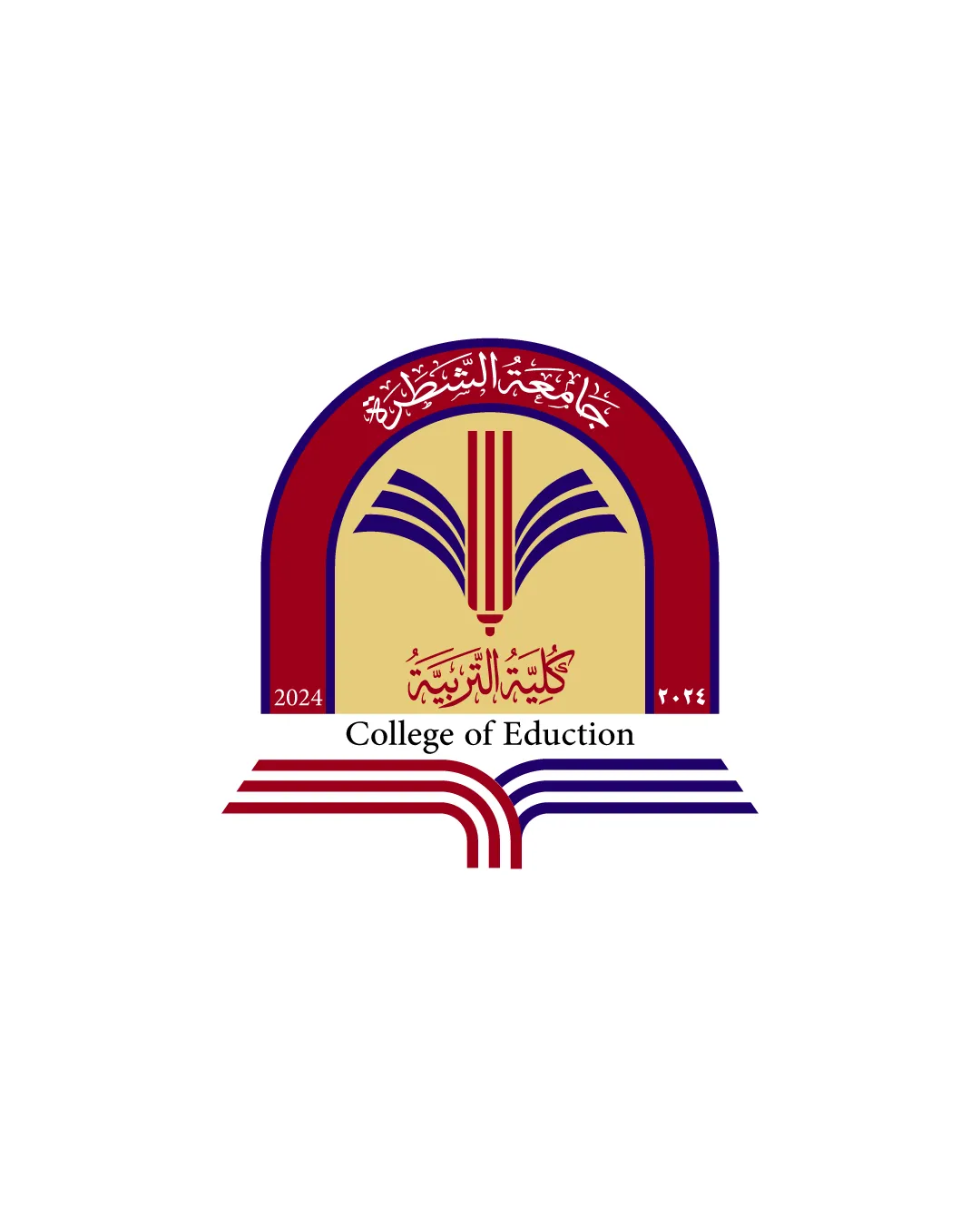
College of Eduction logo review
3.2 / 5
Logo score
Logo review of

College Of Eduction

Clear and serviceable educational logo, but weakened by a critical typo and common academic symbolism.

Objective AI feedback. Your creative decision.

Combination Mark Academic, Formal, Institutional Education
3.5/5
Legibility
3/5
Originality
4/5
Misread
3.5/5
Balance
3/5
Scale
Action plan

What to fix first

The most important fixes to handle before polishing the full presentation.

1

Correct the wordmark spelling to 'Education'.

High priority

Misspelling damages credibility and clarity.

Impact: Prevents Confusion, Enhances Professionalism And Trust. · Effort: Low

2

Increase small text size and optimize for legibility at small scales.

Medium priority

Small Arabic script and numbers may blur or become unreadable when scaled down.

Impact: Improves Reproduction And Usability On Various Media. · Effort: Medium

Detailed review

Logo performance breakdown

3.5/5

Legibility

Checkmark icon Latin script is mostly clear and readable.
Checkmark icon Arabic script is distinguishable.

Warning icon 'Education' is misspelled as 'Eduction'.
Warning icon Small Arabic text could be hard to read at small sizes.

3/5

Originality

Checkmark icon Book imagery combined with an arch adds mild uniqueness.

Warning icon Book and arch symbols are very common for academic logos and lack a distinctive twist.

3.5/5

Color harmony

Checkmark icon Colors fit academic context; contrast is clear between arch, book, and background.

Warning icon Beige background slightly diminishes impact; colors are common and not highly distinctive.

Maroon
#7C0016

Navy Blue
#12126B

Beige
#E9D6A4

White
#FFFFFF

Your palette is close. Refine the color roles and combinations before updating the logo.

Build brand colors
3.5/5

Balance alignment

Checkmark icon Symmetrical central composition.
Checkmark icon Book symbol is well-centered.

Warning icon Wordmark and arch shape have somewhat awkward spacing; baseline alignment could be improved.

logo 200x250 pixels scalability test alignment grid overlay
3/5

Scalability

Checkmark icon Main shapes and marks are distinguishable at moderate sizes.

Warning icon Small script details (especially Arabic) and small numbers may collapse at small sizes.

logo 200x250 pixels scalability test

200x250 px

logo 100x125 pixels scalability test

100×125 px

logo 50x62 pixels scalability test

50×62 px

4/5

Misinterpretations

Checkmark icon No negative secondary interpretations; book and arch are clear.

3.5 / 5

Logo structure & brief match

Checkmark icon Book and text both communicate education theme.

Warning icon Mismatch between the precision of the arch/symbol and the wordmark font style.

Checkmark icon Theme: Appropriately conveys academic and educational context through book and arch symbolism.
Checkmark icon Bilingual Use: Incorporates both Arabic and English clearly, supporting accessibility.

Try your own review

Wondering how your logo performs?

Get a clear logo score, key risks, and priority fix ideas before your client or audience sees it.

Review my logo