EDUVELLEO logo review
3.5/5
Logo score
Logo review of

Eduvelleo

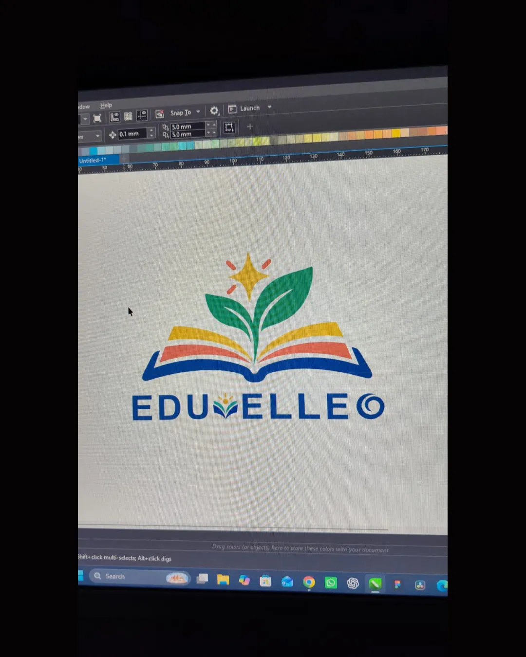
A visually strong and sector-appropriate logo that would benefit from clarifying the end letter and fine-tuning balance for a more distinctive, polished result.

Combination Mark Modern, Illustrative, Semi-abstract Education
3/5
Legibility
3/5
Originality
5/5
Misread
3/5
Balance
4/5
Scale
Your next steps

What to fix first

Focus on the changes that matter. Keep what makes the logo work.

1

wordmark (letter 'O')

Clarify the intent of the 'O' (logo element or copyright); adjust styling for clear communication.

Visible issue High priority Low effort
Area to inspectApproximate location

The 'O' at the end, styled as a copyright symbol, may cause confusion whether it's intentional or a copyright mark.

How to check

Ask for viewer interpretation of the final letter and confirm it is perceived as intended.

See the category review
2

ENTIRE LOGO (visual center)

Adjust proportions or spacing so the pictorial mark and wordmark feel more evenly anchored as a unit.

Visible issue Medium priority Low effort
Area to inspectApproximate location

The central open-book graphic sits slightly above the wordmark, causing minor vertical imbalance.

How to check

Visually check perceived balance when the logo is centered on a page vertically and horizontally.

See the category review
Detailed review

Logo performance breakdown

4/5

Brief & logo match

Based on your brief
Compared with

Education

The logo addresses the core goals of education and learning through universally recognized symbols, with a lively and encouraging visual tone.

  • Education Theme

    Open book, leaves, and star clearly represent learning and growth.

  • Approachability & Vibrancy

    The palette is bright and child-friendly, encouraging engagement.

3/5

Legibility

  • Large, geometric text is mostly easy to read
  • The 'O' at the end, styled as a copyright symbol, may cause confusion whether it's intentional or a copyright mark.

    Visible issue wordmark (letter 'O')

    Try: Clarify the intent of the 'O' (logo element or copyright); adjust styling for clear communication.

    Check: Ask for viewer interpretation of the final letter and confirm it is perceived as intended.
    Area to inspectApproximate location
3/5

Originality

  • Polished execution of educational tropes
  • The open book with a sprouting plant/star is a common educational motif, risking generic appearance.

    Worth testing standalone_mark (open book + leaves)

    Try: Assess recognizability among peer education brands and consider a more distinctive twist to the graphic.

    Check: Compare side-by-side with other educational logos to gauge potential for confusion or differentiation.

4/5

Color harmony

  • Bright, lively palette suits education theme
  • Color contrast makes each element pop
Yellow#FFC72C
Green#37B34A
Red#E94E1B
Blue#0057B7

Estimated colors. Use the original design file for exact values.

Create a full color palette using these colors

Create new palette
3/5

Balance alignment

  • Overall composition is centered
  • Horizontal weight is balanced
  • The central open-book graphic sits slightly above the wordmark, causing minor vertical imbalance.

    Visible issue ENTIRE LOGO (visual center)

    Try: Adjust proportions or spacing so the pictorial mark and wordmark feel more evenly anchored as a unit.

    Check: Visually check perceived balance when the logo is centered on a page vertically and horizontally.

    Area to inspectApproximate location
Uploaded logoAlignment guide overlay

Inspect spacing with the guide. Optical balance may differ from geometric centering.

4/5

Scalability

  • Artwork keeps clarity at small size
  • Color blocking maintains visibility
Uploaded logo at 200 pixels wide
200 × 250 px
Uploaded logo at 100 pixels wide
100 × 125 px
Uploaded logo at 50 pixels wide
50 × 63 px

Compare the detail at different sizes. Labels show the full image dimensions.

5/5

Misinterpretations

  • No plausible second readings apparent
4/5

Symbol & text fit

  • Graphics and text visually relate via the book motif

Black & white

Does the shape still work without color?

These tests are available only for logos uploaded in vector (SVG) format.

Background contrast

Find the surfaces where your logo stays clear.

These tests are available only for logos uploaded in vector (SVG) format.

Blur & silhouette

A 3px blur softens fine details so you can check whether the overall shape stays recognizable. If key gaps close or elements merge, the logo may rely too heavily on detail.

These tests are available only for logos uploaded in vector (SVG) format.

Try your own review

Wondering how your logo performs?

Get a clear logo score, key risks, and priority fix ideas before your client or audience sees it.

Review my logo