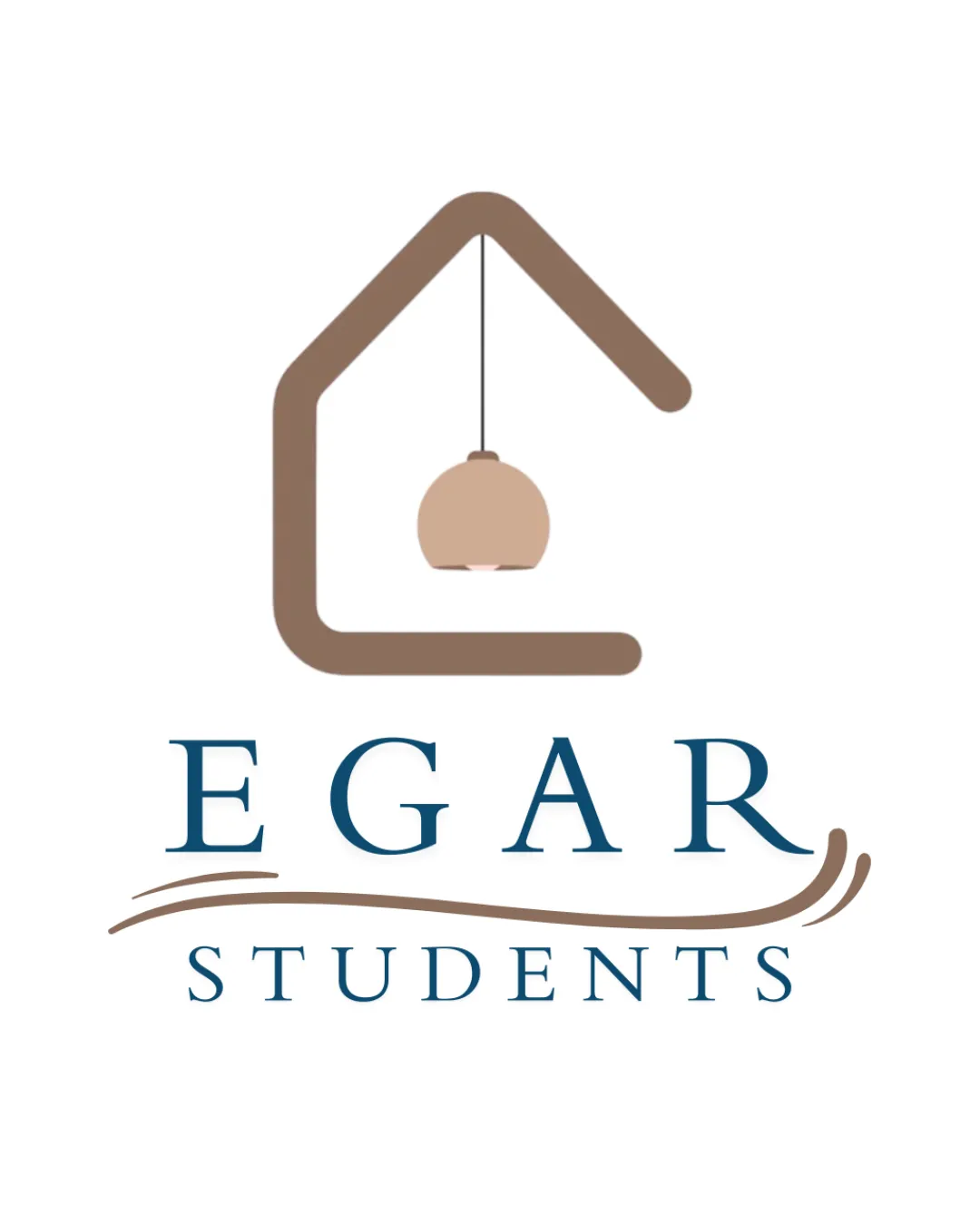
EGAR STUDENTS logo review
3.9 / 5
Logo score
Logo review of

Egar Students

Solid concept meeting industry needs, but requires refinement in ornamentation and alignment for optimal presentation.

Combination Mark Modern Minimal Real Estate
5/5
Legibility
3/5
Originality
5/5
Misread
3/5
Balance
4/5
Scale
Action plan

What to fix first

The most important fixes to handle before polishing the full presentation.

1

Reduce or refine the swoosh element under 'EGAR' for better visual cohesion and balance.

High priority

The swoosh currently distracts and competes with the house mark, lessening clarity.

Impact: Improves Overall Balance, Removes Visual Competition, And Raises Professionalism. · Effort: Medium

2

Consider slightly thickening the lamp line for small-size clarity.

Medium priority

Thin details may be lost at smaller scales, affecting versatility.

Impact: Ensures Logo Remains Legible And Effective At All Sizes. · Effort: Low

Detailed review

Logo performance breakdown

5/5

Legibility

Checkmark icon Text is clear and easy to read
Checkmark icon Serif font is spaced well

3/5

Originality

Checkmark icon Integrated house and lamp feels contextually appropriate

Warning icon House outline is a very common symbol in real estate logos

4/5

Color harmony

Checkmark icon Coffee and blue complement well and suggest trust and warmth

Warning icon Swoosh's color weight visually offsets the overall harmony

Coffee
#8C6D5B

Fjord
#37627B

White
#FFFFFF

Your palette is close. Explore sharper color combinations with Colorfly.design before updating the logo.

Explore palettes
3/5

Balance alignment

Checkmark icon Visually anchored with central house shape

Warning icon The swoosh under 'EGAR' creates a slight imbalance and competes with the house mark

logo 200x250 pixels scalability test alignment grid overlay
4/5

Scalability

Checkmark icon Simple forms enhance scalability
Checkmark icon Limited detail and solid lines

Warning icon Thin lines in the hanging lamp may disappear at small sizes

logo 200x250 pixels scalability test

200x250 px

logo 100x125 pixels scalability test

100×125 px

logo 50x62 pixels scalability test

50×62 px

5/5

Misinterpretations

Checkmark icon No unintended or inappropriate visual readings detected

4 / 5

Logo structure & brief match

Checkmark icon House symbol aligns contextually with the real estate theme

Warning icon Swoosh element below 'EGAR' feels unrelated to other elements

Checkmark icon Modern Digital Platform For Student Housing: Modern, clean design aligns with digital and real estate themes. House symbol and approachable color palette are relevant for student housing.

Try your own review

Wondering how your logo performs?

Get a clear logo score, key risks, and priority fix ideas before your client or audience sees it.

Review my logo