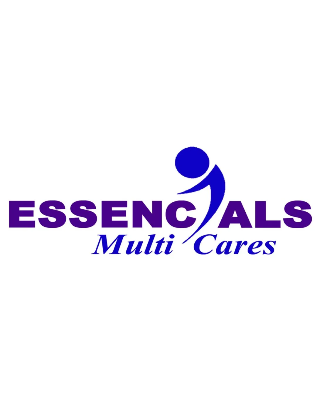
ESSENCIALS Multi Cares logo review
3.4 / 5
Logo score

Logo review ofEssencials Multi Cares

Safe for non-critical use but needs refinement in visual integration for strong client-ready delivery.

Combination Mark Corporate Sans Serif With Italic Script Healthcare
4/5
Legibility
3/5
Originality
4/5
Misread
3/5
Balance
3/5
Scale
Review next
Action plan

What to fix first

The most important fixes to handle before polishing the full presentation.

1

Fix possible misinterpretation

High priority

Abstract figure could be misread as a stylized checkmark or comma at a glance
Impact: High · Effort: Medium

2

Refine the integration of the human figure symbol with the letterforms for improved flow and consistency

High priority

Currently, the transition between the mark and remaining text is visually abrupt and decreases unity.

Impact: Improves Overall Cohesion And Reduces Momentary Reading Confusion · Effort: Medium

3

Enhance scalability by adjusting thinner elements in the symbol for clarity at smaller sizes

Medium priority

Portions of the figure may not print or display well at small scale.

Impact: Ensures The Logo Remains Recognizable And Professional On All Applications · Effort: Low

Detailed review

Logo performance breakdown

4/5

Legibility

Checkmark icon Essencials is bold and easy to read
Checkmark icon Subtext 'Multi Cares' is clear and distinct

Warning icon Letter 'I' as a figure could cause momentary hesitation in reading

3/5

Originality

Checkmark icon Attempts original letter integration with abstract figure

Warning icon Human figure as a letter is a common concept in care logos

4/5

Color harmony

Checkmark icon Consistent blue tones support a calm and reliable brand impression

Warning icon Use of just one color family limits visual interest

DarkBlue
#2E1F8A

Blue
#2B32C1

Your palette is close. Explore sharper color combinations with Colorfly.design before updating the logo.

Explore palettes
3/5

Balance alignment

Checkmark icon Central alignment is visually balanced

Warning icon Symbol disrupts the baseline and slightly crowds adjacent letters

logo 200x250 pixels scalability test alignment grid overlay
3/5

Scalability

Checkmark icon Minimal detail supports reduction in size

Warning icon Thin elements of the symbol may lose clarity at small sizes
Warning icon Color gradients or boldness difference between symbol and type may not reproduce well in all uses

logo 200x250 pixels scalability test

200x250 px

logo 100x125 pixels scalability test

100×125 px

logo 50x62 pixels scalability test

50×62 px

4/5

Misinterpretations

Checkmark icon No inappropriate or offensive shapes detected

Warning icon Abstract figure could be misread as a stylized checkmark or comma at a glance

3 / 5

Logo structure & brief match

Checkmark icon Mark serves directly as a letter in the wordmark

Warning icon Visual style of figure and letterforms are slightly disconnected

Checkmark icon Health/wellness/care Industry Alignment: Human figure and blue color scheme fit well for a care or wellness brand

Try your own review

Wondering how your logo performs?

Get a clear logo score, key risks, and priority fix ideas before your client or audience sees it.

Review my logo