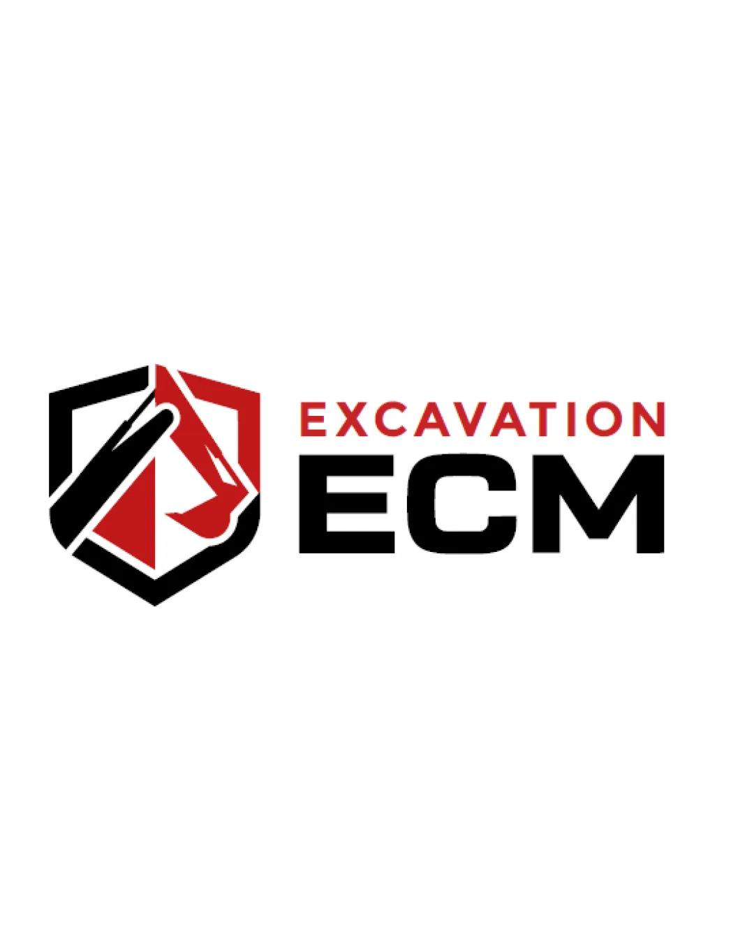
ECM Excavation logo logo review
4.1/5
Logo score Combination mark category

ECM Excavation logo

creative146719 Essential logo review

A robust, visually relevant construction logo with excellent legibility, strong category fit, and only minor considerations for maximum clarity in reduced sizes.

This logo lockup shows strong execution, supported by visual balance and text readability; improving distinctiveness is the clearest next step.

Combination Mark Bold, Geometric, Modern Construction
5/5
Legibility
3.6/5
Originality
4/5
Balance
4.4/5
Scale
4/5
Color
4/5
Style consistency
Your next steps

What to fix first

Focus on the changes that matter. Keep what makes the logo work.

1

Standalone mark

Test the mark at small scale and refine line weights if loss of clarity is observed.

Medium priority Worth testing Low effort

The shield mark contains several angled lines and intersecting negative spaces. At extremely small sizes, the internal excavator shapes could become less clear or merge visually.

See the category review

Detailed review

Logo performance breakdown

5/5

Brief & logo match

Bold mark, excavation-relevant imagery, and strong type combine to convincingly express a construction/excavation identity, with minor polish possible for small-scale use.

5/5

Legibility

Wordmark 5/5 · Layout 5/5

  • Both 'EXCAVATION' and 'ECM' are highly legible with clear sans-serif letterforms.
5/5

Misinterpretations

  • No plausible misinterpretation or dual meaning present.
4.4/5

Scalability

Symbol 4/5 · Wordmark 5/5 · Layout 4/5

  • Mark is mostly bold and simple, suitable for small and large scale, but internal detail may need monitoring at micro sizes.
  • The shield mark contains several angled lines and intersecting negative spaces. At extremely small sizes, the internal excavator shapes could become less clear or merge visually.

    Worth testing Standalone mark

    Try: Test the mark at small scale and refine line weights if loss of clarity is observed.

4/5

Color harmony

Symbol 4/5 · Wordmark 4/5

  • Red, black, and white palette is strong, bold, and appropriate for construction with good visual hierarchy.
Red#BA181B
Black#000000
White#FFFFFF

Estimated colors. Use the original design file for exact values.

Create a full color palette using these colors

Create new palette
4/5

Balance alignment

Symbol 4/5 · Wordmark 4/5 · Layout 4/5

  • Mark and wordmark are visually balanced side by side, and text is aligned for strong horizontal presence.
Uploaded logoAlignment guide overlay

Inspect spacing with the guide. Optical balance may differ from geometric centering.

4/5

Style consistency

Available in Advanced logo reviews
3.6/5

Originality

Symbol 4/5 · Wordmark 3/5

Available in Advanced logo reviews
Try your own review

Wondering how your logo performs?

Get a clear logo score, key risks, and priority fix ideas before your client or audience sees it.

Review my logo