Firma'IQ logo review
4.1/5
Logo score Combination mark category

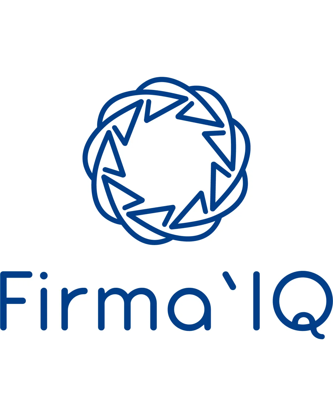
Firma'IQ

oussema_khmeja Essential logo review

Review the detailed scores below to see what is working and what should be refined first.

Symbols recognized:
circular geometric badge made of interlaced triangles
Legible text:
Firma'IQ
Combination Mark Modern Minimal Line Art Technology
4/5
Legibility
3/5
Originality
4/5
Balance
4/5
Scale
Detailed review

Logo performance breakdown

4/5

Legibility

  • Font is highly readable with generous spacing and simple letterforms.
  • Good contrast between dark blue text and white background.
  • The accent mark (apostrophe) between 'Firma' and 'IQ' is visually awkward and may cause mild confusion or be mistaken for a typo.

3/5

Originality

  • Logomark features a distinctive interlaced triangle motif.
  • The use of a geometric ring gives it some uniqueness.
  • Circular geometric motifs with interlocking arrows/chevrons are increasingly common in tech and consulting.
  • Wordmark uses a very standard rounded sans-serif, lacking distinguishing touches.
5/5

Color harmony

  • Excellent restraint with a two-tone color scheme.
  • Color choice is business-appropriate and easy to reproduce.
DeepSkyBlue#1155A3
White#FFFFFF

Estimated colors. Use the original design file for exact values.

Create a full color palette using these colors

Create new palette
4/5

Balance alignment

  • Symmetrical round logomark is visually matched with a centered wordmark for balance.
  • Good internal geometric alignment within the symbol itself.
  • The logomark feels slightly bolder than the light wordmark, creating a mild imbalance, especially at smaller scales.
Uploaded logoAlignment guide overlay

Inspect spacing with the guide. Optical balance may differ from geometric centering.

4/5

Scalability

  • Simple line thicknesses support most print and digital applications.
  • Single color allows easy adaptation to different backgrounds and single-color formats.
  • Symbol contains intricate interlaced lines, which may lose clarity at very small sizes (e.g., favicon, embroidery).
5/5

Misinterpretations

  • No inappropriate or problematic visual associations detected.
  • Symbol is abstract but remains professional and neutral.
4/5

Symbol & text fit

  • Styles are congruent; both use round geometry and light lines.
  • Good vertical spacing between mark and text.
  • Minor mismatch in visual weight; the mark draws a bit more attention than the text.
Try your own review

Wondering how your logo performs?

Get a clear logo score, key risks, and priority fix ideas before your client or audience sees it.

Review my logo