 View review
Logo score
Logo review ofFlare
Review the detailed scores below to see what is working and what should be refined first.
Legibility
Originality
Misread
Balance
Scale
Detailed review
Logo performance breakdown
Legibility
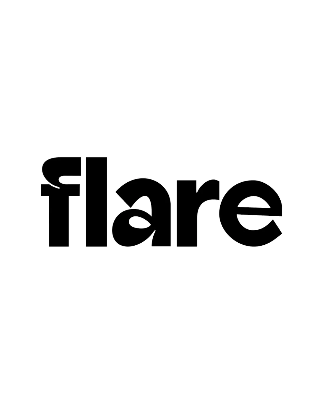
![]() Text is generally bold and clear.
Text is generally bold and clear.![]() All letters are easily distinguishable, except for a minor variation on the 'f'.
All letters are easily distinguishable, except for a minor variation on the 'f'.
![]() The stylized 'f' may momentarily confuse readers due to its unconventional form, especially at smaller sizes or in quick glances.
The stylized 'f' may momentarily confuse readers due to its unconventional form, especially at smaller sizes or in quick glances.
Originality
![]() The altered 'f' and overall bold geometry give it a distinct, memorable style.
The altered 'f' and overall bold geometry give it a distinct, memorable style.![]() Font manipulation adds ownable character.
Font manipulation adds ownable character.
![]() Beyond the 'f', the rest of the letters are less distinctive and feel more generic.
Beyond the 'f', the rest of the letters are less distinctive and feel more generic.
Color harmony
![]() Monochrome palette ensures strong contrast and broad usability.
Monochrome palette ensures strong contrast and broad usability.![]() Very effective in both black-on-white and reversed forms.
Very effective in both black-on-white and reversed forms.
Black
#000000
White
#FFFFFF
Balance alignment
![]() Letter spacing is generally even throughout the wordmark.
Letter spacing is generally even throughout the wordmark.![]() Strong geometric balance in the 'are' portion.
Strong geometric balance in the 'are' portion.
![]() The oversized and stylized 'f' disrupts the left-side weight, making the beginning feel heavier than the end, resulting in visual imbalance.
The oversized and stylized 'f' disrupts the left-side weight, making the beginning feel heavier than the end, resulting in visual imbalance.

Scalability
![]() Simple structure ensures readability at many sizes.
Simple structure ensures readability at many sizes.![]() Functions well for digital use, print media, and larger applications like billboards or banners.
Functions well for digital use, print media, and larger applications like billboards or banners.
![]() Very thick strokes and unique 'f' construction may lose clarity in very small applications such as favicons or small embroidery.
Very thick strokes and unique 'f' construction may lose clarity in very small applications such as favicons or small embroidery.
200x250 px
100×125 px
50×62 px
Misinterpretations
![]() No inappropriate or unintended negative associations detected.
No inappropriate or unintended negative associations detected.
Try your own review
Review my logo
Wondering how your logo performs?
Get a clear logo score, key risks, and priority fix ideas before your client or audience sees it.
Keep exploring