 View review
Logo score
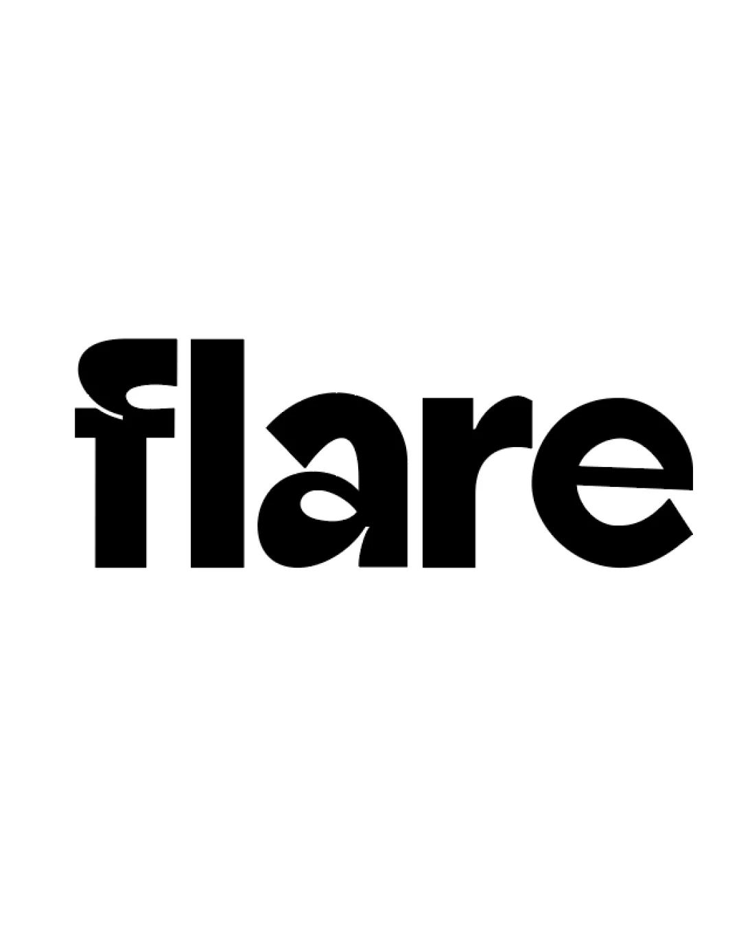
Logo review ofFlare
Review the detailed scores below to see what is working and what should be refined first.
Legibility
Originality
Misread
Balance
Scale
Detailed review
Logo performance breakdown
Legibility
![]() Thick, bold letterforms offer strong visibility at larger sizes.
Thick, bold letterforms offer strong visibility at larger sizes.![]() Minimalist style aids quick readability from a distance.
Minimalist style aids quick readability from a distance.
![]() The exaggerated and stylized 'f' has a nonstandard top curve and counter, making it confusing at first glance.
The exaggerated and stylized 'f' has a nonstandard top curve and counter, making it confusing at first glance.![]() Letter spacing is tight and bold shapes may blur together at smaller scales.
Letter spacing is tight and bold shapes may blur together at smaller scales.![]() The 'a' is stylistically unique and partially ambiguous with its open form.
The 'a' is stylistically unique and partially ambiguous with its open form.
Originality
![]() Highly distinctive 'f' and 'a' give the brand its own visual personality.
Highly distinctive 'f' and 'a' give the brand its own visual personality.![]() Bold execution separates it from generic geometric sans-serif wordmarks.
Bold execution separates it from generic geometric sans-serif wordmarks.
![]() The abstraction may sacrifice some immediate clarity for the sake of being different.
The abstraction may sacrifice some immediate clarity for the sake of being different.![]() Uniqueness is mainly concentrated in the first two letters, while 'are' is more generic.
Uniqueness is mainly concentrated in the first two letters, while 'are' is more generic.
Color harmony
![]() Single black/white palette is versatile and timeless.
Single black/white palette is versatile and timeless.![]() High contrast ensures maximum visibility on light or dark backgrounds.
High contrast ensures maximum visibility on light or dark backgrounds.
Black
#000000
White
#FFFFFF
Balance alignment
![]() General horizontal alignment is consistent and the bold text feels grounded.
General horizontal alignment is consistent and the bold text feels grounded.![]() Proportional letter sizing maintains some visual balance.
Proportional letter sizing maintains some visual balance.
![]() The unconventional 'f' introduces a small imbalance at the start of the wordmark.
The unconventional 'f' introduces a small imbalance at the start of the wordmark.![]() Uneven thickness and negative space between some letters (especially 'f' and 'l').
Uneven thickness and negative space between some letters (especially 'f' and 'l').

Scalability
![]() Bold, simple shapes ensure clarity at large and standard sizes, such as on billboards or website headers.
Bold, simple shapes ensure clarity at large and standard sizes, such as on billboards or website headers.![]() Single color design enhances flexibility across backgrounds and applications.
Single color design enhances flexibility across backgrounds and applications.
![]() The pronounced modifications on 'f' and 'a' could lose definition at small scales, especially in embroidery or favicon use.
The pronounced modifications on 'f' and 'a' could lose definition at small scales, especially in embroidery or favicon use.![]() Overlapping and unique forms may not hold up in miniature (e.g., as a tiny app icon).
Overlapping and unique forms may not hold up in miniature (e.g., as a tiny app icon).
200x250 px
100×125 px
50×62 px
Misinterpretations
![]() No inappropriate or ambiguous dual meanings detected.
No inappropriate or ambiguous dual meanings detected.![]() Overall composition remains professional and suitable for mainstream branding.
Overall composition remains professional and suitable for mainstream branding.
Try your own review
Review my logo
Wondering how your logo performs?
Get a clear logo score, key risks, and priority fix ideas before your client or audience sees it.
Keep exploring