Wondering how your logo performs? 🧐
Get professional logo reviews in seconds and catch design issues in time.
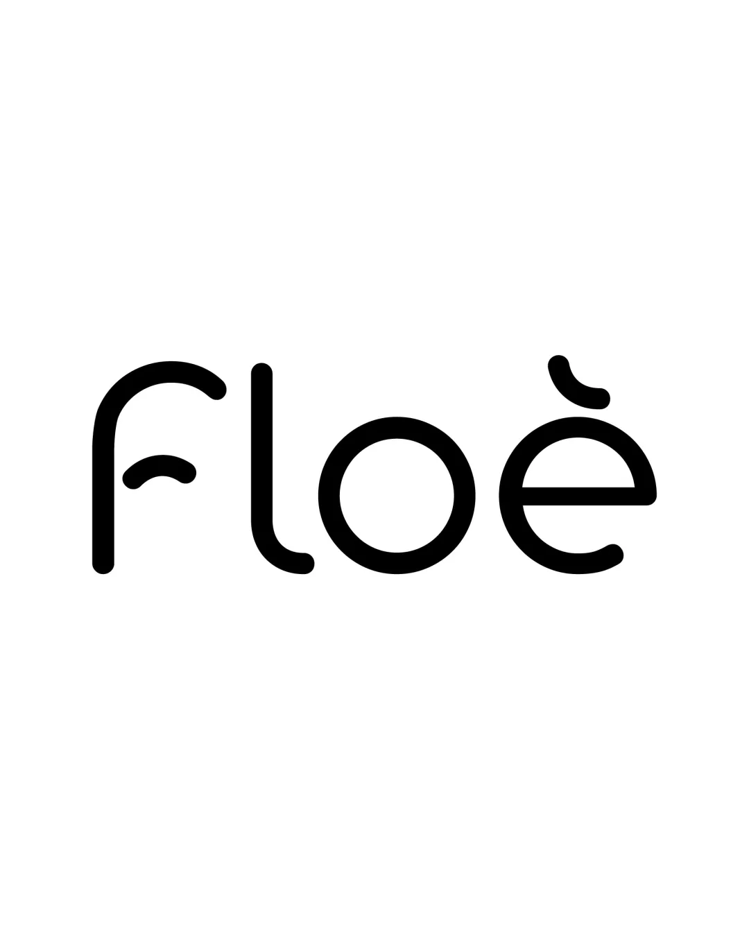
Try it Now!Logo review of floe
 Logo analysis by AI
Logo type:
Style:
Detected text:
Business industry:
Review requested by Khat_sian_
**If AI can recognize or misinterpret it, so can people.
Structured logo review
Legibility
![]() The text is generally clean, rounded, and highly readable at most sizes.
The text is generally clean, rounded, and highly readable at most sizes.![]() Letter spacing remains balanced, and every character is distinguishable.
Letter spacing remains balanced, and every character is distinguishable.
![]() The stylized accent on the 'e' and the unconventional 'f' may cause momentary confusion, especially at small sizes or from a distance.
The stylized accent on the 'e' and the unconventional 'f' may cause momentary confusion, especially at small sizes or from a distance.
Scalability versatility
![]() The logo's thickness and simplicity work well for a variety of applications, including print and digital formats.
The logo's thickness and simplicity work well for a variety of applications, including print and digital formats.![]() Should scale cleanly to favicons and app icons, and looks high-impact on signage or packaging.
Should scale cleanly to favicons and app icons, and looks high-impact on signage or packaging.
![]() The thin lines might lose some visual impact on extremely small sizes or embroidery, where the accent detail could disappear.
The thin lines might lose some visual impact on extremely small sizes or embroidery, where the accent detail could disappear.
200x250 px
100×125 px
50×62 px
Balance alignment
![]() Excellent vertical and horizontal alignment; letterforms feel harmonious as a unit.
Excellent vertical and horizontal alignment; letterforms feel harmonious as a unit.![]() Consistent stroke weight supports cohesion and visual symmetry.
Consistent stroke weight supports cohesion and visual symmetry.

Originality
![]() Custom stylization of the 'e' accent and the playful 'f' distinguish the logo from basic wordmarks.
Custom stylization of the 'e' accent and the playful 'f' distinguish the logo from basic wordmarks.![]() The curves and shapes evoke a sense of 'flow', aligning well with a lifestyle or wellness brand.
The curves and shapes evoke a sense of 'flow', aligning well with a lifestyle or wellness brand.
![]() While unique, the idea of geometric, minimalist custom lettering is not groundbreaking, and similar sans-serif, rounded designs are common.
While unique, the idea of geometric, minimalist custom lettering is not groundbreaking, and similar sans-serif, rounded designs are common.
Aesthetic look
![]() Modern and minimal, the logo is visually appealing and uncluttered.
Modern and minimal, the logo is visually appealing and uncluttered.![]() The round forms and custom diacritic create a sense of approachability and fluidity.
The round forms and custom diacritic create a sense of approachability and fluidity.
![]() Could be seen as slightly generic in the context of modern branding without more distinctive iconography or color accents.
Could be seen as slightly generic in the context of modern branding without more distinctive iconography or color accents.
Dual meaning and misinterpretations
![]() No inappropriate or accidental symbols detected.
No inappropriate or accidental symbols detected.![]() All letterforms maintain an abstract, positive appearance.
All letterforms maintain an abstract, positive appearance.
Color harmony
![]() Classic black on white ensures maximum versatility and timelessness.
Classic black on white ensures maximum versatility and timelessness.![]() Single-color design maintains high clarity and professionalism.
Single-color design maintains high clarity and professionalism.
Black
#000000
White
#FFFFFF