Wondering how your logo performs? 🧐
Get professional logo reviews in seconds and catch design issues in time.
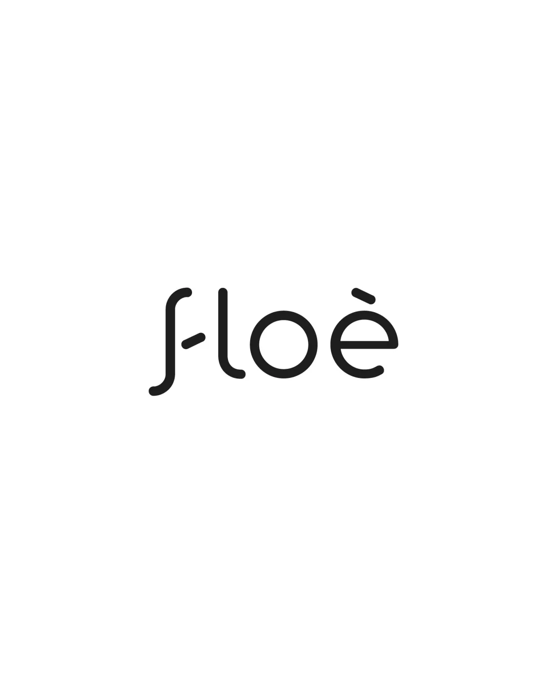
Try it Now!Logo review of floè
 Logo analysis by AI
Logo type:
Style:
Detected text:
Business industry:
Review requested by Khat_sian_
**If AI can recognize or misinterpret it, so can people.
Structured logo review
Legibility
![]() Clean, proper spacing between letters.
Clean, proper spacing between letters.![]() Distinct, rounded forms make most characters easy to distinguish.
Distinct, rounded forms make most characters easy to distinguish.
![]() The 'f' is highly stylized and could be confused for a 'J' or 'l' at a glance.
The 'f' is highly stylized and could be confused for a 'J' or 'l' at a glance.![]() The accent on the 'e' is small and at small sizes may become illegible.
The accent on the 'e' is small and at small sizes may become illegible.
Scalability versatility
![]() Simple, monochrome design will reproduce well at small and large sizes.
Simple, monochrome design will reproduce well at small and large sizes.![]() Minimal detail aids in clarity for both print and digital usage.
Minimal detail aids in clarity for both print and digital usage.
![]() Thin weight and open shapes could lose visibility and impact in very small applications (favicons, embroidery).
Thin weight and open shapes could lose visibility and impact in very small applications (favicons, embroidery).![]() Accent details may disappear at tiny scales.
Accent details may disappear at tiny scales.
200x250 px
100×125 px
50×62 px
Balance alignment
![]() Good baseline alignment and consistent letterform weight.
Good baseline alignment and consistent letterform weight.![]() White space around the word improves focus.
White space around the word improves focus.
![]() Visual imbalance caused by the unique 'f' drawing more attention than other characters.
Visual imbalance caused by the unique 'f' drawing more attention than other characters.![]() Accent mark on 'e' and the mid-bar on 'f' create asymmetrical emphasis.
Accent mark on 'e' and the mid-bar on 'f' create asymmetrical emphasis.

Originality
![]() Unique treatment of the initial letter 'f' distinguishes it from standard sans-serif wordmarks.
Unique treatment of the initial letter 'f' distinguishes it from standard sans-serif wordmarks.![]() Minimalist style with custom detail.
Minimalist style with custom detail.
![]() Custom 'f' borderlines on being overly abstract, which diminishes instant recognizability.
Custom 'f' borderlines on being overly abstract, which diminishes instant recognizability.![]() Rounded forms are contemporary but somewhat common in current trends.
Rounded forms are contemporary but somewhat common in current trends.
Aesthetic look
![]() Visually pleasing and modern.
Visually pleasing and modern.![]() Rounded aesthetics and simplicity evoke a sleek, approachable vibe.
Rounded aesthetics and simplicity evoke a sleek, approachable vibe.
![]() Slightly generic due to overused minimal rounded geometric sans-serif look.
Slightly generic due to overused minimal rounded geometric sans-serif look.![]() Highly stylized initial letter may not appeal to all audiences.
Highly stylized initial letter may not appeal to all audiences.
Dual meaning and misinterpretations
![]() No inappropriate or ambiguous dual interpretations detected.
No inappropriate or ambiguous dual interpretations detected.![]() Wordmark remains inoffensive and straightforward.
Wordmark remains inoffensive and straightforward.
Color harmony
![]() Effective use of monochrome palette maximizing readability and versatility.
Effective use of monochrome palette maximizing readability and versatility.![]() Black on white offers optimal contrast.
Black on white offers optimal contrast.
Black
#000000
White
#FFFFFF