Wondering how your logo performs? 🧐
Get professional logo reviews in seconds and catch design issues in time.
Try it Now!Logo review of Fly Smart
 Logo analysis by AI
Logo type:
Style:
Detected symbol:
Detected text:
Business industry:
Review requested by Alshuhris
**If AI can recognize or misinterpret it, so can people.
Structured logo review
Legibility
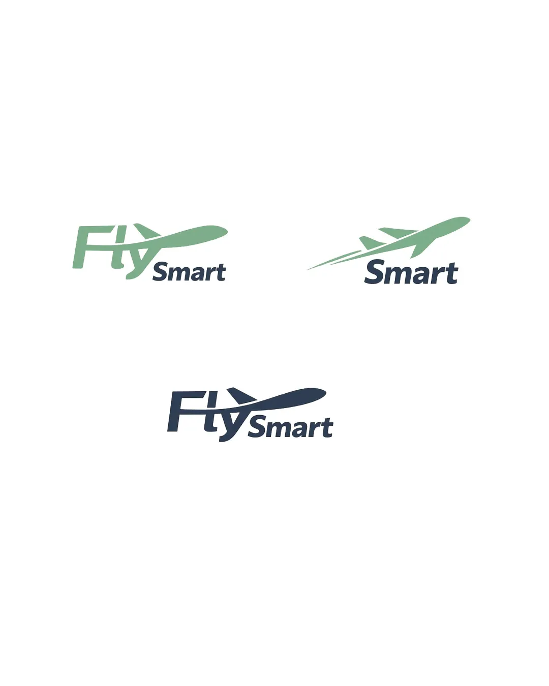
The text 'Fly Smart' is readable in all three versions.
The contrast between the colors ensures the wordmark stands out.
In the variants where the airplane overlaps with 'Fly', the tail of the airplane may slightly interfere with the legibility of the letter 'y', especially at small sizes.
Scalability versatility
Simple forms and clear outline ensure the logo maintains some integrity at different sizes.
Works on white background; could translate to various print and digital applications.
The integration of the airplane with the letter 'y' may lose clarity at extremely small sizes, such as favicons, embroidery, or on pens.
Thin details and overlapping elements can become indistinct when scaled down.

200x250 px

100×125 px

50×62 px
Balance alignment
The composition feels visually cohesive, with the airplane naturally leading the eye from 'Fly' to 'Smart'.
Good horizontal alignment and typographic hierarchy; 'Smart' remains secondary visually.
In some variations, the tail fin of the airplane disrupts the clean alignment of the overall wordmark.
The airplane extending past the wordmark in certain variants creates minor imbalance.


Originality
Direct integration of the airplane with typography shows an attempt at customization.
Using an airplane as a symbol is extremely common in aviation branding, making the overall feel generic.
There is nothing particularly unique or creative about the airplane or its usage here.
Logomark wordmark fit
Airplane motif aligns with the theme of 'Fly', and the font style matches the symbol in terms of simplicity.
The styles are matched, but the graphical element (airplane) might overpower the wordmark depending on scale and placement.
Aesthetic look
Modern, approachable look with a clean sans-serif font.
Color palette is restrained and professional.
The logo is somewhat bland and does not stand out among aviation brands.
Minimalistic to the point of generic; lacks distinctive flair or memorable visual details.
Dual meaning and misinterpretations
No inappropriate symbols or interpretations; the visual is straightforward.
Color harmony
Two-tone color scheme is harmonious and avoids overcomplication.
Colors provide appropriate contrast for legibility.
SeaGreen
#8ABCA3
Gunmetal
#27313F
White
#FFFFFF

