FUTNXT EV STUDIO logo review
4/5
Logo score
Logo review of

Futnxt Ev Studio

A strong and relevant concept with distinctive tech cues, needing polish for greater unity and small-scale clarity.

Combination Mark Modern, Tech-inspired Electric Vehicles / Technology
4/5
Legibility
4/5
Originality
5/5
Misread
3/5
Balance
3/5
Scale
Your next steps

What to fix first

Focus on the changes that matter. Keep what makes the logo work.

1

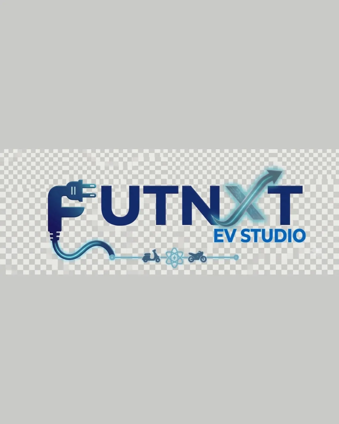
X (arrows crossing)

Refine the X's arrow treatment to harmonize stroke weight and density with the other letters while retaining the concept.

Visible issue High priority Medium effort
Area to inspectApproximate location

The arrow-crossed X is visually busier and lighter than the other bold, solid letters, impacting evenness.

How to check

Compare X's visual weight to adjacent letters and test legibility at small sizes.

See the category review
2

small icons and cable below text

Test logo visibility and icon clarity at smaller sizes or consider simplifying this detail in smaller/alternate versions.

Worth testing Medium priority Low effort
Area to inspectApproximate location

Tiny electric vehicle and atom icons below the wordmark are delicate and may become illegible or lost at reduced sizes or in print.

How to check

Resize artwork to common usage scales and check if lower details remain recognizable.

See the category review
Detailed review

Logo performance breakdown

4/5

Brief & logo match

Based on an inferred industry
Compared with

Implied focus on electric vehicles and technology/future-forward solutions.

The logo clearly channels the electric vehicle and future tech sector, but visual consistency and small-detail legibility need polish.

  • Integration Of EV/technology Theme

    The plug, arrows, and electric vehicle icons strongly signal an EV/tech focus.

  • Modern, Forward-facing Design

    Arrows and gradient color suggest 'next' and progress, reflecting future emphasis.

4/5

Legibility

  • All main text is clear at moderate size.
  • Distinctive F and overall word clarity.
4/5

Originality

  • Plug-F and arrow-X provide brand-relevant symbolism.
  • Uncommon integration of electric vehicle icons.
4/5

Color harmony

  • Clean blue gradient fits tech/EV sector.
  • Contrast supports readability.
DarkBlue#192D56
LightBlue#279FDE
Blue#1891CD
White#FFFFFF

Estimated colors. Use the original design file for exact values.

Create a full color palette using these colors

Create new palette
3/5

Balance alignment

  • Good left-right symmetry with central focus.
  • Effective use of whitespace.
  • The arrow-crossed X is visually busier and lighter than the other bold, solid letters, impacting evenness.

    Visible issue X (arrows crossing)

    Try: Refine the X's arrow treatment to harmonize stroke weight and density with the other letters while retaining the concept.

    Check: Compare X's visual weight to adjacent letters and test legibility at small sizes.

    Area to inspectApproximate location
Uploaded logoAlignment guide overlay

Inspect spacing with the guide. Optical balance may differ from geometric centering.

3/5

Scalability

  • Primary wordmark holds shape at a range of sizes.
  • Simple color palette aids reproduction.
  • Tiny electric vehicle and atom icons below the wordmark are delicate and may become illegible or lost at reduced sizes or in print.

    Worth testing small icons and cable below text

    Try: Test logo visibility and icon clarity at smaller sizes or consider simplifying this detail in smaller/alternate versions.

    Check: Resize artwork to common usage scales and check if lower details remain recognizable.

    Area to inspectApproximate location
Uploaded logo at 200 pixels wide
200 × 250 px
Uploaded logo at 100 pixels wide
100 × 125 px
Uploaded logo at 50 pixels wide
50 × 63 px

Compare the detail at different sizes. Labels show the full image dimensions.

5/5

Misinterpretations

  • No unintended or distracting double meanings.
3/5

Symbol & text fit

  • Plug-F is well-incorporated.
  • The plug-F integrates well and conceptually supports the name; the X's style shift is more disruptive.

    Optional refinement Mark/wordmark integration (F and X)

    Try: Iterate on how the X transitions visually to ensure the tech/future feel is smooth but consistent with the logo's main weight.

    Check: Seek feedback on the X’s visual connection to the rest at first glance.

Black & white

Does the shape still work without color?

These tests are available only for logos uploaded in vector (SVG) format.

Background contrast

Find the surfaces where your logo stays clear.

These tests are available only for logos uploaded in vector (SVG) format.

Blur & silhouette

A 3px blur softens fine details so you can check whether the overall shape stays recognizable. If key gaps close or elements merge, the logo may rely too heavily on detail.

These tests are available only for logos uploaded in vector (SVG) format.

Try your own review

Wondering how your logo performs?

Get a clear logo score, key risks, and priority fix ideas before your client or audience sees it.

Review my logo