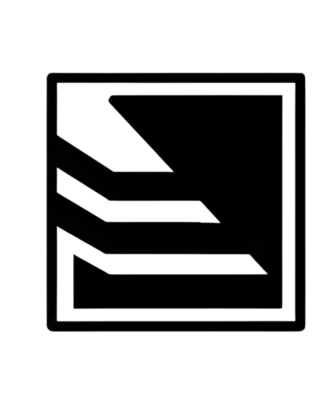
Abstract angular mark within a square outline, fea.. logo review
3.5/5
Logo score
Logo review of

Abstract Angular Mark Within A Square Outline, Fea..

A robust industrial mark with clear relevance but limited instant uniqueness and some small-size risk.

Standalone Mark Geometric, Abstract, Angular Metal Fabrication / Industrial
3/5
Originality
5/5
Misread
4/5
Balance
3/5
Scale
Your next steps

What to fix first

Focus on the changes that matter. Keep what makes the logo work.

1

Standalone mark

Test reduction to favicon/small print and adjust gaps if necessary for clarity.

Visible issue High priority Low effort
Area to inspectApproximate location

Some of the finer white segments between black shapes may disappear or become unclear at extremely small sizes.

How to check

Print and screen test at 16px-32px size.

See the category review
2

Standalone mark

Increase distinctive features or integrate subtle references to metalworking or the company initials.

Optional refinement Medium priority Medium effort

The abstract motif resembles generic industrial or tech logos due to its geometric composition, which limits instant brand recognition.

How to check

Compare with peer logos for distinctiveness.

See the category review
Detailed review

Logo performance breakdown

4/5

Brief & logo match

Based on your brief
Compared with

Metal structural fabrication and assembly for civil and industrial construction, emphasizing strength, precision, and certification.

The logo aligns visually with the metalworking and industrial fabrication sector but could become more distinctive.

  • Industry Relevance

    The angular, geometric shapes reference metal construction and industrial assembly lines, matching the sector.

  • Strength And Precision

    Thick lines and sharp corners visually communicate strength and accuracy, aligning with metal fabrication values.

3/5

Originality

  • Cohesive geometric construction.
  • The abstract motif resembles generic industrial or tech logos due to its geometric composition, which limits instant brand recognition.

    Optional refinement Standalone mark

    Try: Increase distinctive features or integrate subtle references to metalworking or the company initials.

    Check: Compare with peer logos for distinctiveness.

4/5

Balance alignment

  • Well-centered in a square.
  • Consistent line weight.
Uploaded logoAlignment guide overlay

Inspect spacing with the guide. Optical balance may differ from geometric centering.

3/5

Scalability

  • Strong silhouette.
  • Some of the finer white segments between black shapes may disappear or become unclear at extremely small sizes.

    Visible issue Standalone mark

    Try: Test reduction to favicon/small print and adjust gaps if necessary for clarity.

    Check: Print and screen test at 16px-32px size.
    Area to inspectApproximate location
Uploaded logo at 200 pixels wide
200 × 250 px
Uploaded logo at 100 pixels wide
100 × 125 px
Uploaded logo at 50 pixels wide
50 × 63 px

Compare the detail at different sizes. Labels show the full image dimensions.

5/5

Misinterpretations

  • No confusing or negative shapes detected.

Black & white

Does the shape still work without color?

These tests are available only for logos uploaded in vector (SVG) format.

Background contrast

Find the surfaces where your logo stays clear.

These tests are available only for logos uploaded in vector (SVG) format.

Blur & silhouette

A 3px blur softens fine details so you can check whether the overall shape stays recognizable. If key gaps close or elements merge, the logo may rely too heavily on detail.

These tests are available only for logos uploaded in vector (SVG) format.

Try your own review

Wondering how your logo performs?

Get a clear logo score, key risks, and priority fix ideas before your client or audience sees it.

Review my logo