What to preserve
The wordmark gives the Arabic name a distinctive silhouette through sweeping curves and geometric letterforms.
Spelling & grammar
No obvious issue foundThe visible name reads نبراس; spelling has not been independently verified.
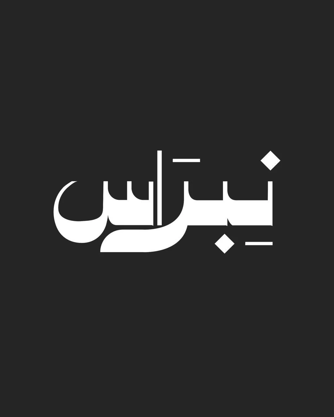
A distinctive Arabic wordmark with a strong silhouette and one small-scale detail risk.
This wordmark shows solid execution, supported by distinctive construction and text readability; improving clarity at smaller sizes is the clearest next step.
Focus on the changes that matter. Keep what makes the logo work.
The wordmark gives the Arabic name a distinctive silhouette through sweeping curves and geometric letterforms.
The visible name reads نبراس; spelling has not been independently verified.
Logo preview unavailable. The written feedback is still available on this card.
Central vertical stroke and upper horizontal accent
The slim vertical and detached horizontal strokes are much finer than the main letterforms and may lose definition at small social-platform sizes.
See the category reviewThe Arabic lettering suits the stated Qatari audience, though the wordmark does not itself communicate the podcast format.
The slim vertical and detached horizontal strokes are much finer than the main letterforms and may lose definition at small social-platform sizes.
Try: Test the wordmark at typical profile and thumbnail sizes, then strengthen the fine strokes if needed.
Logo preview unavailable. The written feedback is still available on this card.

Inspect spacing with the guide. Optical balance may differ from geometric centering.
This review includes a score but no supporting explanation for this category.
Get a clear logo score, key risks, and priority fix ideas before your client or audience sees it.
More credits needed
Add credits to continue without losing your work.
Then $7/month. Cancel anytime.
Essential logo review
Usually takes under a minute