What to preserve
A large P-shaped monogram and connected lettering give the name a distinctive geometric identity.
Spelling & grammar
No obvious issue foundThe name reads as “path provider”; spelling has not been independently verified.
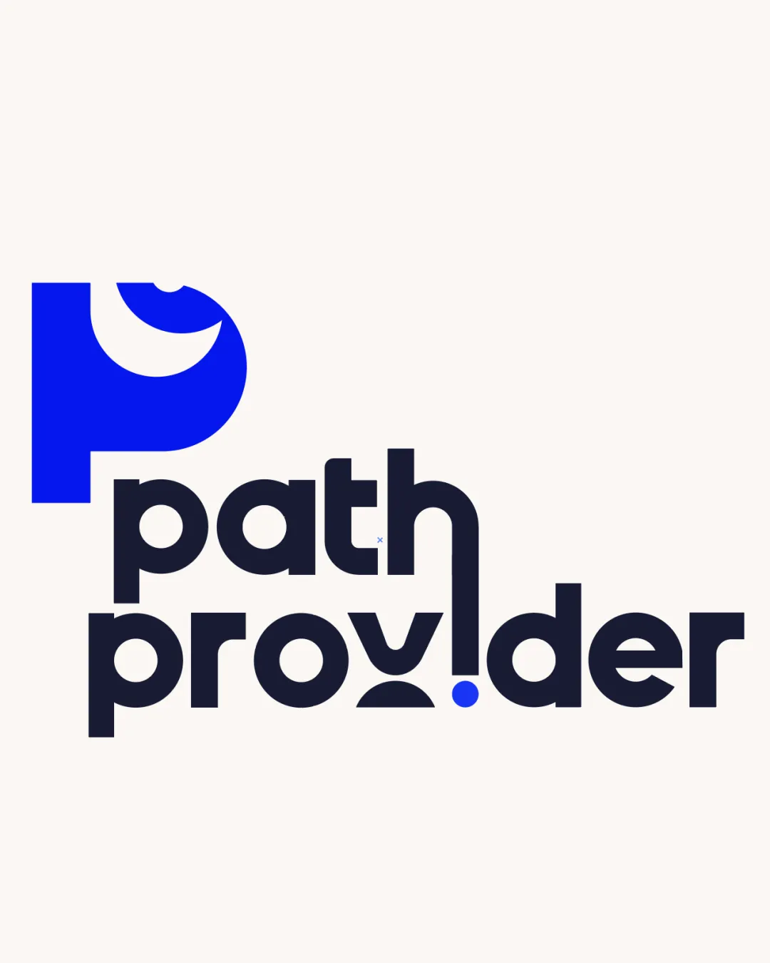
A distinctive, cohesive typographic lockup with a few letterforms worth testing for clarity.
This logo lockup shows strong execution, supported by distinctive construction and visual balance.
Focus on the changes that matter. Keep what makes the logo work.
A large P-shaped monogram and connected lettering give the name a distinctive geometric identity.
The name reads as “path provider”; spelling has not been independently verified.
Logo preview unavailable. The written feedback is still available on this card.
Center of the lower word
The split, curved v and the i formed by the descending h are unconventional, so “provider” may take an extra moment to read.
See the category reviewThe bold, approachable lettering suits a consultancy name, though the abstract treatment does not specifically signal education.
Monogram 4/5 · Wordmark 4/5 · Layout 4/5
The split, curved v and the i formed by the descending h are unconventional, so “provider” may take an extra moment to read.
Try: Test first-read recognition of the full name before changing the letterforms.
Logo preview unavailable. The written feedback is still available on this card.
Monogram 4/5 · Wordmark 4/5
Monogram 4/5 · Wordmark 4/5
Estimated colors. Use the original design file for exact values.
Create a full color palette using these colors
Create new paletteMonogram 4/5 · Wordmark 4/5 · Layout 4/5

Inspect spacing with the guide. Optical balance may differ from geometric centering.
Monogram 4/5 · Wordmark 4/5 · Layout 4/5
The narrow gap between the two parts of the v is much finer than the surrounding bold strokes and may close at smaller sizes.
Try: Check the lower word at the smallest intended print and screen sizes.
Get a clear logo score, key risks, and priority fix ideas before your client or audience sees it.
More credits needed
Add credits to continue without losing your work.
Then $7/month. Cancel anytime.
Essential logo review
Usually takes under a minute