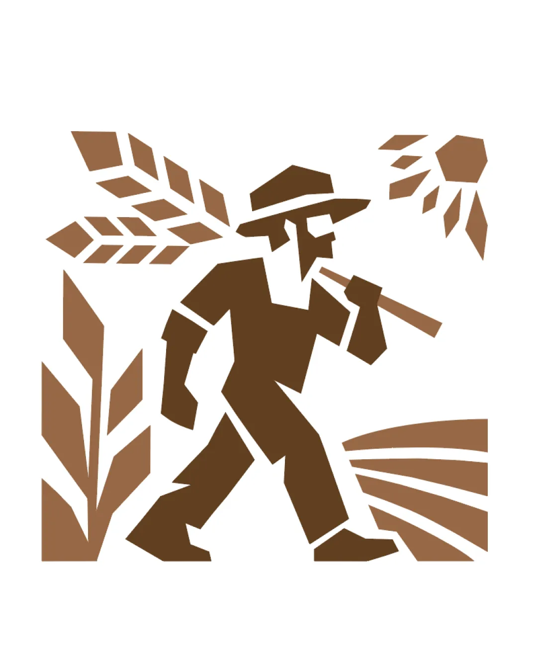
stylized farmer figure with hat, carrying a farmin.. logo review
4/5
Logo score
Logo review of

Stylized Farmer Figure With Hat, Carrying A Farmin..

A strong, distinctive mark for a farmers market, justifying local agricultural roots with a memorable silhouette and minor scalability refinements advised.

Standalone Mark Geometric, Rustic, Monoline Illustration Farmers Market / Agriculture
4/5
Originality
5/5
Misread
4/5
Balance
3.5/5
Scale
Your next steps

What to fix first

Focus on the changes that matter. Keep what makes the logo work.

1

standalone mark (thin details of farm fields and wheat)

Test the logo at reduced dimensions to ensure details remain recognizable.

Worth testing High priority Low effort
Area to inspectApproximate location

The thin strips representing fields and wheat details may lose clarity at very small sizes.

How to check

Render the mark at common small sizes (e.g., 32px, 16px) and inspect all motif details for clarity.


See the category review
2

standalone mark (overall composition)

Consider subtly adjusting right-side elements or background spacing to achieve stronger optical balance.

Optional refinement Medium priority Medium effort
Area to inspectApproximate location

The composition is dynamic but slightly left-heavy, as the farmer and wheat angle create visual weight on the left side.

How to check

Compare the mark with a central axis overlay and assess visual balance by eye.

See the category review
Detailed review

Logo performance breakdown

5/5

Brief & logo match

Based on your brief
Compared with

it's a logo for a local farmers market

Logo strongly embodies agricultural and local community values central to a farmers market brand.

  • Agricultural Symbolism

    The farmer figure, wheat, and fields directly express agricultural values and connect to farmers market identity.

  • Local/traditional Impression

    The hand-cut, geometric style feels approachable and traditional, well-suited for a community-focused farmers market.

  • Reproducibility

    Design simplicity supports printing, but fine elements should be tested for small or single-color use.

4/5

Originality

  • Distinctive stylization of classic farming themes.
  • Recognizable silhouette unusual for local market brands.
4/5

Color harmony

  • Earthy brown tones well suited to agricultural theme.
  • Limited palette aids reproduction and mood.
Brown#8B5A2B
LightBrown#A67C52

Estimated colors. Use the original design file for exact values.

Create a full color palette using these colors

Create new palette
4/5

Balance alignment

  • Dynamic walking pose and motif interplay create engaging layout.
  • Compositional energy relates to the farming context.
  • The composition is dynamic but slightly left-heavy, as the farmer and wheat angle create visual weight on the left side.

    Optional refinement standalone mark (overall composition)

    Try: Consider subtly adjusting right-side elements or background spacing to achieve stronger optical balance.

    Check: Compare the mark with a central axis overlay and assess visual balance by eye.

    Area to inspectApproximate location
Uploaded logoAlignment guide overlay

Inspect spacing with the guide. Optical balance may differ from geometric centering.

3.5/5

Scalability

  • Simple, blocky geometric shapes enable reproduction.
  • Some thin details may be fragile at small scale.
  • The thin strips representing fields and wheat details may lose clarity at very small sizes.

    Worth testing standalone mark (thin details of farm fields and wheat)

    Try: Test the logo at reduced dimensions to ensure details remain recognizable.

    Check: Render the mark at common small sizes (e.g., 32px, 16px) and inspect all motif details for clarity.
    Area to inspectApproximate location
Uploaded logo at 200 pixels wide
200 × 250 px
Uploaded logo at 100 pixels wide
100 × 125 px
Uploaded logo at 50 pixels wide
50 × 63 px

Compare the detail at different sizes. Labels show the full image dimensions.

5/5

Misinterpretations

  • No confusing alternate meanings or forms detected.

Black & white

Does the shape still work without color?

These tests are available only for logos uploaded in vector (SVG) format.

Background contrast

Find the surfaces where your logo stays clear.

These tests are available only for logos uploaded in vector (SVG) format.

Blur & silhouette

A 3px blur softens fine details so you can check whether the overall shape stays recognizable. If key gaps close or elements merge, the logo may rely too heavily on detail.

These tests are available only for logos uploaded in vector (SVG) format.

4/5
Market fit

Category positioning

Distinctive mark well fits the farmers market space while standing apart from basic produce or sun icons.

The agricultural figure motif differentiates this mark from common category clichés and projects human connection instead of generic product images.

1
Category Fit
Good fit

Rural/agricultural symbolism is a direct visual match for farmers markets.

Interpreted correctly by intended audiences.

2
Differentiation Risk
Some overlap

Most farmers market logos use literal produce; the walking farmer motif is less common but not entirely unique.

Possible resemblance to broader agricultural/organic associations, but not likely to be confused locally.

3
Market Signal
Clear signal

The earthy palette and geometric style communicate trust and community rootedness.

Clear signal for target demographic.

How to stand out more
  • Leverage the human figure for emotional resonance unlike abstract sun/plant marks.
  • Keep field/wheat motif for instant farming connection.
From design file to real use

Use-case readiness

How the logo may work in practice, and what to check before production.

Website header

Looks suitable

Bold style and strong silhouette adapt well to digital headers.

Before you use it

Place in typical website header mockup at 80-120px height.

Social media avatar

Looks suitable

Iconic mark is recognizable at avatar scale for most platforms.

Before you use it

Preview at 64x64px and 48x48px to confirm main shape clarity.

Favicon & app icon

Needs testing

Thin field/wheat lines may blur at 16-32px icon sizes; a simplified favicon may be needed.

Before you use it

Generate standard favicon includes and inspect legibility.

Business card

Looks suitable

Simple shape and contrast reproduce well on printed cards.

Before you use it

Print logo at 20-30mm to confirm sharpness.

Signs & signage

Looks suitable

Bold shapes support effective outdoor signage and banners.

Before you use it

Create a signboard mockup and verify distant recognizability.

Packaging & labels

Looks suitable

Limited palette and clear figure suit market packaging and produce labels.

Before you use it

Apply to a typical box or sticker label design.

Embroidery

Adjust first

Thin wheat/field lines may not translate to thread; some elements may need thickening for embroidered patches.

Before you use it

Test with a 2.5-3mm minimum stitch width preview.

One-color printing

Looks suitable

Strong mark works well as a single-color print but test the thinnest elements for fill-in or loss.

Before you use it

Print in solid black at smallest required size.

Delivery checklist

Logo suite verification

A practical checklist of the logo versions to prepare before sending the final files to a client or team.

Detected in this upload

Already included

Visible

Standalone logomark or monogram

The uploaded asset includes a standalone mark.

Before delivery

Versions to remember

1

Wordmark and primary lockup

High priority Recommended

Pair the mark with a wordmark for full brand identification and wider applications.

2

One-color logo version

High priority Recommended

Prepare a monochrome version for restricted print and production methods.

3

Reversed light logo version

Medium priority Recommended

Prepare a light version for dark brand backgrounds.

Presentation kit

Finalize and present this logo

Primary mark

A bold, geometric silhouette of a walking farmer figure accented by stylized wheat, crops and field motifs in earthy browns, all contained in a square block composition.

Positioning statement

This logo embodies the spirit of your local farmers market, centering the human element of agriculture and community.

Design rationale

The silhouette of the farmer signals tradition, authenticity, and the hands-on nature of local food production.

Geometric shapes and earthy colors create a modern yet rustic feel that is approachable and flexible across materials and media.

Tips for the logo presentation

Mockup ideas
  • Logo mounted on a stall banner at an outdoor market scene.
  • Circular market produce stickers with the emblem at center.
  • Branded reusable tote bag with the walking farmer mark.
Possible objections
  • Will it reproduce clearly on small surfaces or with simple printing?
  • Is the figure clear to all ages or at a quick glance?
Presentation tips
  • Show this logo at both large and small scales to demonstrate versatility.
  • Compare against simple clip-art symbols to highlight originality and crafted approach.
Try your own review

Wondering how your logo performs?

Get a clear logo score, key risks, and priority fix ideas before your client or audience sees it.

Review my logo