What to preserve
A bold, rounded wordmark uses geometric letterforms to convey approachability and cohesion, aligning with an insurance theme that suggests support and unity.
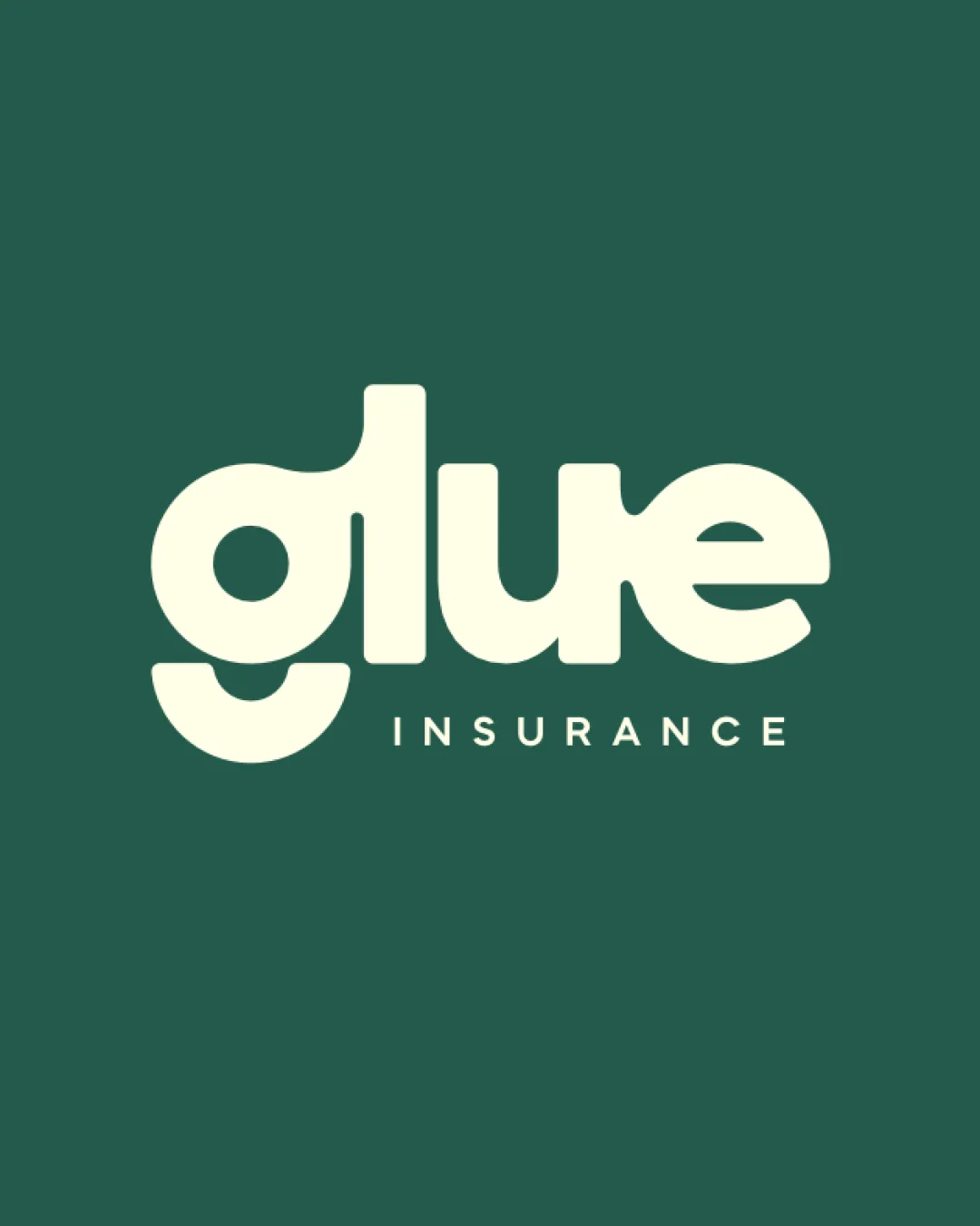
A bold, memorable, and highly readable geometric wordmark that stands out in the insurance space, with only minor refinement potential for even greater balance.
This logo lockup shows solid execution, supported by distinctive construction and text readability; improving visual balance is the clearest next step; layout still needs assessment.
Focus on the changes that matter. Keep what makes the logo work.
A bold, rounded wordmark uses geometric letterforms to convey approachability and cohesion, aligning with an insurance theme that suggests support and unity.
Logo preview unavailable. The written feedback is still available on this card.
lower part of the 'g' and 'e'
The flat-bottomed, geometric shaping of the 'g' and 'e' gives a visually distinct, playful look but creates heavy weight and closed space at the bottom edges, which may slightly disrupt horizontal balance versus the more open top forms.
See the category reviewThe playful, unified wordmark and approachable forms convincingly communicate cohesion and trust for an insurance brand, with a minor caveat on balance.
The extreme geometric stylization is still highly readable but could challenge legibility for some at very small sizes, especially with the large, similar bowls of 'g' and 'e'.
The flat-bottomed, geometric shaping of the 'g' and 'e' gives a visually distinct, playful look but creates heavy weight and closed space at the bottom edges, which may slightly disrupt horizontal balance versus the more open top forms.
Try: Slightly lighten or open up the lower portions of these letters to create more even visual balance if strict neutrality is needed.
Logo preview unavailable. The written feedback is still available on this card.

Inspect spacing with the guide. Optical balance may differ from geometric centering.
Get a clear logo score, key risks, and priority fix ideas before your client or audience sees it.
More credits needed
Add credits to continue without losing your work.
Then $7/month. Cancel anytime.
Essential logo review with AI
Estimated progress