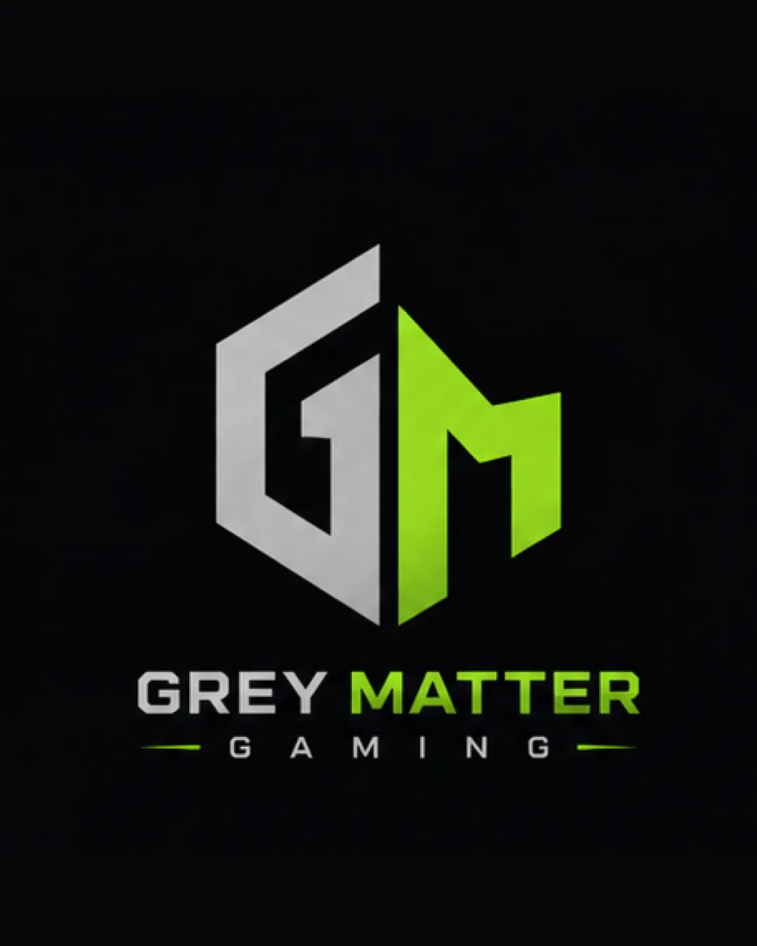
GREY MATTER GAMING logo review
4.2 / 5
Logo score

Logo review ofGrey Matter Gaming

Strong, functional logo with only minor scalability and context risks. Ready for most digital applications.

Combination Mark Modern Geometric Gaming
5/5
Legibility
3/5
Originality
5/5
Misread
4/5
Balance
4/5
Scale
Review next
Action plan

What to fix first

The most important fixes to handle before polishing the full presentation.

1

Slightly increase negative space in the monogram for better clarity at small sizes.

Medium priority

Tight negative spaces could appear muddy or closed at reduced scales.

Impact: Improves Long-term Scalability And Legibility For Smaller Applications. · Effort: Low

2

Consider a slight adjustment to the color intensity or provide an alternative version for print and monochrome usages.

Low priority

Neon green does not always render well outside digital screens.

Impact: Ensures The Logo Remains Legible And Appealing In Non-digital Settings. · Effort: Low

Detailed review

Logo performance breakdown

5/5

Legibility

Checkmark icon Text is bold and clear, easy to read
Checkmark icon High contrast between wordmark and background

3/5

Originality

Checkmark icon Dynamic monogram integration

Warning icon Style and composition are standard for esports; not highly differentiated

4/5

Color harmony

Checkmark icon Grey and neon green offer strong, relevant contrast
Checkmark icon Palette is limited and cohesive

Warning icon Neon green may be visually harsh in some settings

Grey
#B0B0B0

Lime
#A3FF00

Black
#000000

Your palette is close. Explore sharper color combinations with Colorfly.design before updating the logo.

Explore palettes
4/5

Balance alignment

Checkmark icon Monogram and text are well centered
Checkmark icon Consistent horizontal spacing

Warning icon The shape contrast between the G and M halves slightly disrupts perfect balance

logo 200x250 pixels scalability test alignment grid overlay
4/5

Scalability

Checkmark icon Geometric sans-serif lettering scales well
Checkmark icon Solid fill colors will remain stable at reduced sizes

Warning icon Monogram's thin negative space might lose clarity at very small sizes

logo 200x250 pixels scalability test

200x250 px

logo 100x125 pixels scalability test

100×125 px

logo 50x62 pixels scalability test

50×62 px

5/5

Misinterpretations

Checkmark icon No inappropriate or confusing misreadings evident

5 / 5

Logo structure & brief match

Checkmark icon Monogram and wordmark fit visually and stylistically

Checkmark icon Industry: Modern geometric motif and sharp lines fit well with the gaming and esports audience.

Try your own review

Wondering how your logo performs?

Get a clear logo score, key risks, and priority fix ideas before your client or audience sees it.

Review my logo