 View review
Logo score
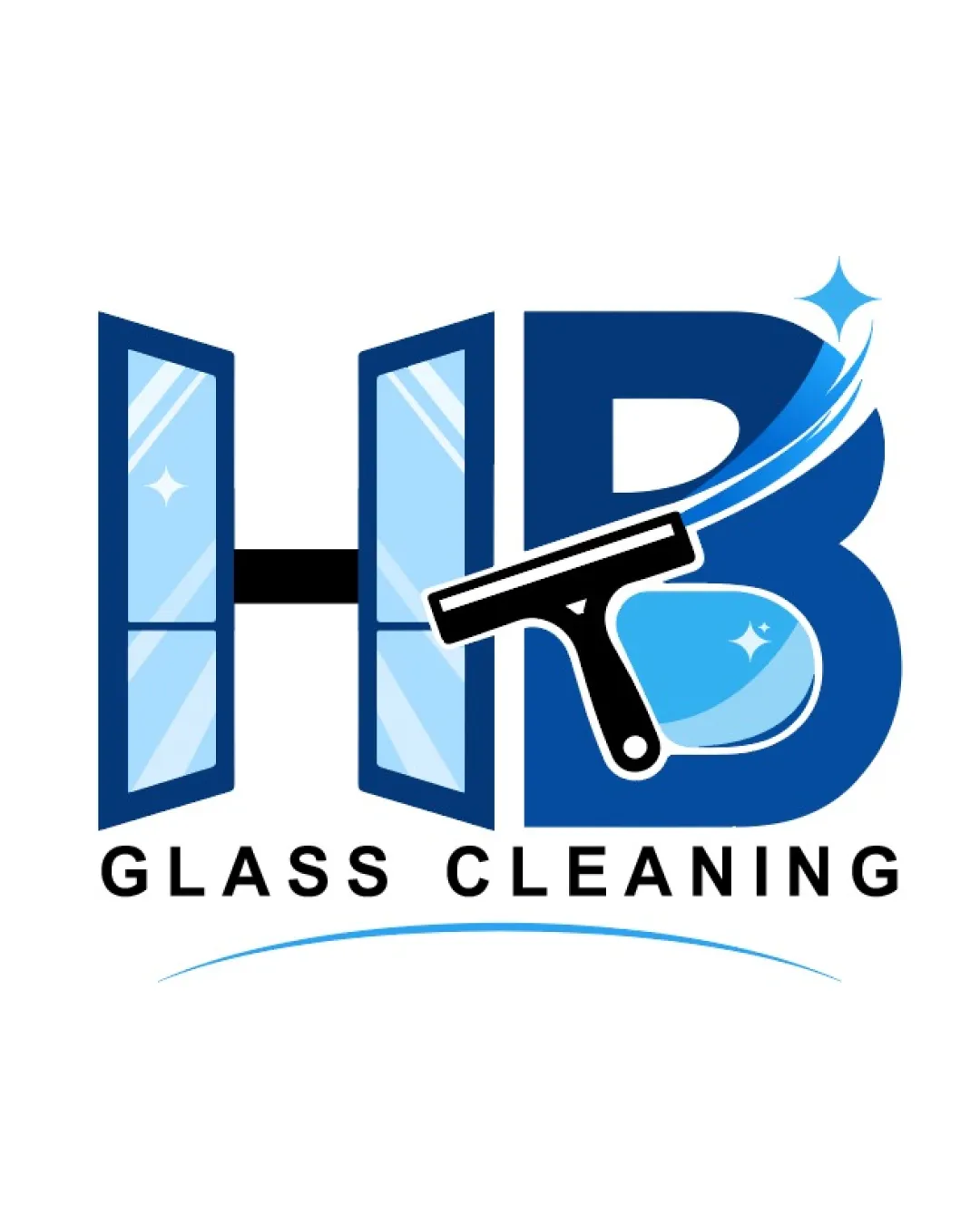
Logo review ofHb Glass Cleaning
Solid concept for the glass cleaning industry, suitable after minor adjustments for broader use.
Legibility
Originality
Misread
Balance
Scale
Action plan
What to fix first
The most important fixes to handle before polishing the full presentation.
1
Simplify illustrative and gradient effects for improved scalability.
High priorityCurrent detail may blur or lose effectiveness when reduced.
Impact: Ensures Logo Remains Legible And Strong At Small Sizes Across Various Media. · Effort: Medium
2
Minimize overlap/crowding between the squeegee and letterforms.
Medium priorityCurrent overlap slightly distracts from core shapes.
Impact: Improves Clarity And Reduces Visual Clutter. · Effort: Medium
Detailed review
Logo performance breakdown
Legibility
 Text 'HB GLASS CLEANING' is clear and easy to read
Originality
Integration of glass and cleaning elements with initials is distinctive
 Window and squeegee motif is somewhat common in the industry
Color harmony
Blues communicate cleanliness and transparency; contrast is good
Heavy use of blue may limit versatility in all applications
Denim
#2A4B85
Maya Blue
#65B3E3
Black
#000000
White
#FFFFFF
Your palette is close. Explore sharper color combinations with Colorfly.design before updating the logo.
Explore palettesBalance alignment
Balanced composition with text and imagery aligned centrally
Squeegee overlaps letterforms, slightly cluttering the design

Scalability
Shapes are bold and well-separated
Illustrative details and gradients may lose clarity at small sizes
200x250 px
100×125 px
50×62 px
Misinterpretations
No inappropriate or confusing shapes detected
Logo structure & brief match
Mark visually reinforces brand service, fits with wordmark
Cleaning Services / Glass Cleaning: Logo directly communicates the cleaning/glass focus with window and squeegee, making the service instantly recognizable.
Try your own review
Review my logo
Wondering how your logo performs?
Get a clear logo score, key risks, and priority fix ideas before your client or audience sees it.
Keep exploring