Concept & direction
The dynamic italic wordmark and angled tagline bar together evoke speed and precision fitting for a ski tuning brand.
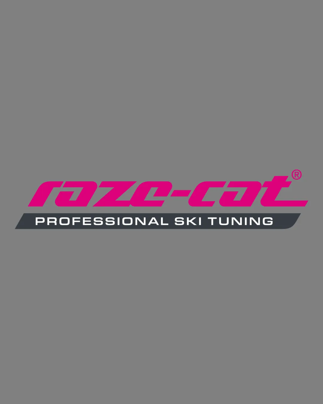
Dynamic and distinctive visual identity for a ski tuning brand with strong color and energy, but risks in rapid/compact legibility from the highly stylized name.
This logo lockup shows solid execution, supported by distinctive construction and clarity at smaller sizes; improving text readability is the clearest next step.
Focus on the changes that matter. Keep what makes the logo work.
The dynamic italic wordmark and angled tagline bar together evoke speed and precision fitting for a ski tuning brand.
Logo preview unavailable. The written feedback is still available on this card.
wordmark (raze-cat)
The highly stylized letterforms (especially the 'r', 'a', and the joined mid-letters) risk being misread, particularly at smaller sizes or quick glances.
See the category reviewThe angular italic wordmark and energetic accent bar communicate speed and precision, aligning with ski tuning but require confirmation that legibility remains strong in use-case conditions.
Estimated colors. Use the original design file for exact values.
Create a full color palette using these colors
Create new paletteWordmark 4/5 · Layout 4/5
Wordmark 3/5 · Layout 4/5
The highly stylized letterforms (especially the 'r', 'a', and the joined mid-letters) risk being misread, particularly at smaller sizes or quick glances.
Try: Test legibility in small and fast recognition scenarios across media.
Logo preview unavailable. The written feedback is still available on this card.
Wordmark 3/5 · Layout 3/5
The angle of the black descriptor bar underlines the logo dynamically, but the offset and width do not perfectly match the wordmark above, resulting in visual imbalance at the right edge.

Inspect spacing with the guide. Optical balance may differ from geometric centering.
Get a clear logo score, key risks, and priority fix ideas before your client or audience sees it.
More credits needed
Add credits to continue without losing your work.
Then $7/month. Cancel anytime.
Essential logo review with AI
Estimated progress