Wondering how your logo performs? 🧐
Get professional logo reviews in seconds and catch design issues in time.
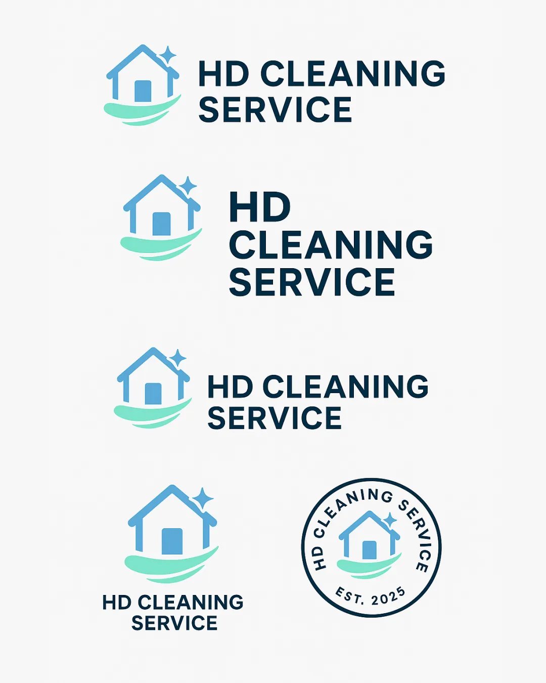
Try it Now!Logo review of HD CLEANING SERVICE
 Logo analysis by AI
Logo type:
Style:
Detected symbol:
Detected text:
Business industry:
Review requested by SAstacio
**If AI can recognize or misinterpret it, so can people.
Structured logo review
Legibility
![]() Typography is bold, sans-serif, and extremely easy to read.
Typography is bold, sans-serif, and extremely easy to read.![]() Good letter spacing and clean, professional type choice.
Good letter spacing and clean, professional type choice.
Scalability versatility
![]() Logo is simple and will scale well on business cards, uniforms, and vehicles.
Logo is simple and will scale well on business cards, uniforms, and vehicles.![]() Minimal details avoid clutter when shrunk to small sizes.
Minimal details avoid clutter when shrunk to small sizes.![]() Circle badge version creates strong versatility for stickers and stamps.
Circle badge version creates strong versatility for stickers and stamps.
![]() Thin lines on the house and sparkle could lose clarity at micro sizes, such as small favicons or embroidery.
Thin lines on the house and sparkle could lose clarity at micro sizes, such as small favicons or embroidery.
200x250 px
100×125 px
50×62 px
Balance alignment
![]() Symbol and wordmark are well-aligned across all layout variations.
Symbol and wordmark are well-aligned across all layout variations.![]() Consistent spacing and visual weight between icon and text.
Consistent spacing and visual weight between icon and text.
![]() In some arrangements, the swoosh feels slightly heavy compared to the sparkle; visual weight could be better balanced.
In some arrangements, the swoosh feels slightly heavy compared to the sparkle; visual weight could be better balanced.

Originality
![]() Clean execution with professional feel.
Clean execution with professional feel.
![]() House + sparkle/star is a widely used and generic concept in the cleaning industry.
House + sparkle/star is a widely used and generic concept in the cleaning industry.![]() The swoosh under the house is also a common motif, lacking unique creativity.
The swoosh under the house is also a common motif, lacking unique creativity.
Logomark wordmark fit
![]() Logomark and wordmark use similar line weight and modern feel, complementing each other.
Logomark and wordmark use similar line weight and modern feel, complementing each other.
Aesthetic look
![]() Professional and clean appearance.
Professional and clean appearance.![]() Limited color palette suits the industry.
Limited color palette suits the industry.![]() Multiple lockups provide flexibility.
Multiple lockups provide flexibility.
![]() Design is somewhat generic and doesn't stand out among competitors.
Design is somewhat generic and doesn't stand out among competitors.
Dual meaning and misinterpretations
![]() Symbols and elements used are appropriate and industry-relevant.
Symbols and elements used are appropriate and industry-relevant.
Color harmony
![]() Cool color palette is harmonious and reinforces cleanliness.
Cool color palette is harmonious and reinforces cleanliness.![]() Strong contrast between logo and background ensures clarity.
Strong contrast between logo and background ensures clarity.
Medium Aquamarine
#53D7B3
Cornflower Blue
#5AACE1
Cetacean Blue
#1A3243
White
#FFFFFF


