 View review
Logo score
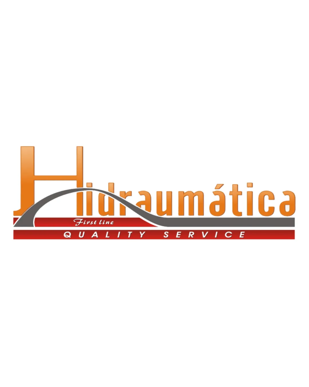
Logo review ofHidraumática First Line Quality Service
Review the detailed scores below to see what is working and what should be refined first.
Legibility
Originality
Misread
Balance
Scale
Detailed review
Logo performance breakdown
Legibility
![]() Main word 'Hidraumática' is generally readable where not obstructed.
Main word 'Hidraumática' is generally readable where not obstructed.
![]() The swoosh cuts through the text, especially over the tall 'H', reducing legibility.
The swoosh cuts through the text, especially over the tall 'H', reducing legibility.![]() Gradient on 'Hidraumática' decreases clarity at smaller sizes.
Gradient on 'Hidraumática' decreases clarity at smaller sizes.![]() Small italic text 'First line' is hard to read on most backgrounds.
Small italic text 'First line' is hard to read on most backgrounds.
Originality
![]() Attempts to integrate an arch/swoosh for dynamism.
Attempts to integrate an arch/swoosh for dynamism.
![]() Large initial with swoosh and gradients is a very common trope in industrial/service sectors.
Large initial with swoosh and gradients is a very common trope in industrial/service sectors.![]() No unique visual metaphor or clever use of negative space.
No unique visual metaphor or clever use of negative space.![]() Generic font and compositional arrangement.
Generic font and compositional arrangement.
Color harmony
![]() Red and orange are industrial, energetic choices and complement each other sufficiently.
Red and orange are industrial, energetic choices and complement each other sufficiently.
![]() Gradient use feels unnecessary and outdated.
Gradient use feels unnecessary and outdated.![]() White script on red is hard to read in 'First Line'.
White script on red is hard to read in 'First Line'.
Orange
#F7941D
Red
#C1272D
Dark Gray
#434343
White
#FFFFFF
Color may be holding this logo back. Explore stronger palette options with Colorfly.design before updating the logo.
Explore palettesBalance alignment
![]() Horizontal bars provide a visual anchor.
Horizontal bars provide a visual anchor.
![]() The left-heavy large 'H' vs. small text block causes imbalance.
The left-heavy large 'H' vs. small text block causes imbalance.![]() The arch feels disconnected from the baseline, giving an awkward visual flow.
The arch feels disconnected from the baseline, giving an awkward visual flow.![]() 'QUALITY SERVICE' is spaced widely but the upper elements are crowded.
'QUALITY SERVICE' is spaced widely but the upper elements are crowded.

Scalability
![]() High contrast colors could work on large signage.
High contrast colors could work on large signage.
![]() Thin arch and small script text details will not reproduce well at small sizes or in embroidery.
Thin arch and small script text details will not reproduce well at small sizes or in embroidery.![]() Gradient effects will not translate to all print techniques.
Gradient effects will not translate to all print techniques.![]() Logo would lose key elements if converted to a single color.
Logo would lose key elements if converted to a single color.
200x250 px
100×125 px
50×62 px
Misinterpretations
![]() No inappropriate or offensive shapes detected.
No inappropriate or offensive shapes detected.
Symbol & text fit
![]() Logomark (the arch and large H) references the wordmark.
Logomark (the arch and large H) references the wordmark.
![]() Logomark overshadows the rest of the type, making the proportions awkward.
Logomark overshadows the rest of the type, making the proportions awkward.
![]() Style of arch and baseline bars does not match the typography style used.
Style of arch and baseline bars does not match the typography style used.
Try your own review
Review my logo
Wondering how your logo performs?
Get a clear logo score, key risks, and priority fix ideas before your client or audience sees it.
Keep exploring


