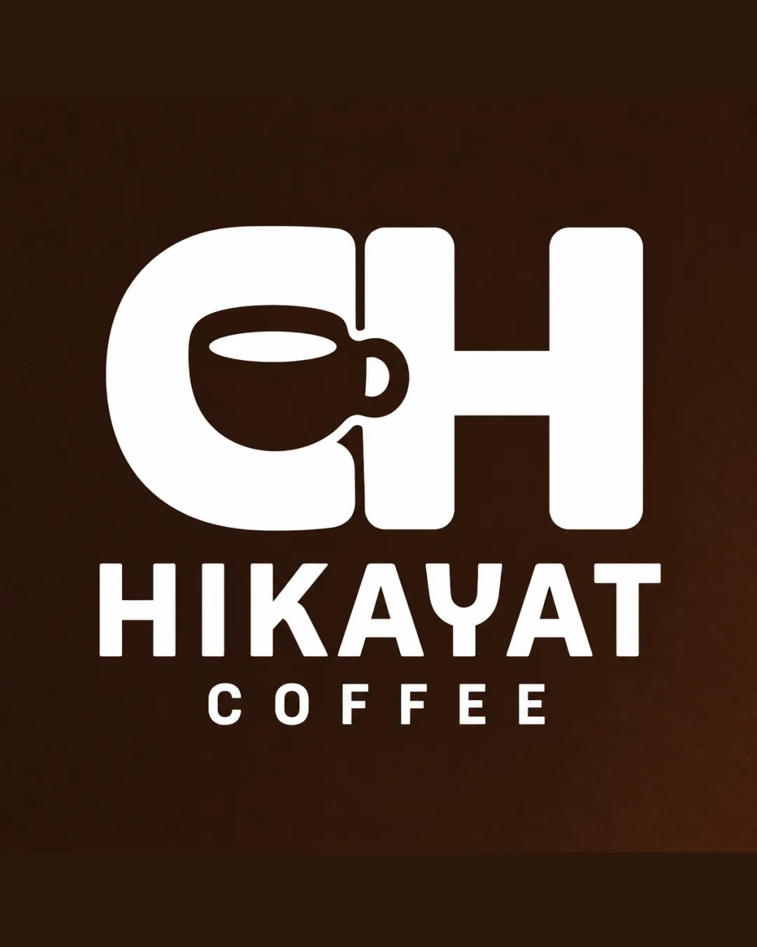
HIKAYAT COFFEE logo review
3.5/5
Logo score
Logo review of

Hikayat Coffee

A competent and legible logo with a clever mark-letter integration, though it risks genericness and minor balance and scalability issues.

Combination Bold, Minimalist, Modern Coffee Shop/cafe
5/5
Legibility
3/5
Originality
5/5
Misread
4/5
Balance
3/5
Scale
Your next steps

What to fix first

Focus on the changes that matter. Keep what makes the logo work.

1

lettermark/symbol

Test and possibly simplify cup details for small-scale clarity.

Visible issue High priority Low effort
Area to inspectApproximate location

The internal details of the coffee cup (handle, cup lip) may become indistinct at small sizes.

How to check

Verify logo clarity and recognition at small dimensions.

See the category review
2

lettermark/symbol

Adjust thickness or shape of the cup and letter to balance visual weight.

Optional refinement Medium priority Low effort
Area to inspectApproximate location

The coffee cup integration within the 'H' is visually effective, but the left bowl (from the 'C') appears heavier than the right, creating minor imbalance.

How to check

Compare both sides of the mark for even optical weight.

See the category review
Detailed review

Logo performance breakdown

4/5

Brief & logo match

Based on your brief
Compared with

The brand aims to emphasize storytelling, emotional bonds, and memorable experiences beyond just coffee sales.

The logo fits the brief through a strong, recognizable mark, but deeper narrative expression could further strengthen differentiation.

  • Emotional/Narrative Experience

    The bold mark and the word 'Hikayat' (meaning 'story' or 'tale') support a narrative-focused, memorable concept, but the visual storytelling could be more distinctive.

  • Coffee/Cafe Category Recognition

    Coffee cup iconography immediately signals the intended industry.

5/5

Legibility

  • Text is highly readable.
  • Letterform clearly distinguished.
3/5

Originality

  • Logo effectively merges initial and symbol.
  • Coffee cup integrated into a letter is a recognizable but somewhat common motif in coffee branding.

    Optional refinement overall

    Try: Explore unique stylistic treatments or narrative elements reflecting the emotional/storytelling brief.

    Check: Assess if visual distinguishes the brand from typical coffee shop marks.

4/5

Balance alignment

  • Well-centered layout.
  • Mark and wordmark align accurately.
  • The coffee cup integration within the 'H' is visually effective, but the left bowl (from the 'C') appears heavier than the right, creating minor imbalance.

    Optional refinement lettermark/symbol

    Try: Adjust thickness or shape of the cup and letter to balance visual weight.

    Check: Compare both sides of the mark for even optical weight.

    Area to inspectApproximate location
Uploaded logoAlignment guide overlay

Inspect spacing with the guide. Optical balance may differ from geometric centering.

3/5

Scalability

  • Bold lines aid scalability.
  • The internal details of the coffee cup (handle, cup lip) may become indistinct at small sizes.

    Visible issue lettermark/symbol

    Try: Test and possibly simplify cup details for small-scale clarity.

    Check: Verify logo clarity and recognition at small dimensions.
    Area to inspectApproximate location
Uploaded logo at 200 pixels wide
200 × 250 px
Uploaded logo at 100 pixels wide
100 × 125 px
Uploaded logo at 50 pixels wide
50 × 63 px

Compare the detail at different sizes. Labels show the full image dimensions.

5/5

Misinterpretations

  • No apparent confusing or negative interpretations.
5/5

Symbol & text fit

  • The symbol and wordmark integrate cohesively.

Black & white

Does the shape still work without color?

These tests are available only for logos uploaded in vector (SVG) format.

Background contrast

Find the surfaces where your logo stays clear.

These tests are available only for logos uploaded in vector (SVG) format.

Blur & silhouette

A 3px blur softens fine details so you can check whether the overall shape stays recognizable. If key gaps close or elements merge, the logo may rely too heavily on detail.

These tests are available only for logos uploaded in vector (SVG) format.

Try your own review

Wondering how your logo performs?

Get a clear logo score, key risks, and priority fix ideas before your client or audience sees it.

Review my logo