Wondering how your logo performs? 🧐
Get professional logo reviews in seconds and catch design issues in time.
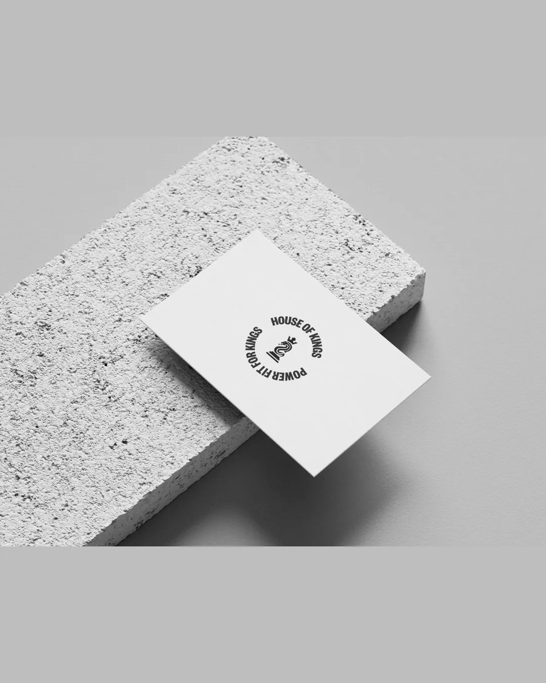
Try it Now!Logo review of HOUSE OF KINGS POWER FIT FOR KINGS
 Logo analysis by AI
Recognized style:
Logo type:
Detected symbol:
Detected text:
Business industry:
Review requested by Chavikumari_
**If AI can recognize or misinterpret it, so can people.
Structured logo review
Legibility
![]() The text is clear and complements the circular design.
The text is clear and complements the circular design.
![]() Curved text slightly affects readability.
Curved text slightly affects readability.
Scalability versatility
![]() Simple and bold design ensures scalability and versatility.
Simple and bold design ensures scalability and versatility.
200x250 px
100×125 px
50×62 px
Balance alignment
![]() Well-balanced circular design with centered symbol.
Well-balanced circular design with centered symbol.

Originality
![]() Unique combination of a snake and crown.
Unique combination of a snake and crown.
![]() Snake and crown are common symbols individually.
Snake and crown are common symbols individually.
Aesthetic look
![]() The logo is clean and aesthetically pleasing with a strong presence.
The logo is clean and aesthetically pleasing with a strong presence.
Cultural sensitivity dual meaning
![]() No cultural sensitivity issues detected.
No cultural sensitivity issues detected.
Color harmony
![]() Effective use of monochrome for a strong, classic look.
Effective use of monochrome for a strong, classic look.