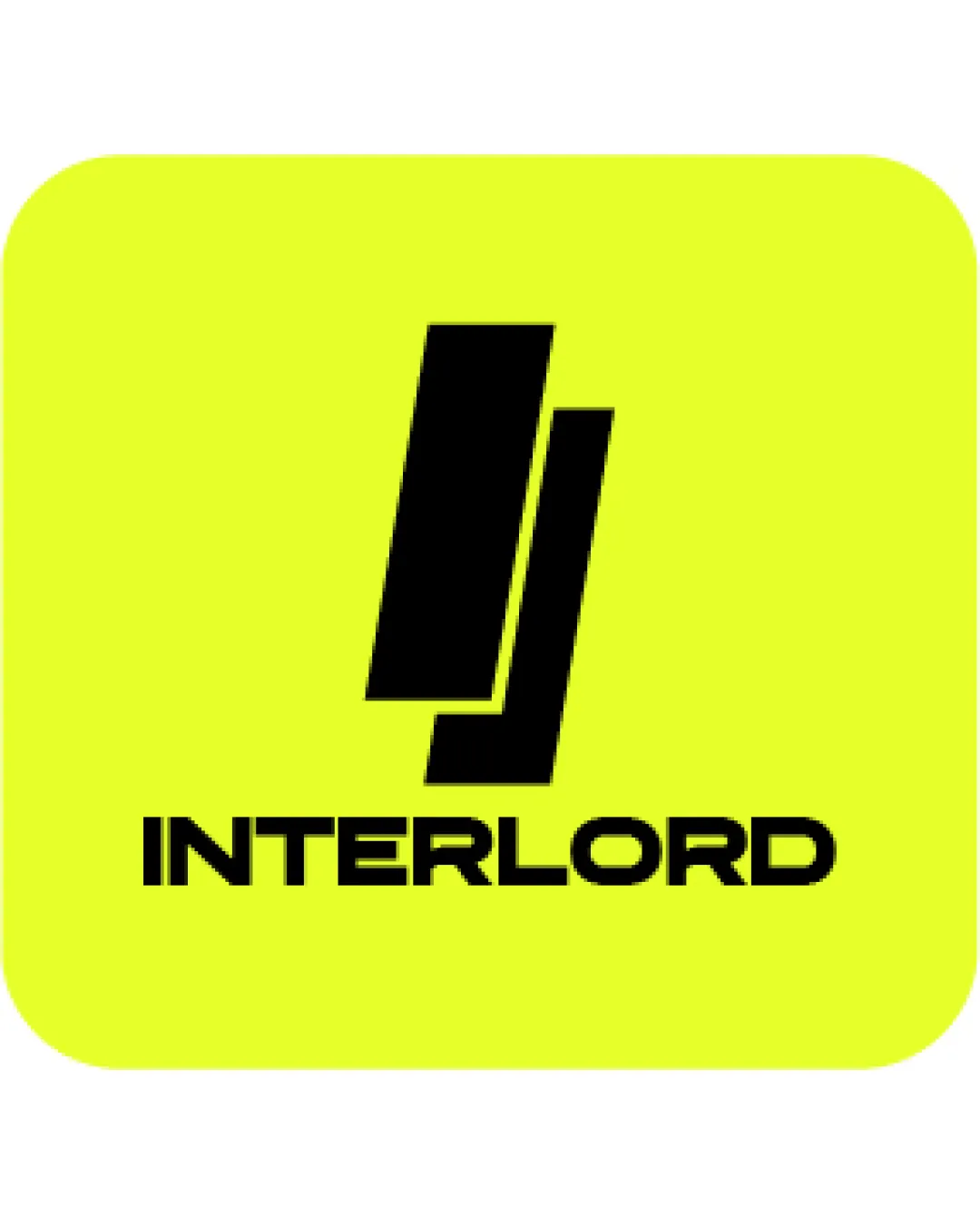
INTERLORD logo review
3.5/5
Logo score
Logo review of

Interlord

A modern, functional logo with clear type and scalability; needs color moderation and a more distinctive mark to be competitive.

Combination Mark Modern, Geometric, Minimal Technology
4/5
Legibility
3/5
Originality
4/5
Misread
4/5
Balance
4/5
Scale
Action plan

What to fix first

The most important fixes to handle before polishing the full presentation.

1

Soften or adjust the background yellow to a more versatile shade.

High priority

Current fluorescent color restricts practical use and may not appeal to wide audiences.

Impact: Improves Professional Impression And Usability Across Applications. · Effort: Low

2

Explore a more unique or brand-relevant mark concept.

Medium priority

Parallel bars are overused; a tweak or distinctive angle could improve memorability.

Impact: Helps Differentiate From Generic Tech/construction Logos And Builds Stronger Visual Identity. · Effort: Medium

Detailed review

Logo performance breakdown

4/5

Legibility

Checkmark icon Wordmark is clear and easy to read.
Checkmark icon Good spacing between letters.

Warning icon E and R letterforms could be more distinct.

3/5

Originality

Checkmark icon Modern and abstract mark.

Warning icon Parallel bar motif is common in tech and construction sectors—lacks distinctiveness.

3/5

Color harmony

Checkmark icon High contrast provides strong visibility.

Warning icon Fluorescent yellow background is harsh and can limit professional use.

Yellow
#F6FF00

Black
#000000

Color may be holding this logo back. Build a stronger strategic palette before updating the logo.

Build brand colors
4/5

Balance alignment

Checkmark icon Symbol and wordmark are well-centered.
Checkmark icon Good vertical spacing and proportion.

Warning icon Slight imbalance from the tilted symbol's visual weight.

logo 200x250 pixels scalability test alignment grid overlay
4/5

Scalability

Checkmark icon Simple structure is easily scalable.
Checkmark icon Symbol holds up well at small sizes.

Warning icon Thin negative spaces between symbol may blur at very small scales.

logo 200x250 pixels scalability test

200x250 px

logo 100x125 pixels scalability test

100×125 px

logo 50x62 pixels scalability test

50×62 px

4/5

Misinterpretations

Checkmark icon No obvious misinterpretation or ambiguity.

4/5

Logo structure & brief match

Checkmark icon Geometric mark fits with wordmark styling.
Checkmark icon Consistent sharp, modern aesthetic.

Warning icon Connection between symbol and name is not immediately apparent.

Checkmark icon Industry Presence: The geometric, modern motif aligns with tech or construction markets.

Try your own review

Wondering how your logo performs?

Get a clear logo score, key risks, and priority fix ideas before your client or audience sees it.

Review my logo