 View review
Logo score
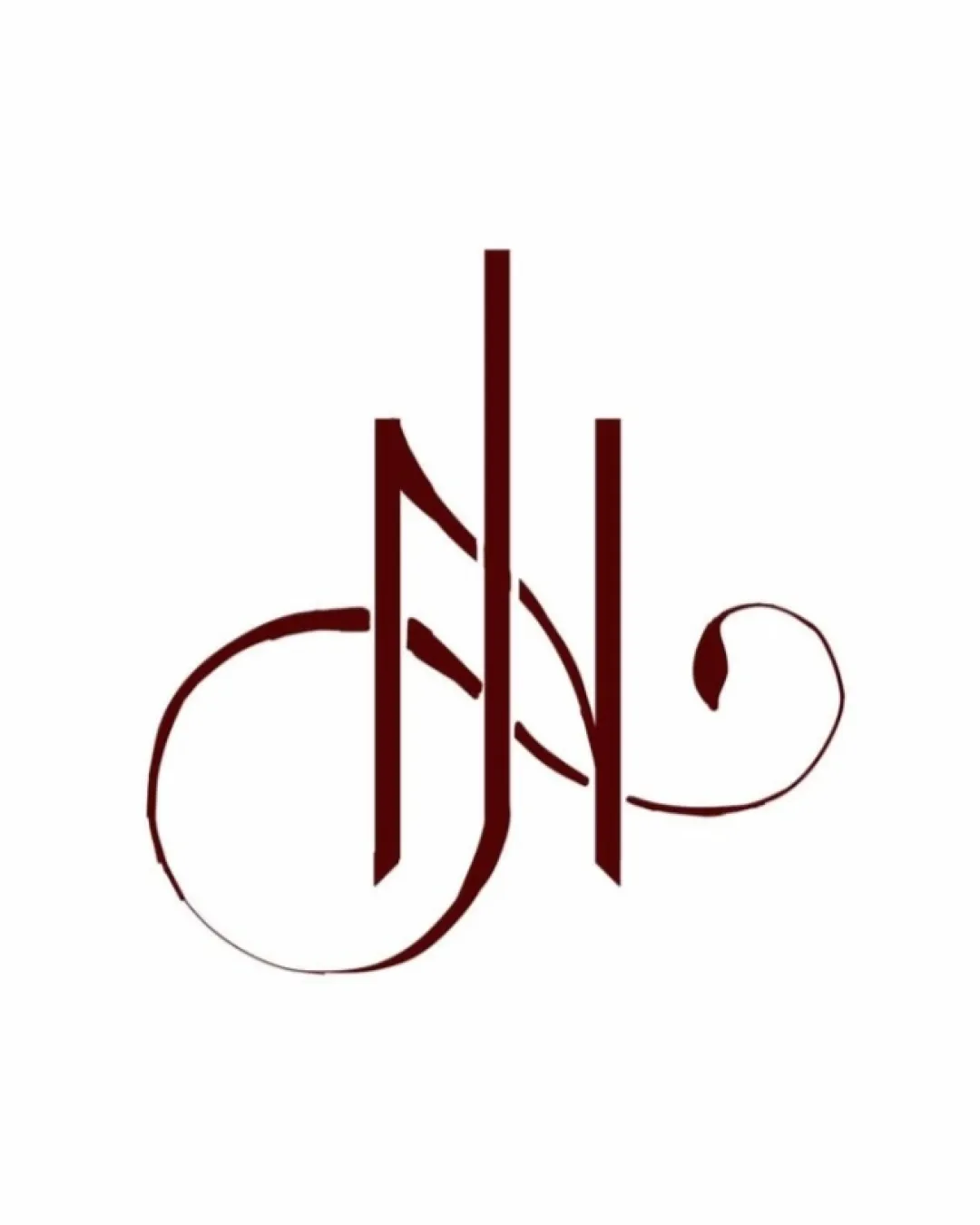
Logo review ofJ N
Review the detailed scores below to see what is working and what should be refined first.
Legibility
Originality
Misread
Balance
Scale
Detailed review
Logo performance breakdown
Legibility
![]() The vertical strokes are clean and uniform in color.
The vertical strokes are clean and uniform in color.
![]() Ornate flourishes diminish clarity, making the letters difficult to parse at first glance, especially for those unfamiliar with the brand.
Ornate flourishes diminish clarity, making the letters difficult to parse at first glance, especially for those unfamiliar with the brand.![]() The overlapping of letterforms further reduces instant readability.
The overlapping of letterforms further reduces instant readability.![]() The decorative style may hinder recognition at smaller sizes.
The decorative style may hinder recognition at smaller sizes.
Originality
![]() Distinctive calligraphic style adds uniqueness.
Distinctive calligraphic style adds uniqueness.![]() Creative integration of initials is eye-catching and elegant.
Creative integration of initials is eye-catching and elegant.
![]() Monogram concepts are not uncommon in the hospitality or luxury market, diminishing overall novelty.
Monogram concepts are not uncommon in the hospitality or luxury market, diminishing overall novelty.![]() Does not leverage negative space in a compelling or innovative way.
Does not leverage negative space in a compelling or innovative way.
Color harmony
![]() Simple two-color palette maintains elegance and ties well with luxury brands.
Simple two-color palette maintains elegance and ties well with luxury brands.![]() Excellent contrast between logo and white background.
Excellent contrast between logo and white background.
Deep Burgundy
#531009
White
#FFFFFF
Balance alignment
![]() Central vertical axis creates a sense of structure; symmetrical appearance overall.
Central vertical axis creates a sense of structure; symmetrical appearance overall.
![]() Heavy vertical strokes contrast sharply with light flourishes, leading to visual imbalance.
Heavy vertical strokes contrast sharply with light flourishes, leading to visual imbalance.![]() Ornamental swashes on left and right are uneven in weight and size.
Ornamental swashes on left and right are uneven in weight and size.![]() Lower part feels visually heavier due to extended left stroke.
Lower part feels visually heavier due to extended left stroke.

Scalability
![]() Will work well on large-scale applications like signage or invitations.
Will work well on large-scale applications like signage or invitations.
![]() Swashes and thin flourishes will likely be lost or blurred in small-scale uses such as business cards or social media avatars.
Swashes and thin flourishes will likely be lost or blurred in small-scale uses such as business cards or social media avatars.![]() Design complexity impairs reproduction on embroidery or stamps.
Design complexity impairs reproduction on embroidery or stamps.![]() Logo loses its calligraphic elegance and legibility at reduced scales.
Logo loses its calligraphic elegance and legibility at reduced scales.
200x250 px
100×125 px
50×62 px
Misinterpretations
![]() No immediately apparent inappropriate imagery.
No immediately apparent inappropriate imagery.![]() The letter design stays clear of accidental negative connotations.
The letter design stays clear of accidental negative connotations.
Try your own review
Review my logo
Wondering how your logo performs?
Get a clear logo score, key risks, and priority fix ideas before your client or audience sees it.
Keep exploring


